


The journal
Best Colours for North-Facing Rooms: Two Strategies
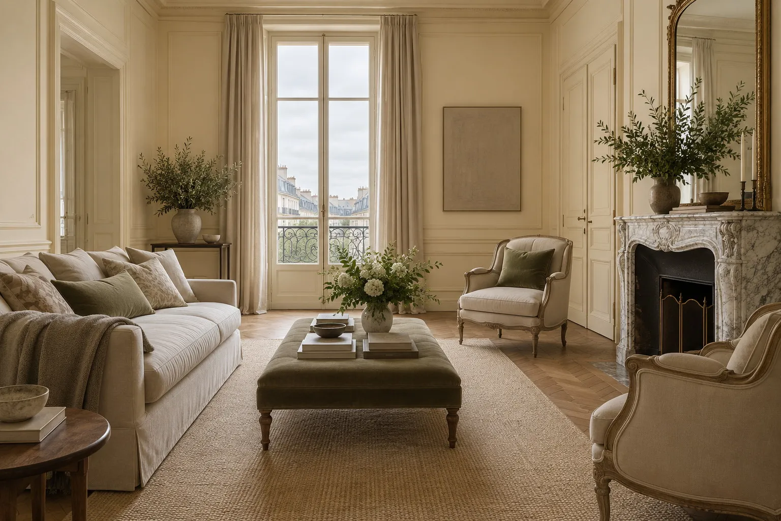
The best colours for north-facing rooms follow one of two paths: a warm shade, cream, sand or blush, that offsets the bluish light; or a deep colour, plum, blue-grey or fir green, that turns the half-light into atmosphere. In both cases, a matt finish and a test in the morning and again at dusk.
A north-facing room never receives the sun directly. Its light comes from the sky rather than from the sun itself: it is steady, diffuse, and markedly cooler than the light in rooms that face south or west. Painters have always sought it out for their studios, but in a living room or a bedroom it lays a grey-blue veil over the walls that dulls most colours. So what are the best colours for north-facing rooms? There is not one answer but two, and the choice between them depends less on the light than on the life you want to lead in the room.
What north light actually does
North light is bluish because it is reflected from the sky rather than cast by the sun. It changes little through the day, which is restful, but it has none of the golden hours that, in a south-facing room, warm a grey or make a white sing. Every colour placed on a north wall therefore receives that cool cast and adds it to its own. A light grey becomes steel blue; a pure white turns greyish; a beige loses its warmth and goes drab.
The good news is that this light is predictable. What you see at ten in the morning will look much like what you see at four in the afternoon, so a colour can be chosen with some confidence, provided you understand how light influences colour. Mylands paints, richly loaded with earth and mineral pigments, respond particularly well to this even light: their depth stays legible even without sun, where a paint with less pigment looks flat.
Best colours for north-facing rooms: warm them up
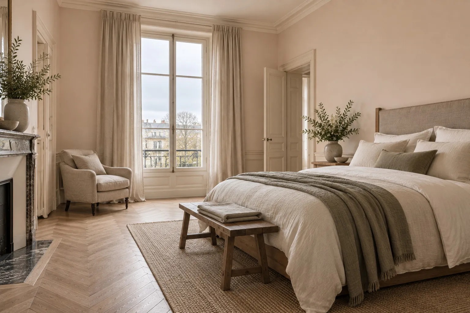
The first strategy is to compensate. You bring into the wall the warmth the window does not supply, with shades containing yellow ochre, raw umber or a touch of red. These colours absorb the blue cast and give the room back a light that seems to come from the south. It is the safest route for a family living room, a kitchen or a child's bedroom, rooms you want welcoming at every hour.
Cavendish Cream No.120 is our first recommendation: a cream inspired by John Nash's stucco façades, with enough ochre to look sunlit in a north room without tipping into yellow. Walbrook No.142, a slightly richer cream that recalls the stone walls of St Stephen Walbrook, heads the same way with more roundness. For a room you want frankly warm, a dining room or a study, Wharf Sacking No.127 moves from cream to golden sand; it is the colour of the sacks in which the factory still receives its raw materials, and in north light it takes on the softness of honey.
Those wary of yellow will find the same warmth on the pink and red-ochre side. Onslow No.48 is a warm neutral lifted with a hint of red ochre, reminiscent of London's grand façades, which gives walls a flattering complexion. Pediment No.73, a neutral blush just a shade deeper, brings a soft, almost end-of-day light to a north room and works particularly well in a bedroom. Both belong to our family of neutrals, where you will find other warm shades in the same spirit.
Second strategy: embrace the shade
The second strategy gives up the fight. Rather than trying to brighten a room that will stay dim, you give it a deep colour that turns the half-light into atmosphere. It is the approach of libraries, dining rooms, studies and bedrooms, rooms where you are not looking for the clarity of a summer morning but for enclosure. In north light a dark colour keeps all its richness because the even light never washes it out; it looks, if anything, more velvety than it would facing south.
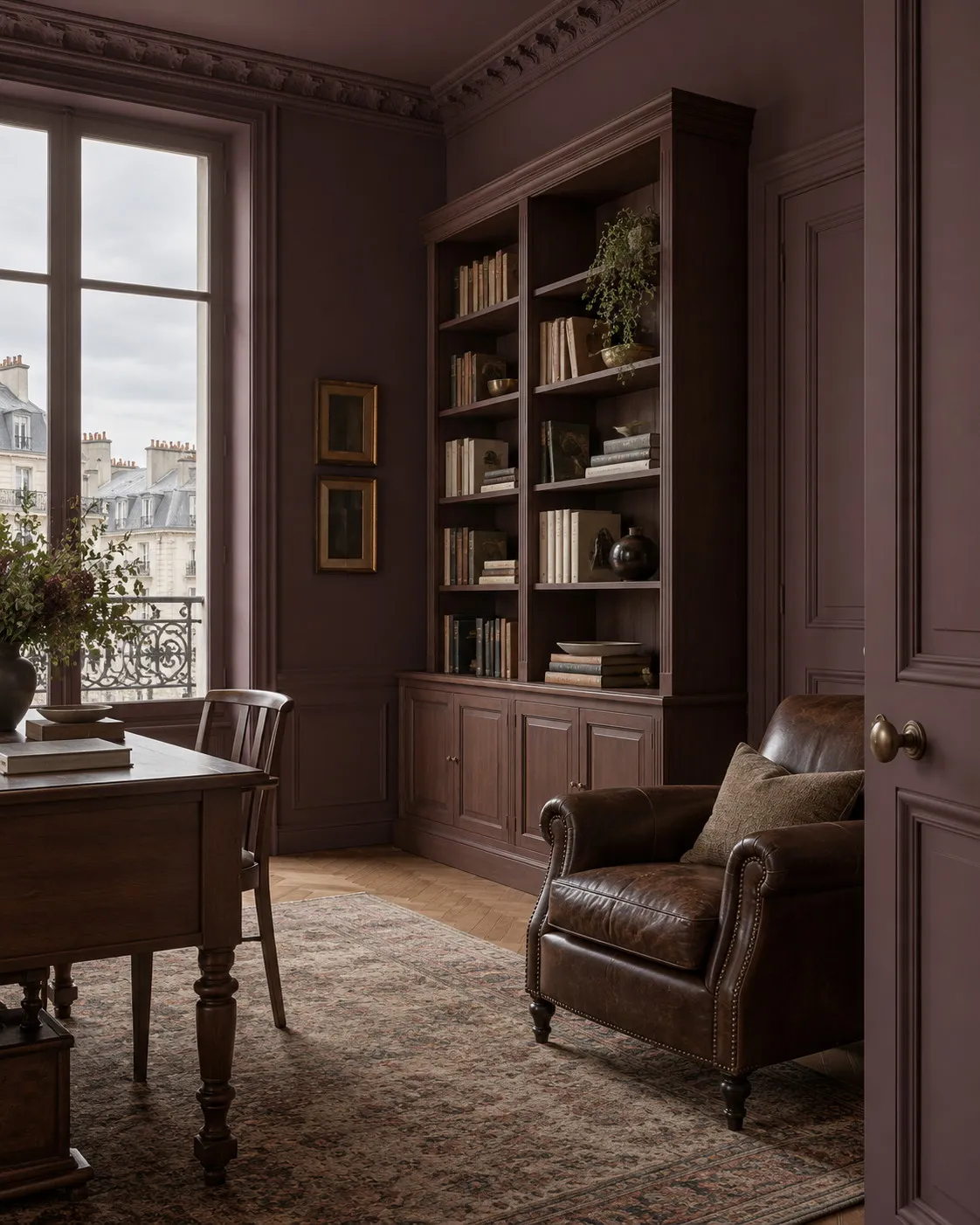
Plum Tree No.283, a deep plum with brown in it, is one of the most successful shades for this aspect: the cool light draws out its red, and the room feels warm despite the absence of sun. Duke's House No.44, a sumptuous deep purple, goes further still into the theatrical, with a depth that suits a dining room lit by candles in the evening.
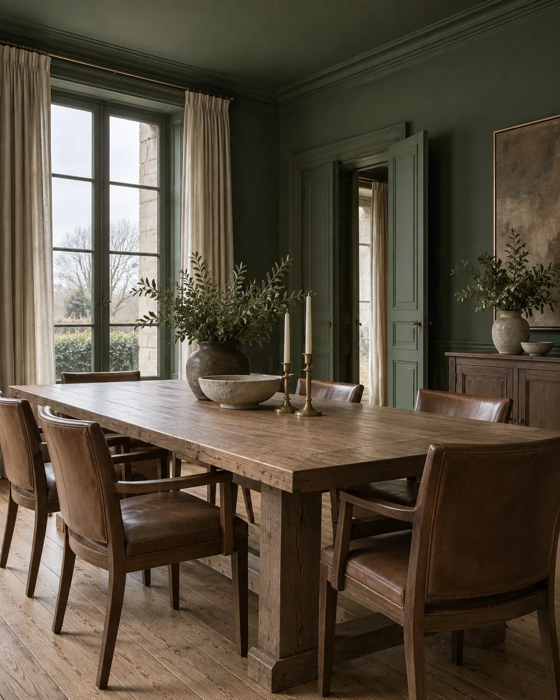
On the cool side, two shades agree with north light instead of contradicting it. Maritime No.236, a blue-grey inspired by the boating lake in Regent's Park, takes on a sea-mist quality in a north room that makes a study or a bedroom deeply serene. Forest BH.16, Beata Heuman's dark fir green inspired by the forests of Sweden, deepens in this light until it reads almost black in the corners, a magnificent effect in a living room with plenty of timber and brass. In both cases the key is to go decisively deep; a mid-strength version of these colours would simply look dull.
A north-facing room does not ask to be rescued; it asks you to decide, at last, what it is.
Colours to avoid facing north
Some families of colour almost always suffer in this aspect. Light, cool greys, so widespread ten years ago, turn steel blue and give the room the air of an office. Pale blues, charming facing south, fade and take on a slightly sorry note. Pure white, finally, becomes a characterless pale grey. It is not that these colours are bad; it is that they need a sun that will not arrive. If you are set on a grey or a blue, choose one with a warm undertone, or go markedly deeper, as with Maritime No.236.
The finish matters as much as the shade
In a north-facing room it is tempting to reach for a glossy finish to "catch the light". It is a common mistake: a satin or gloss surface reflects the grey sky in the window and creates cold patches and dark patches on the same wall. A matt finish, by contrast, diffuses the light evenly and lets the colour speak fully. Marble Matt Emulsion, our reference wall paint, pairs that deep matt with class 1 wet-scrub resistance under EN 13300, which makes it suitable for living rooms and hallways that see a lot of life.
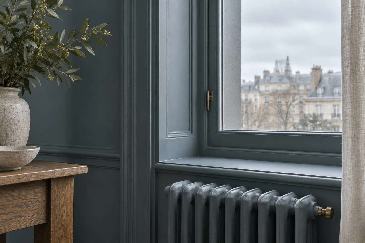
The deep colours of the second strategy are best applied everywhere: walls, ceiling, woodwork, radiators, all in the same tone. This colour drenching technique removes the contrasts that look harsh in north light and gives the room the coherence of a jewellery box. Multi-Surface Dead Matt, at around 5 % sheen, was designed for exactly this: it moves from plaster to timber to metal without changing its appearance. For the lighter shades of the first strategy, a ceiling in the same colour, or in a warm white, avoids the cold break of a pure white ceiling.
Test in the morning and at dusk
North light varies little, but it does vary between the morning, when it is at its bluest, and late afternoon, when it softens. A 100 ml sample covers around 1.5 m²: paint two coats on two different walls, including the one facing the window, and look at them at both times. Always compare two neighbouring shades side by side, Cavendish Cream No.120 against Walbrook No.142 for instance, rather than a single colour in isolation, which tells you nothing about whether it is too warm or too cool. The site's visualiser helps you picture it, but nothing replaces paint on the wall.
Where to start
Choose your strategy first, then order three sample pots: Cavendish Cream No.120, Onslow No.48 and Plum Tree No.283 cover both options and let you decide over a weekend. The physical colour card is sent free, and the cost per square metre of each finish is set out on the prices page. Our French-speaking team answers questions about aspect and light from Monday to Friday.
Frequently asked questions
Which colour should I choose for a north-facing living room?
For a living room used all day, a warm shade is the safest choice: Cavendish Cream No.120 or Onslow No.48 give the room a light that seems to come from the south. If the room is mostly used in the evening, a deep plum like Plum Tree No.283 or a dark green like Forest BH.16 turns it into an enveloping space.
Should white be avoided in a north-facing room?
Pure white should be avoided, because it takes on the grey tint of the sky and looks cold. A warm white with a touch of yellow ochre or pink remains possible and keeps the light. The best answer is often a frank cream like Cavendish Cream No.120, which reads as a sunlit white without the drabness.
Can a north-facing room be painted in a dark colour?
Yes, and it is often the most beautiful option. A deep colour like Maritime No.236 or Duke's House No.44 does not try to brighten the room: it makes it an intimate space where the even north light gives the colour a velvety quality. Applied to the ceiling and woodwork too, it removes harsh contrasts and visually enlarges the volume.
Which paint finish is best for a room with little light?
A matt finish, counter-intuitive as it may seem. Satin and gloss reflect the grey sky in the window and create cold patches on the wall. A deep matt such as Marble Matt Emulsion diffuses the light evenly and lets the colour speak, while remaining washable. For a dark colour applied everywhere, Multi-Surface Dead Matt suits walls and woodwork alike.





