How to read a black
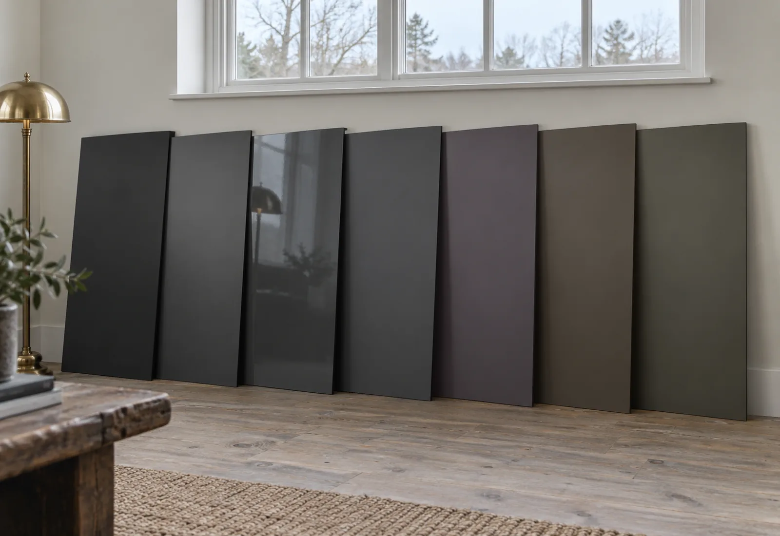
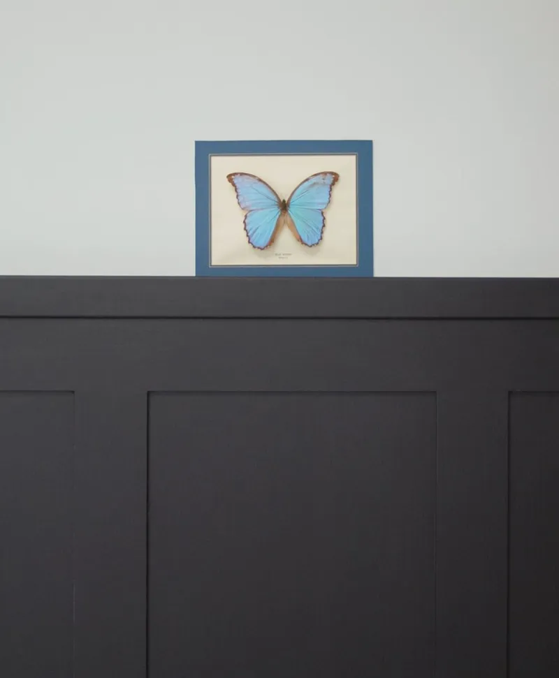
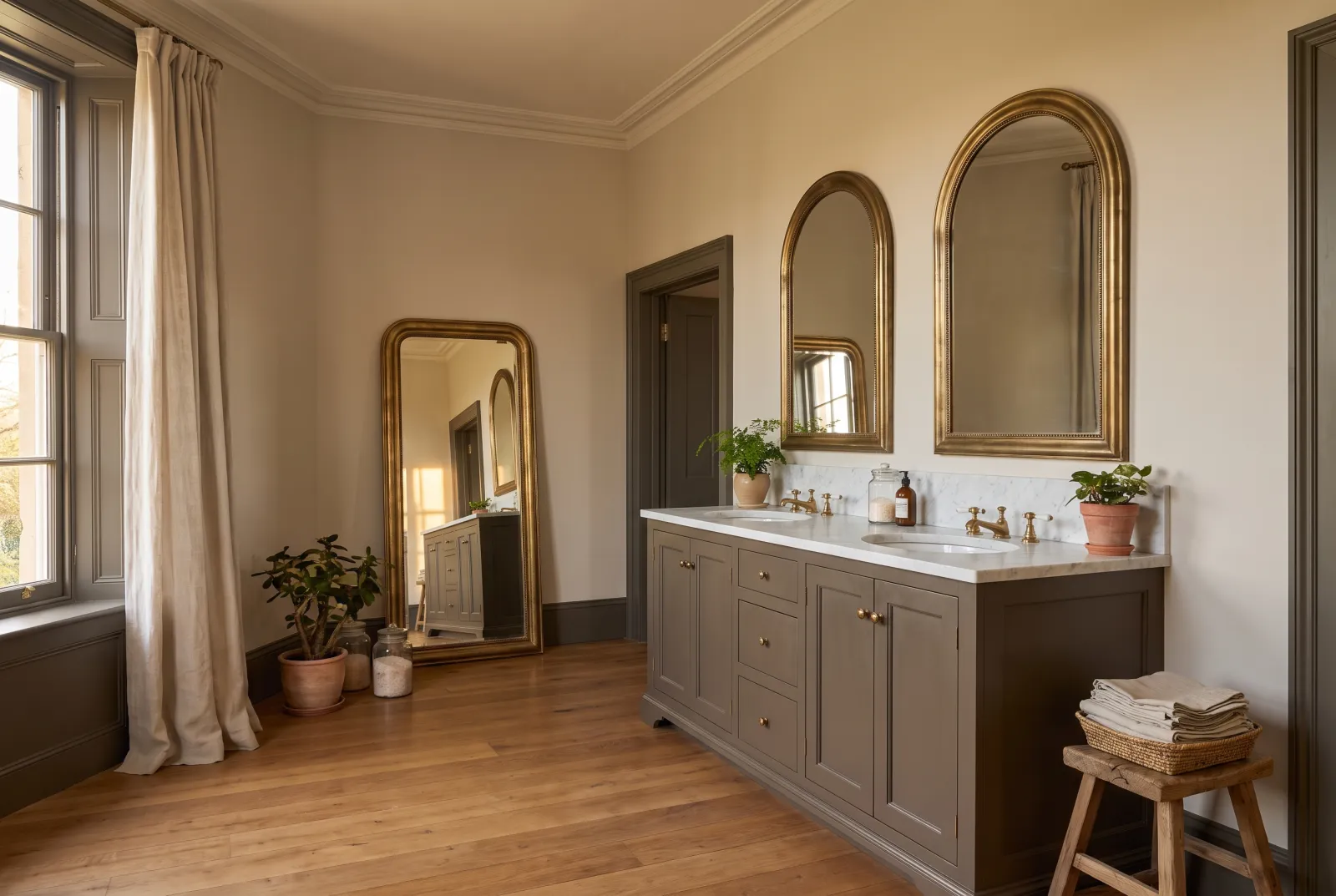
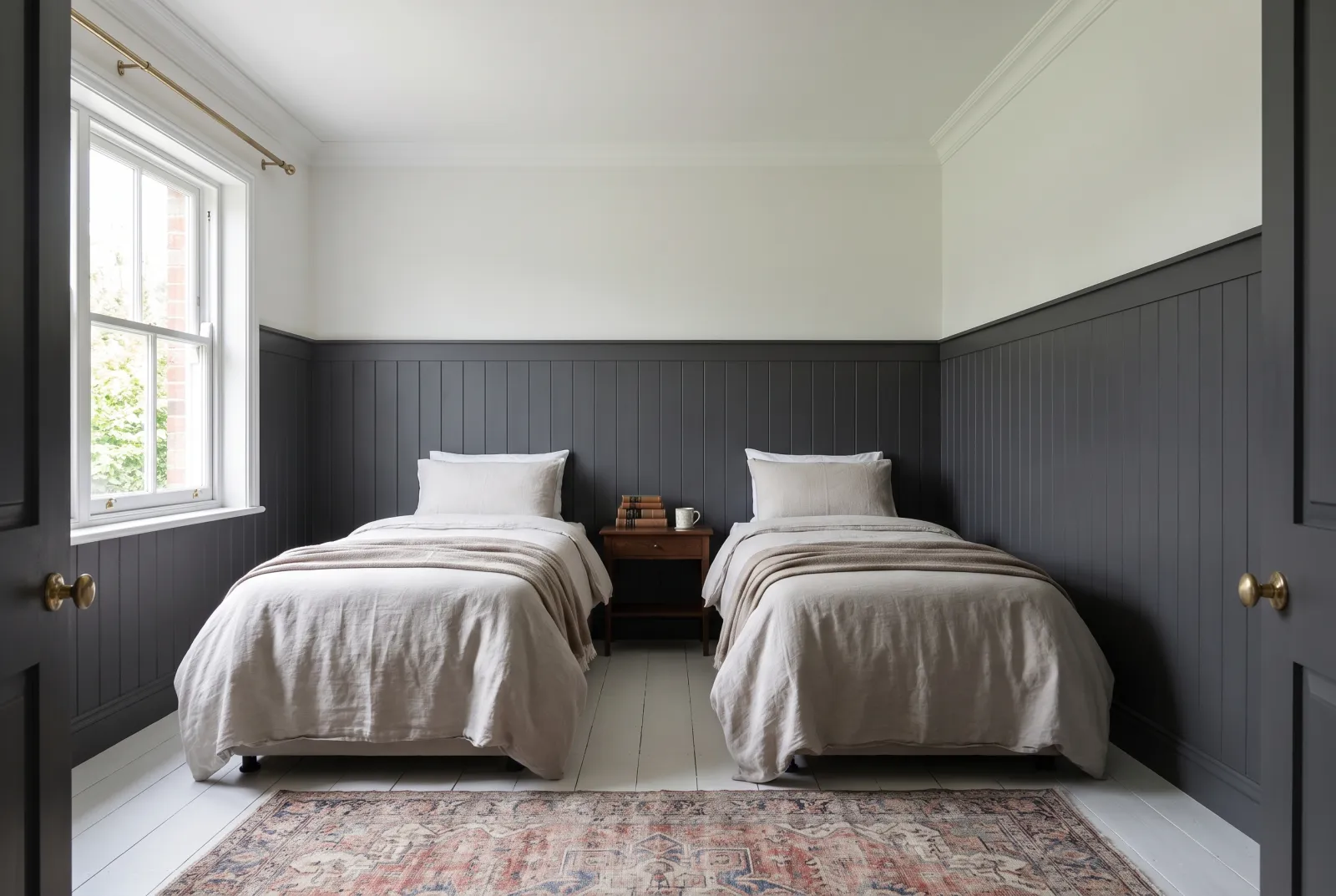
No black is truly black: each returns between 4 and 7% of the light, and it is in those few per cent that the undertone hides. Set two samples side by side in sunlight and it shows at once — blue for Sinner No.238 and Woodnight JB.12, violet for Duke's House No.44 and Blackout No.41, brown for Pub BH.08 and Cragside JB.10, almost nothing for Downing Street No.10, the most neutral of the seven.
The right black by use
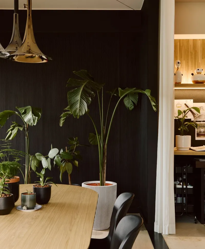
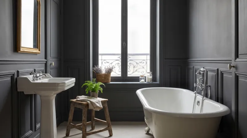
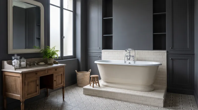
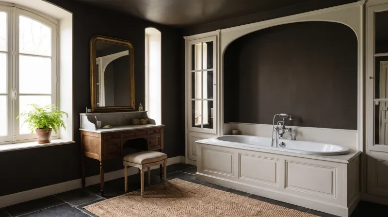
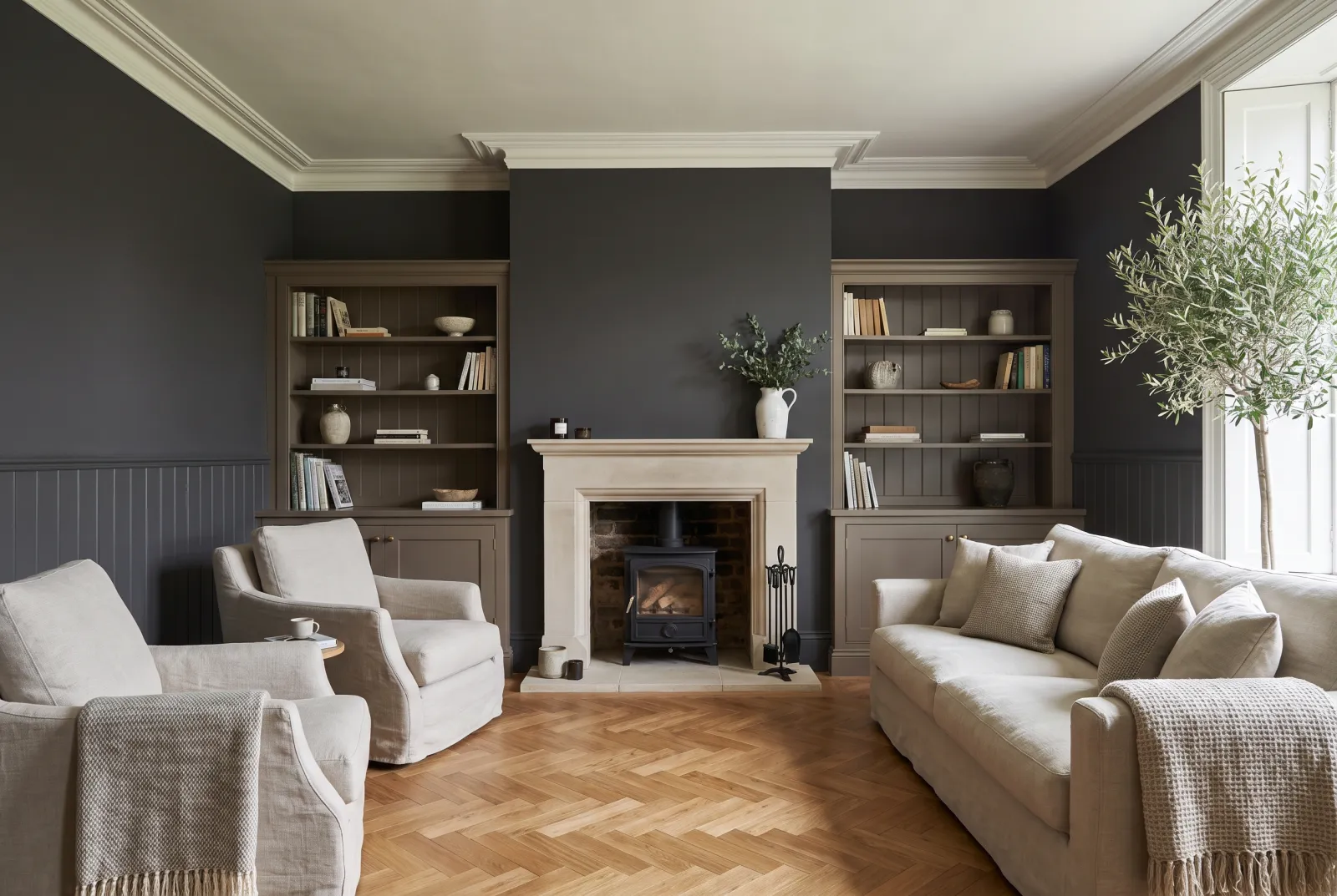
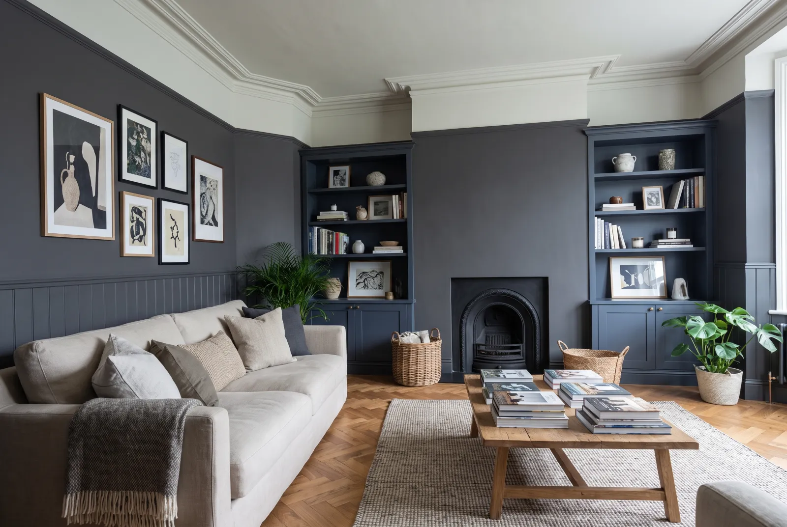
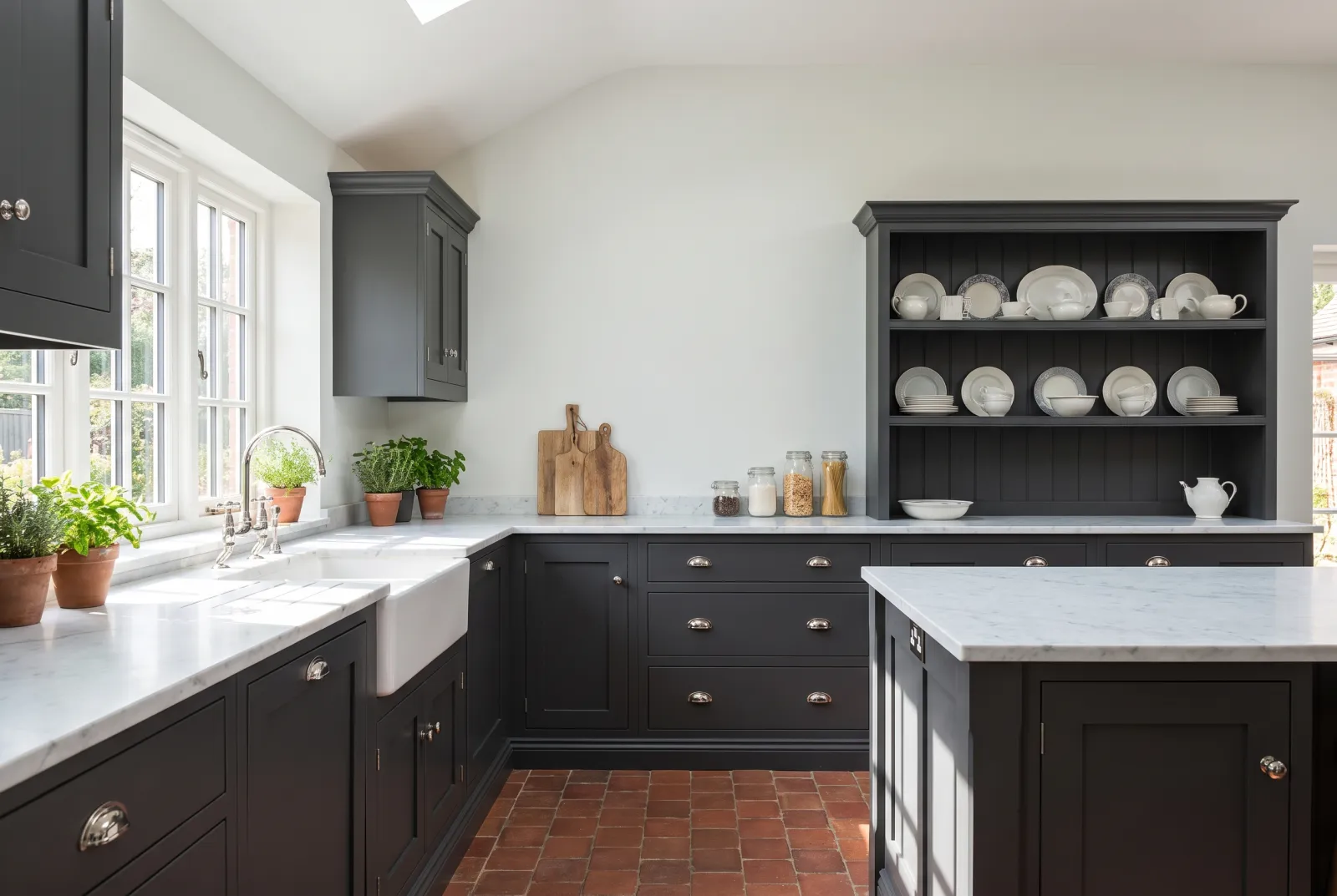
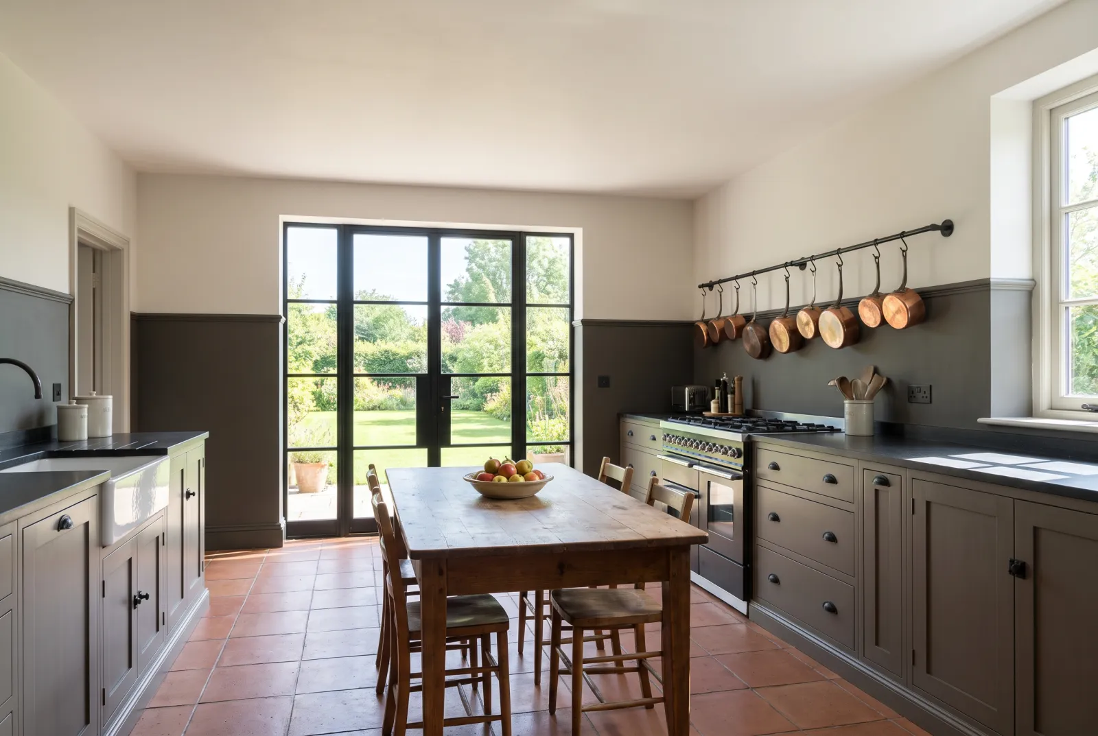
A front door: Downing Street No.10, in gloss, without hesitation. Kitchen cabinets: Downing Street or Sinner No.238, in eggshell, with very light walls. Four walls: Blackout No.41, the only one that keeps enough light, or Duke's House No.44 for an evening room. Old woodwork: Pub BH.08, whose warmth suits timber. Outdoors: Cragside JB.10 or Woodnight JB.12, which get on with stone and garden.
What to pair it with
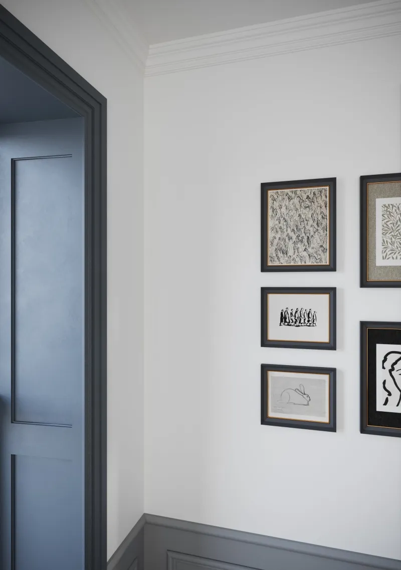
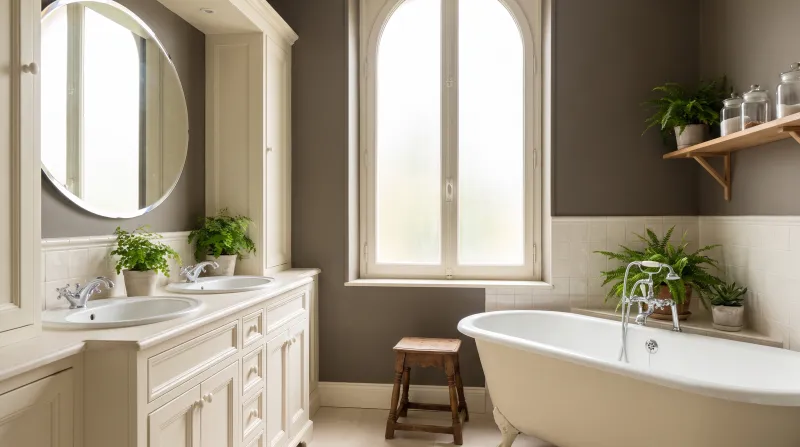
Black likes pure white (Pure White No.1) for contrast, cream (Cavendish Cream No.120) for softness, ochre (Golden Square No.131) for warmth, and a deep colour — Huguenot No.49, Observatory No.34 — for depth without contrast. Apply all our blacks over our dark grey primer & undercoat: two coats are then enough. See also our front-door colours, our black schemes and all our blacks.