Colour guides · Blue

Deep blue: 8 Mylands colours compared

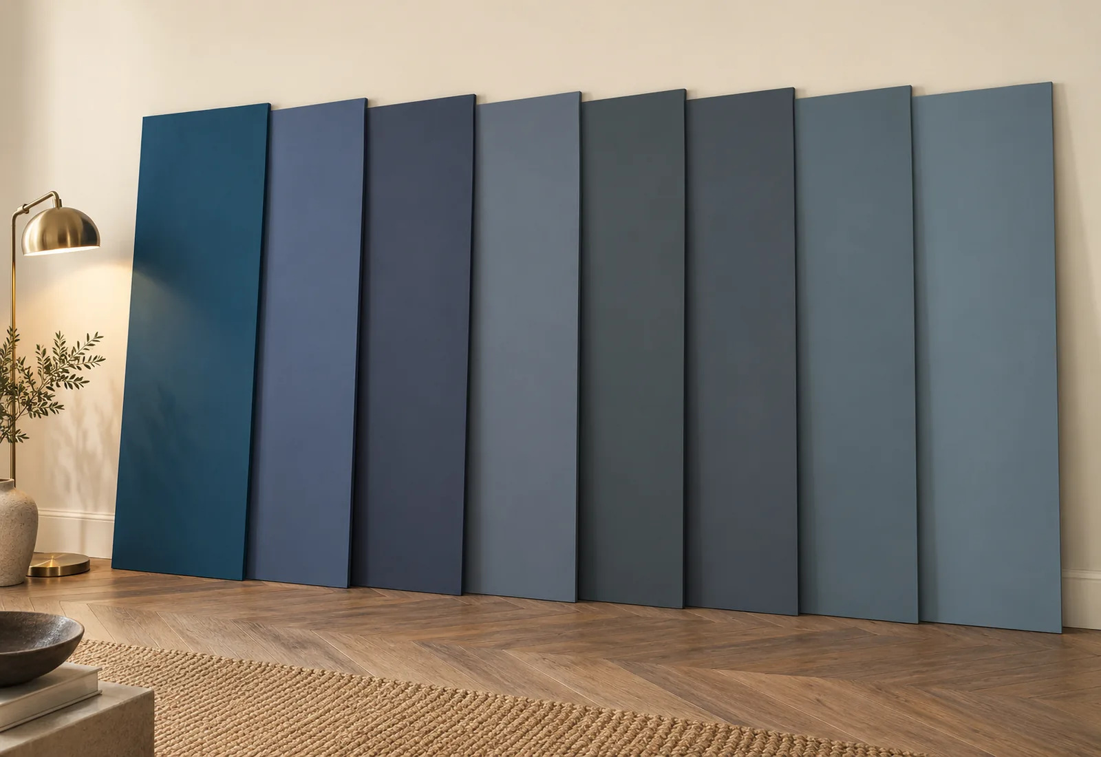
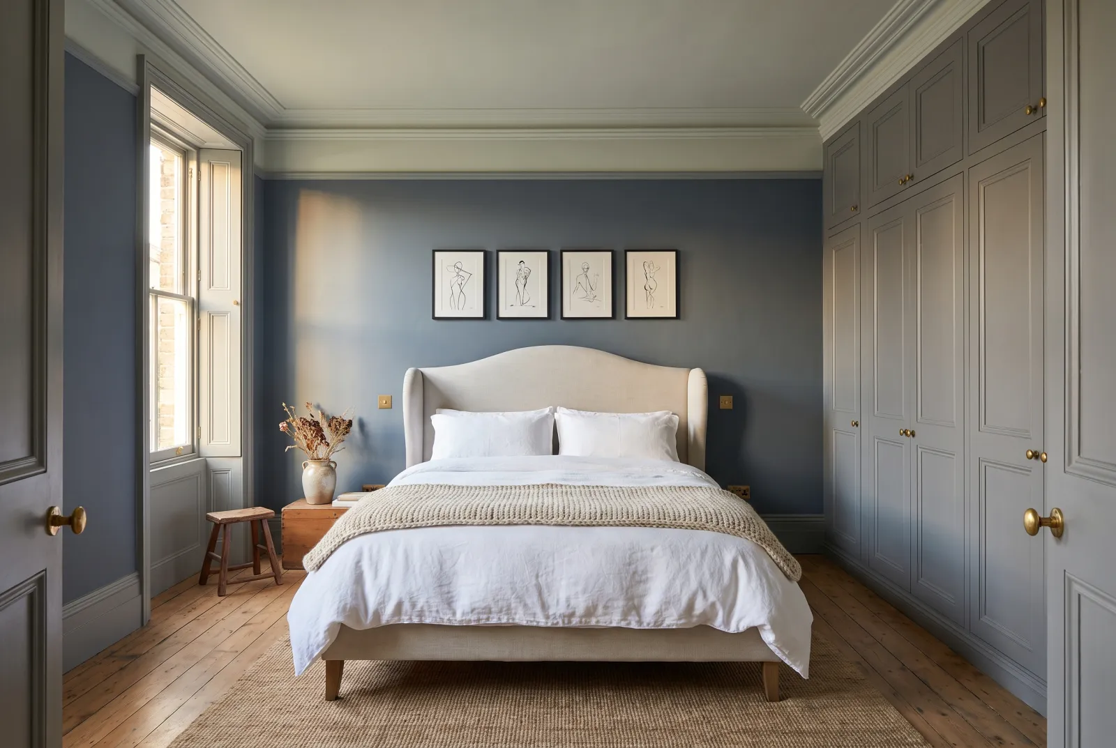
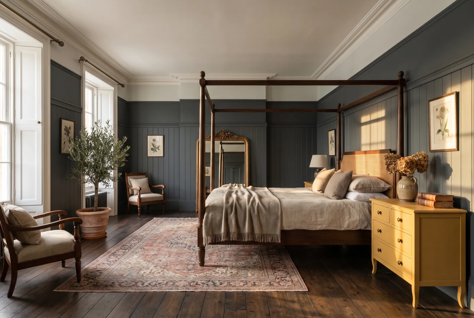
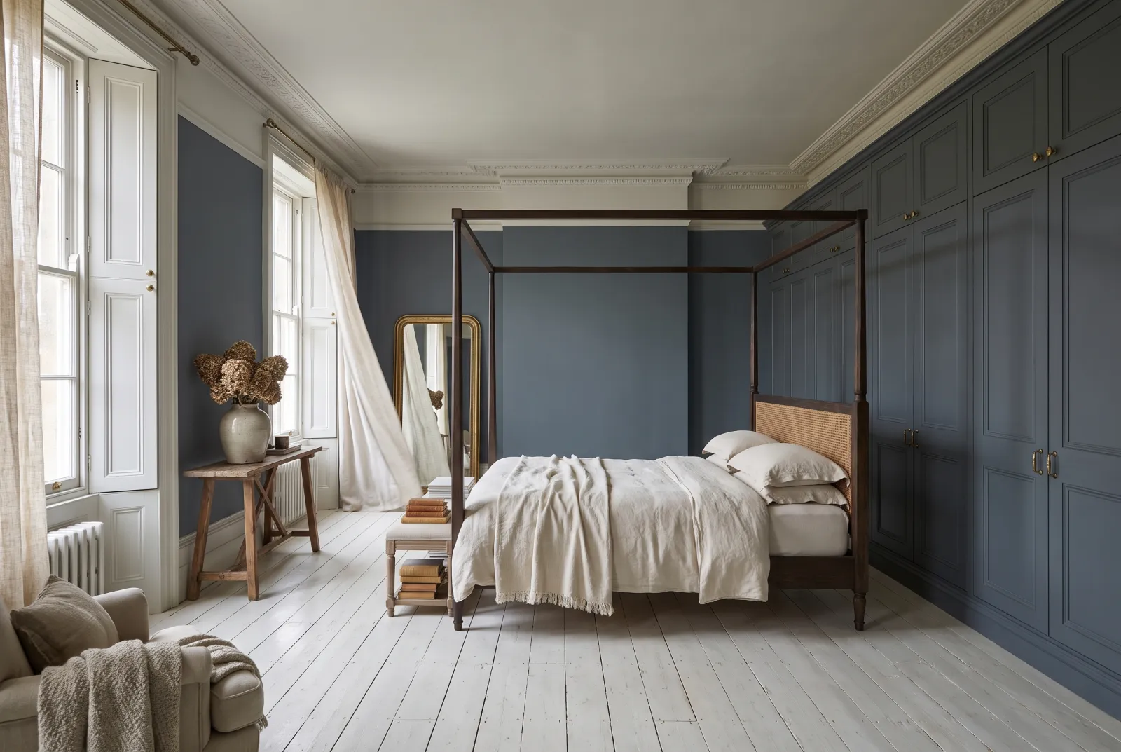
'Deep blue' covers at least three families: night blues that lean violet, ink blues that lean grey, and petrol blues that lean green. On a colour card they look alike; across four walls they make very different rooms.

Here are our eight deep blues, compared on what really matters: undertone, the light they return, and the room where each excels.

Updated September 2026 · by the Mylands France colour team

Deep blue: 8 Mylands colours compared

The short answer

The most versatile of our deep blues is Proper Blue No.67, an ink blue with a grey-green undertone that goes from kitchen cabinets to living-room walls. For a more violet, more enveloping blue, Observatory No.34 or Blueprint No.50; for a blue-grey that is almost a neutral, Bond Street No.219 or Mayfair Dark No.218.

At a glance

The shades compared

Colour Family Tone Light LRV ≈ Best for
Proper Blue™ No.67 Blue Dark tone South 7 % Kitchen cabinets, doors, dining-room walls
Observatory™ No.34 Blue Dark tone South 11 % Living room, bedroom, north-facing rooms
Blueprint™ No.50 Neutral Dark tone North 6 % Library, study, dining room — colour-drenched
Mayfair Dark™ No.218 Neutral Dark tone North 13 % Furniture, woodwork, a back wall behind pictures
Bond Street™ No.219 Neutral Dark tone North 8 % Front doors, shutters, kitchens, staircases
Murmuration JB.11 Neutral Dark tone North 7 % Garden rooms, conservatories, outdoor furniture
Thunder BH.12 Neutral Dark tone North 11 % Painted furniture, woodwork, kitchen
Maritime™ No.236 Neutral Dark tone North 15 % Bedroom, bathroom, study

LRV: light reflectance estimated from the on-screen shade, from 0 (absolute black) to 100 (absolute white). Light: the orientation in which the shade looks its best.

Our selection

8 colours

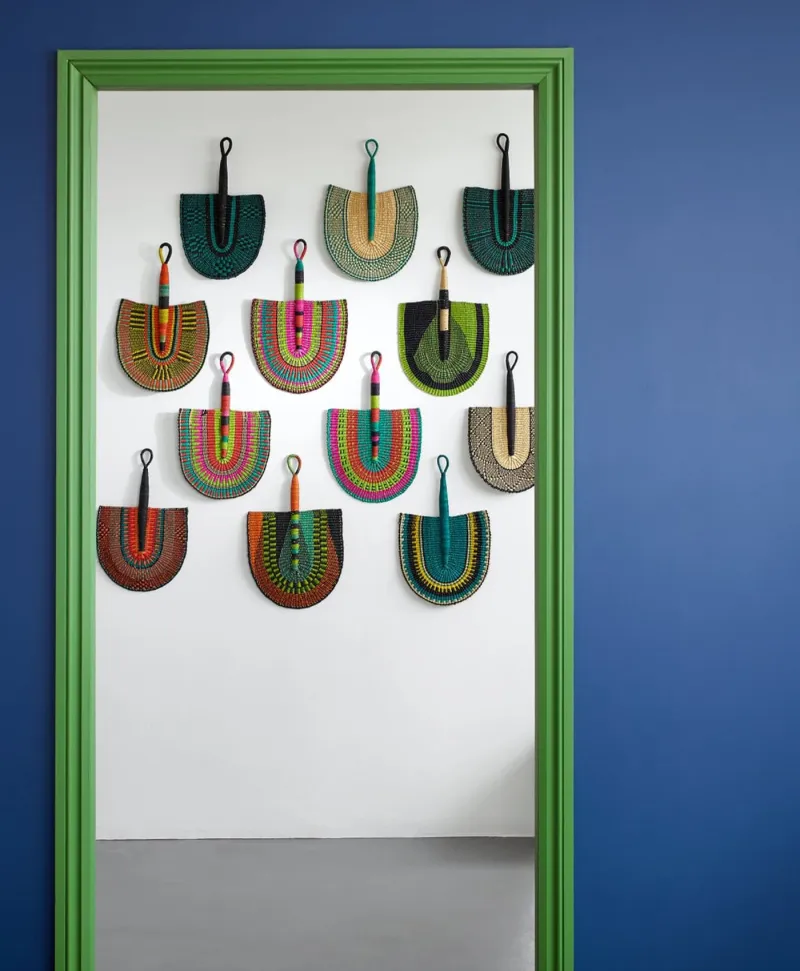
Colorful handbags hanging on a white door with a blue wall background
01

The ink blue

Proper Blue™ No.67

  • Blue
  • Dark tone
  • South light
  • LRV ≈ 7%

A deep, candid blue, tempered by a grey-green undertone that stops it turning into office navy. It is our most-used blue, and for good reason: it holds on kitchen cabinets as on dining-room walls, likes brass as much as oak, and stays blue — not black — once evening comes. From the archive, it has the patina of an old blue.

Our tip — Kitchen cabinets, doors, dining-room walls

View the colour → Already in your basket (limit 1 per order)
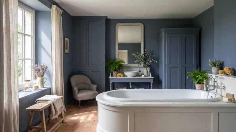
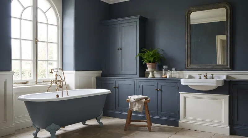
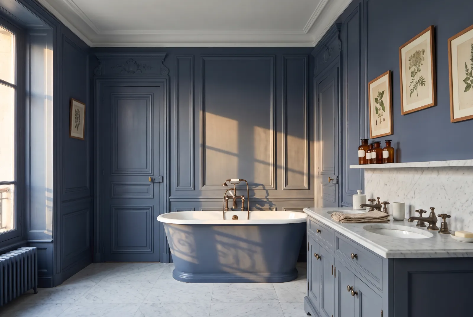
Observatory — Bathroom
02

The night blue

Observatory™ No.34

  • Blue
  • Dark tone
  • South light
  • LRV ≈ 11%

A deep blue-grey sliding towards violet — the colour of the sky an hour after sunset. Softer and lighter than Proper Blue, it is also warmer thanks to that hint of violet, which makes it the easiest deep blue in a north-facing room. Under lamps it turns to velvet.

Our tip — Living room, bedroom, north-facing rooms

View the colour → Already in your basket (limit 1 per order)
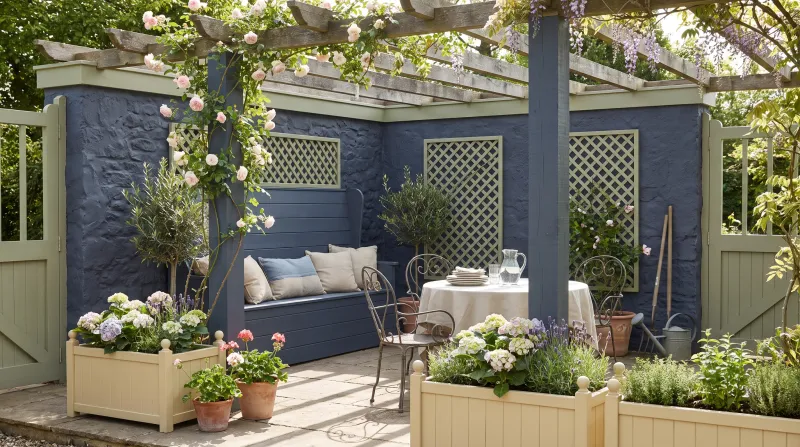
Blueprint — Outside
03

The darkest

Blueprint™ No.50

  • Neutral
  • Dark tone
  • North light
  • LRV ≈ 6%

Our deepest blue: a slate blue that is almost black, with a violet undertone, returning only 6% of the light. It is a colour-drenching blue — walls, ceiling, woodwork — for a library, a study or an evening dining room. By day it is grave; at night, with candles and brass, it is sumptuous.

Our tip — Library, study, dining room — colour-drenched

View the colour → Already in your basket (limit 1 per order)
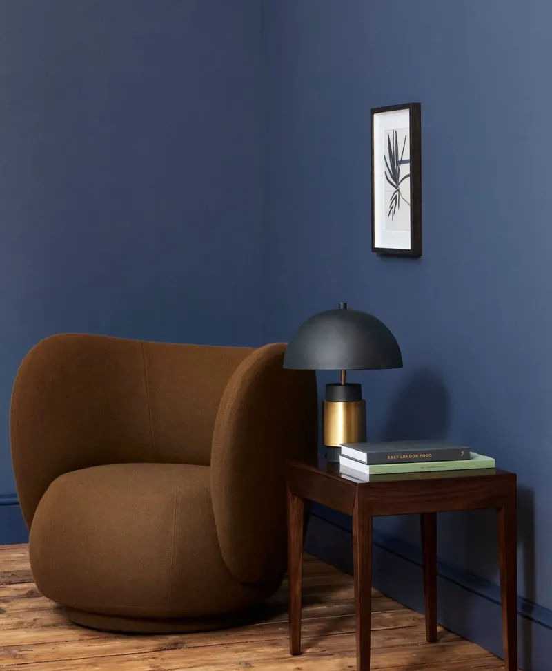
Brown armchair in a room with an indigo blue wall, side table, and framed artwork.
04

The blue-grey

Mayfair Dark™ No.218

  • Neutral
  • Dark tone
  • North light
  • LRV ≈ 13%

A blue so greyed it behaves like a deep neutral: from a distance you hesitate between blue and grey; up close, the blue wins. It is the most discreet deep blue on the list, the one that accepts any colour beside it — rust, ochre, pink, green — without argument. An excellent furniture blue.

Our tip — Furniture, woodwork, a back wall behind pictures

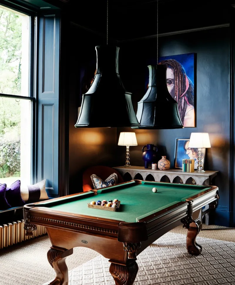
Dark blue games room with pool table, decorative lamps, and wall art.
05

The slate

Bond Street™ No.219

  • Neutral
  • Dark tone
  • North light
  • LRV ≈ 8%

Darker and greyer than Mayfair Dark: the blue of wet slate, with a faintly green undertone that makes it mineral. It has Blueprint's depth without its gravity, and works very well outdoors — doors, shutters, gates — as much as in. Superb with raw timber and stone.

Our tip — Front doors, shutters, kitchens, staircases

View the colour → Already in your basket (limit 1 per order)
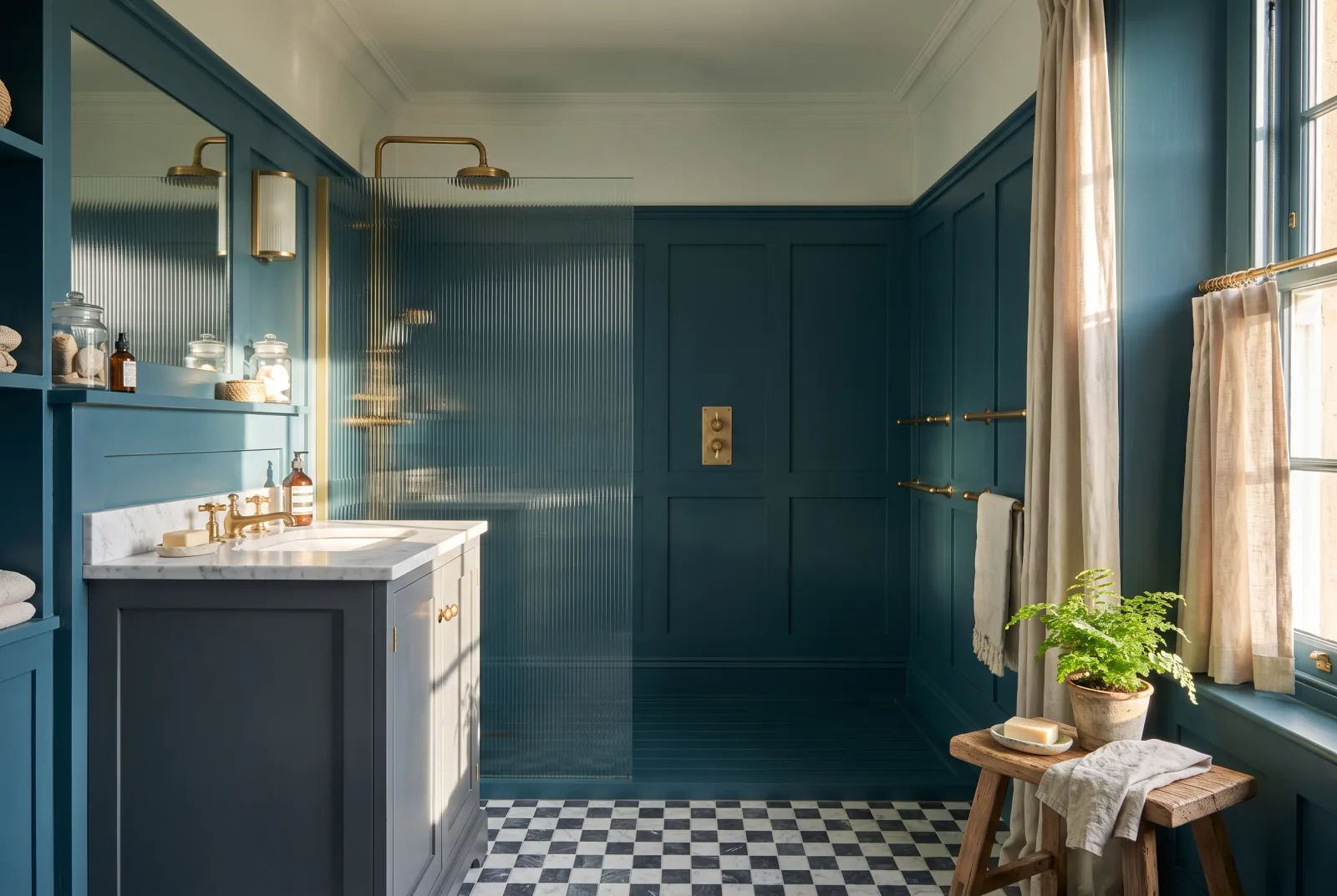
Murmuration — Bathroom
06

The storm blue

Murmuration JB.11

  • Neutral
  • Dark tone
  • North light
  • LRV ≈ 7%

Drawn by Jinny Blom from the starling murmurations of an autumn sky: a deep, cool blue, closer to Bond Street than to Observatory, with a hint of grey holding it. It is a landscape blue more than a drawing-room blue — it makes most sense facing a garden, in a room that opens to the outside.

Our tip — Garden rooms, conservatories, outdoor furniture

View the colour → Already in your basket (limit 1 per order)
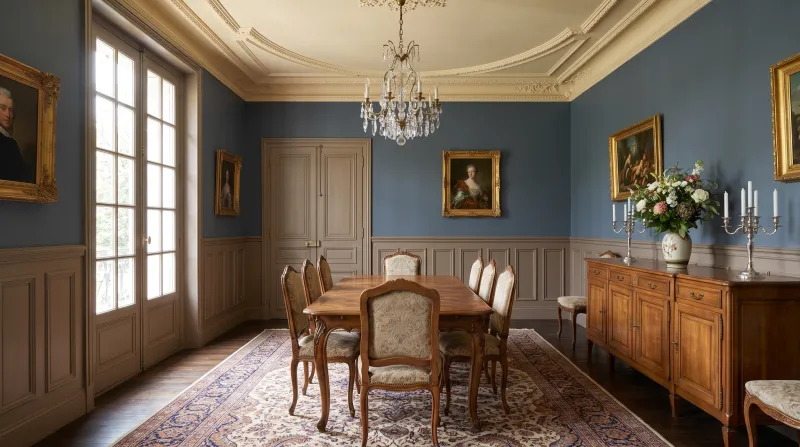
Thunder — Diningroom
07

The thunder blue

Thunder BH.12

  • Neutral
  • Dark tone
  • North light
  • LRV ≈ 11%

A dark blue-grey from the Beata Heuman collection, the colour of a storm sky over the sea. It is lighter than Blueprint and greyer than Proper Blue, with a verdigris undertone. Beata recommends it for painted furniture and woodwork, where it makes a perfect ground for the more cheerful colours of her collection.

Our tip — Painted furniture, woodwork, kitchen

View the colour → Already in your basket (limit 1 per order)
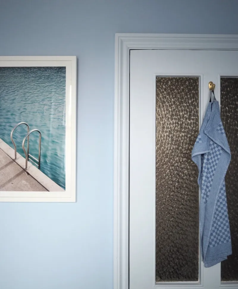
Light blue bathroom, Blue towel hanging on a door with a framed picture of a pool on the wall.
08

The least deep

Maritime™ No.236

  • Neutral
  • Dark tone
  • North light
  • LRV ≈ 15%

The lightest of the eight: a mid-deep blue-grey with a green undertone, the colour of northern seas. It returns twice the light of Blueprint, which makes it the 'deep blue' that is possible in a bedroom or bathroom you don't want to darken. It ages beautifully with off-whites and blond timber.

Our tip — Bedroom, bathroom, study

View the colour → Already in your basket (limit 1 per order)

These colours in real rooms

Our schemes in which one of this guide's shades plays the lead — or a supporting role.

All schemes · Blue →
Proper Blue™ No.67 Greenwich Time™ No.8 Maritime™ No.236
Observatory™ No.34 Greenwich Time™ No.8 Mayfair Dark™ No.218
Murmuration JB.11 Saint Johns™ No.64 Bond Street™ No.219 Verdure Yellow™ No.148
Mayfair Dark™ No.218 Saint Johns™ No.64 Archway House™ No.106
Bond Street™ No.219 Greenwich Time™ No.8 Haymarket™ No.47
Maritime™ No.236 Saint Johns™ No.64 Riverine JB.07

How to read this comparison

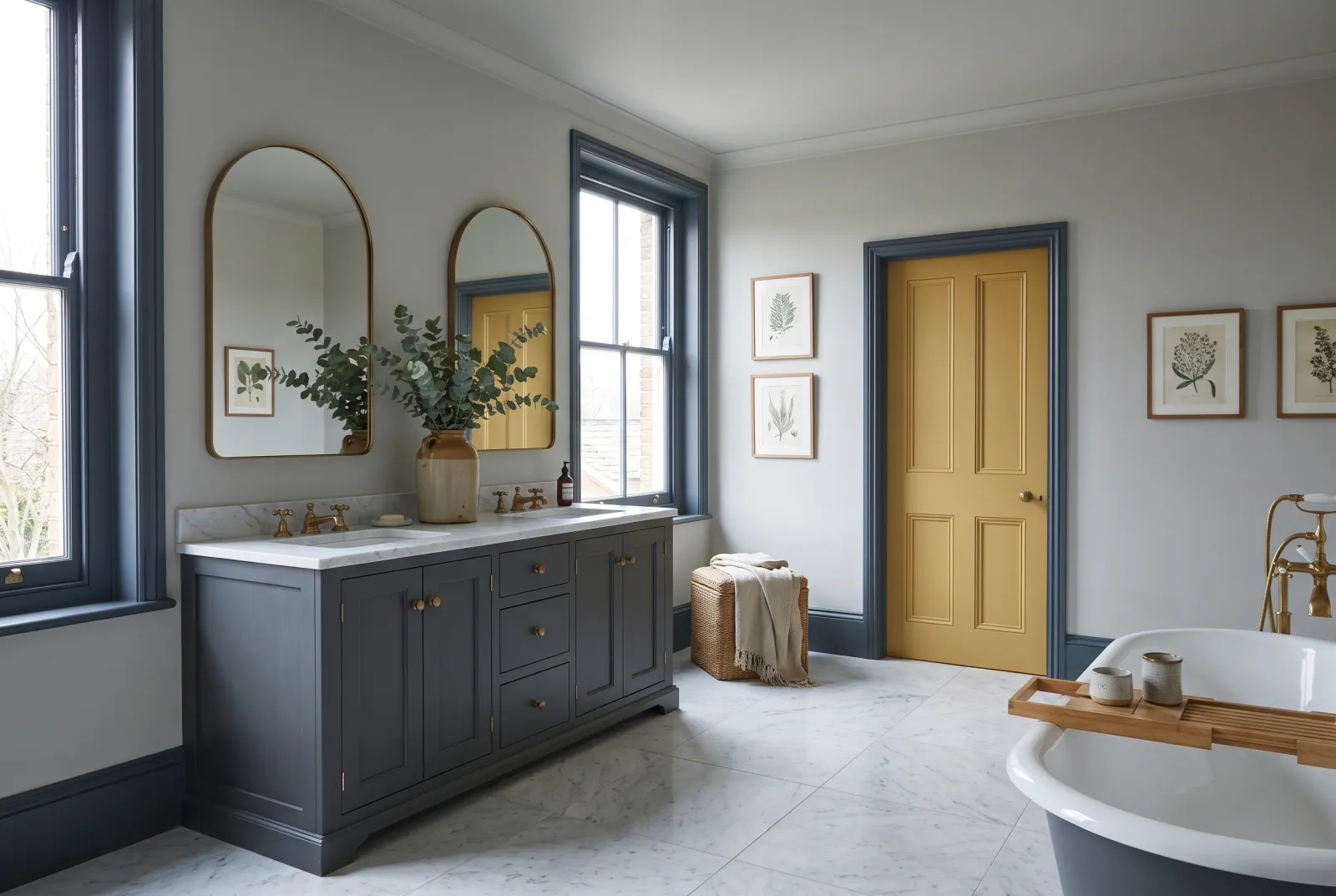
The undertone decides the room. Violet-undertoned blues — Observatory No.34, Blueprint No.50 — are the warmest and most enveloping: living-room and bedroom blues. Green- or grey-undertoned blues — Proper Blue No.67, Bond Street No.219, Maritime No.236 — are cooler and more mineral: kitchen, bathroom and exterior blues.

Light reflectance (LRV) says how much the room will darken. Between 6% (Blueprint No.50) and 15% (Maritime No.236), the difference is that between an evening library and a morning bedroom. None of these blues suits a room you want bright; all of them suit a room you want beautiful.

The two blues we didn't compare

Midnight FTT-017 and Ultramarine Blue FTT-018, from the film-and-theatre palette, are deep but saturated blues — a vivid petrol and an electric ultramarine — that don't compare with the ink blues above. They are accent colours, superb on a door or a piece of furniture, hard work on four walls.

What to pair them with

A deep blue asks for a white that isn't blue: Limestone No.55, Cavendish Cream No.120 or Holland Park No.5 rather than Pure White No.1, which chills them. And a warm colour somewhere — an ochre such as Golden Square No.131, a pink such as Soho Pink No.266, a terracotta such as Coral Orange No.277 — so the room doesn't tip into night. See also our blues for a bedroom, our blue schemes and all our blues.


Frequently asked questions

Which is the most versatile deep blue?
Proper Blue No.67: an ink blue with a grey-green undertone that suits kitchen cabinets, doors and dining-room walls, and stays blue under lamps.
Which deep blue for a bedroom?
Observatory No.34, softer and faintly violet, or Maritime No.236 if the bedroom is short of light: it is the least dark of the Mylands deep blues (LRV ≈ 15%).
Which deep blue for a kitchen?
Proper Blue No.67 on cabinet fronts, in Multi-Surface Eggshell; Bond Street No.219 or Thunder BH.12 for a greyer, more discreet blue.
Which white with a deep blue?
A warm or stone white — Limestone No.55, Holland Park No.5, Cavendish Cream No.120 — rather than a pure white, which makes deep blues cold and hard.

Guides to read next

All colour guides →

Want to see these colours at home?

Order a sample to judge the shade in your own light, or browse every paint for the room.

Sign up to our newsletter

Sign up to our newsletter

Thanks for signing up to our newsletter!