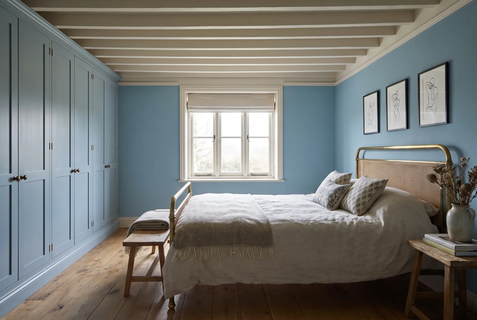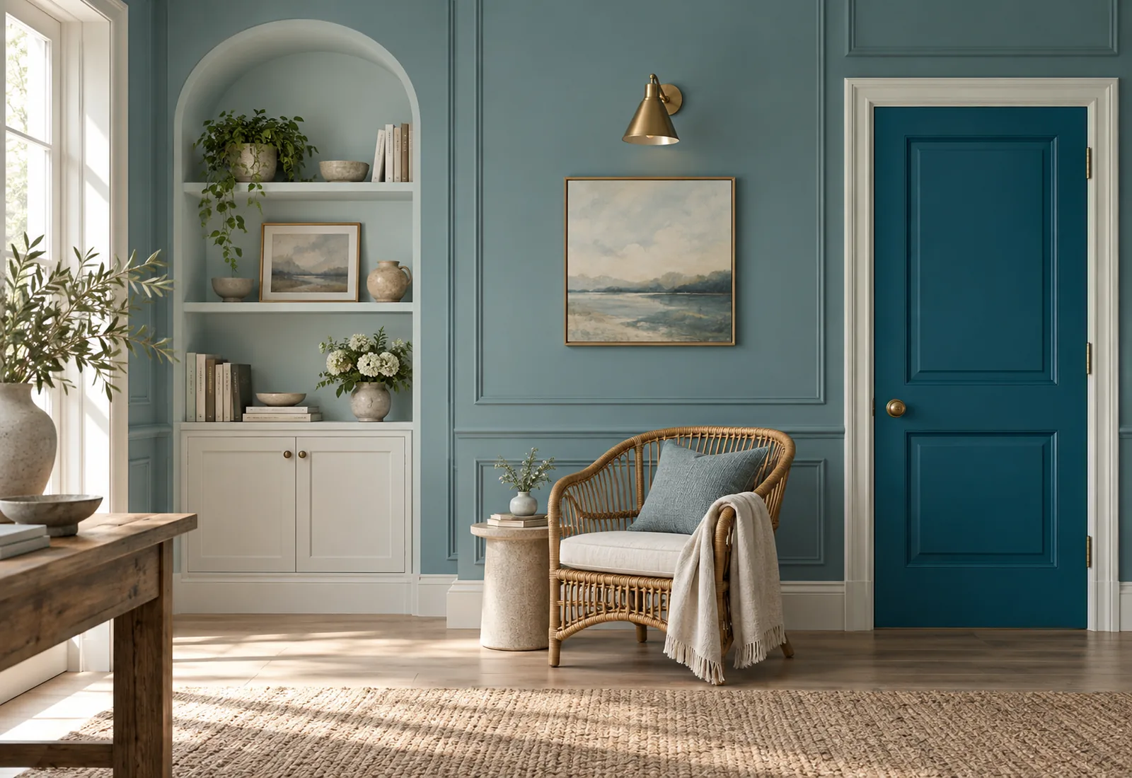
Colour guides · Blue

Teal and blue-green: 10 Mylands shades compared

Between blue and green lies a family of colours that belongs to neither: teal, peacock, petrol, deep water green, dulled turquoise. They are the colours of water, feathers and old enamels — and they have a rare quality: they shift with the light, blue in the morning, green at night, without ever tiring.

Here are our ten blue-greens side by side, from palest to deepest, with their lean — bluer or greener — and the room that suits them.

Updated September 2026 · by the Mylands France colour team

Teal and blue-green: 10 Mylands shades compared

The short answer

Our blue-greens run from pale — Notting Hill No.213, Hawksmoor No.112, Bridge Blue No.222 — through mid — Stockholm BH.11, Enamel Blue No.78, Eaton Square No.232, the reference teal — to deep — Maritime No.236, Midnight FTT-017, Market Green No.38, Deep Green FTT-012. The greyest (Hawksmoor No.112, Maritime No.236) suit north-facing rooms; the most saturated (Enamel Blue No.78, Midnight FTT-017, Deep Green FTT-012) need light.

At a glance

The shades compared

Colour Family Tone Light LRV ≈ Best for
Notting Hill™ No.213 Blue Pale tone South 54 % Lean: green. For bright rooms; facing north it becomes a pale grey-green, very pretty too.
Hawksmoor™ No.112 Blue Pale tone South 55 % Lean: grey. For north-facing sitting rooms and bedrooms, hallways.
Bridge Blue™ No.222 Blue Mid tone South 45 % Lean: balanced. For bedrooms, bathrooms and kitchens.
Stockholm BH.11 Blue Mid tone South 28 % Lean: blue. For kitchens, dining rooms, painted furniture.
Enamel Blue™ No.78 Blue Mid tone South 34 % Lean: blue, saturated. For south-facing bathrooms, doors, furniture.
Eaton Square™ No.232 Blue Mid tone South 24 % Lean: balanced. For everything: sitting rooms, bedrooms, kitchens, front doors.
Maritime™ No.236 Neutral Dark tone North 15 % Lean: grey. For studies, libraries and bedrooms, north- or south-facing.
Midnight FTT-017 Blue Dark tone South 17 % Lean: blue, saturated. For dining rooms, libraries, cloakrooms, doors.
Market Green™ No.38 Neutral Dark tone North 7 % Lean: green. For bathrooms, studies, hallways and colour drenching.
Deep Green FTT-012 Green Dark tone South 17 % Lean: green, saturated. For bright dining rooms, bathrooms and kitchens.

LRV: light reflectance estimated from the on-screen shade, from 0 (absolute black) to 100 (absolute white). Light: the orientation in which the shade looks its best.

Our selection

10 colours

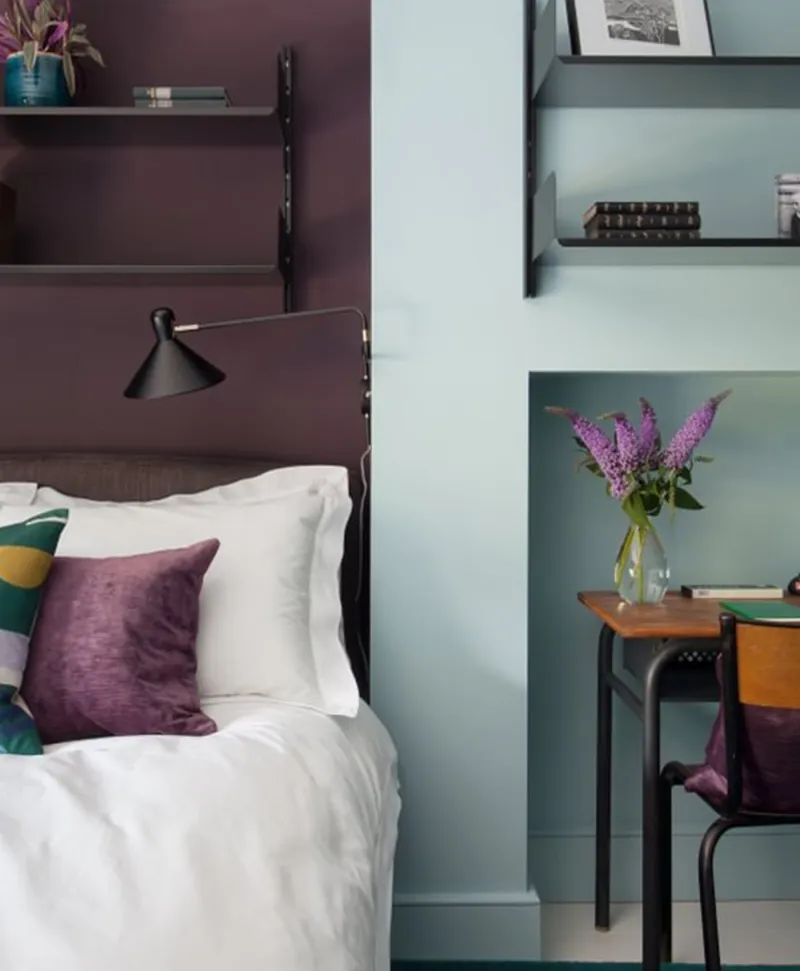
Bedroom with purple accents and aqua blue contrasts, white bedding, and a desk with a vase of flowers.
01

Pale · the pastel blue-green

Notting Hill™ No.213

  • Blue
  • Pale tone
  • South light
  • LRV ≈ 54%

A pale, powdery blue-green, the colour of the pastel façades of the district it is named after. It leans slightly to green, which makes it softer than a sky blue, and it enlarges a room as a white would while adding a watery freshness. Bedrooms, bathrooms, seaside kitchens.

Our tip — Lean: green. For bright rooms; facing north it becomes a pale grey-green, very pretty too.
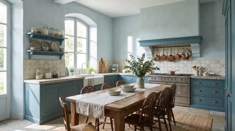
View the colour → Already in your basket (limit 1 per order)
Hawksmoor — Kitchen
02

Pale · the greyed blue-green

Hawksmoor™ No.112

  • Blue
  • Pale tone
  • South light
  • LRV ≈ 55%

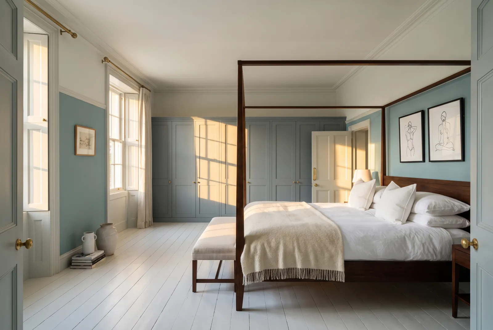
A pale grey tinted with blue-green, the colour of the Portland stone of Hawksmoor's churches on a rainy day. It is the most discreet of our blue-greens — almost a neutral — and therefore the easiest: it holds in a north-facing room without turning cold, and it makes a calm ground for dark furniture and coloured fabrics.

Our tip — Lean: grey. For north-facing sitting rooms and bedrooms, hallways.

View the colour → Already in your basket (limit 1 per order)
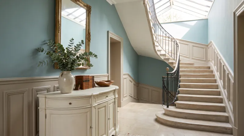
Bridge Blue — Hallway
03

Pale · the Thames blue-green

Bridge Blue™ No.222

  • Blue
  • Mid tone
  • South light
  • LRV ≈ 45%

A light-mid, greyed blue-green, the colour of the Thames on a sunny day — neither truly blue nor truly green. It has more presence than Notting Hill and more colour than Hawksmoor, and it stays luminous: a blue-green that can go on every wall of a bedroom or bathroom without darkening it.

Our tip — Lean: balanced. For bedrooms, bathrooms and kitchens.

View the colour → Already in your basket (limit 1 per order)
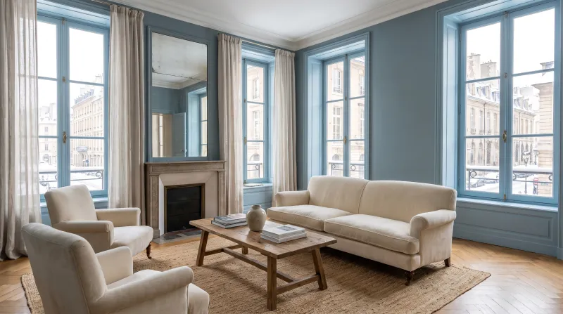
Stockholm — Livingroom
04

Mid · the Scandinavian blue-green

Stockholm BH.11

  • Blue
  • Mid tone
  • South light
  • LRV ≈ 28%

A greyed mid blue leaning to green, designed by Beata Heuman after the Gustavian interiors of Stockholm. It is bluer than most of our blue-greens, with the powdery softness of an old paint, and it is superb on woodwork and painted furniture as much as on walls. The blue-green of country kitchens and dining rooms.

Our tip — Lean: blue. For kitchens, dining rooms, painted furniture.

View the colour → Already in your basket (limit 1 per order)
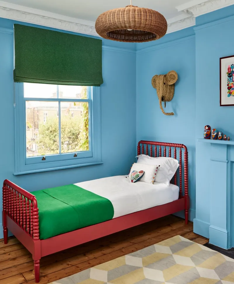
Children's bedroom with blue walls, red bed, and green accents.
05

Mid · the enamelled turquoise

Enamel Blue™ No.78

  • Blue
  • Mid tone
  • South light
  • LRV ≈ 34%

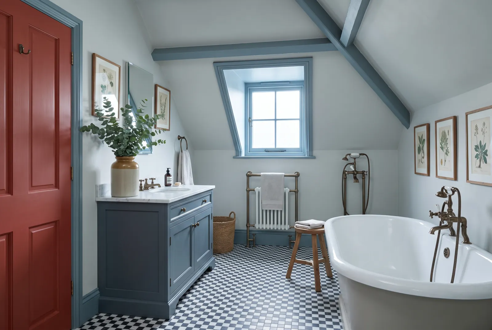
Our brightest blue-green: a saturated mid turquoise, the colour of an enamel or a swimming pool. It has no grey in it, and therefore asks for light and nerve — but in a south-facing bathroom, on a door or a wardrobe, it has a cheer nothing else matches. With white and brass it is the Mediterranean.

Our tip — Lean: blue, saturated. For south-facing bathrooms, doors, furniture.

View the colour → Already in your basket (limit 1 per order)
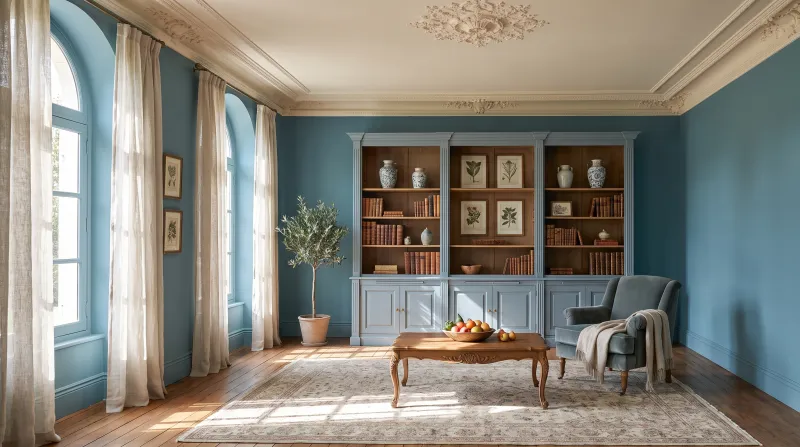
Eaton Square — Livingroom
06

Mid · the reference teal

Eaton Square™ No.232

  • Blue
  • Mid tone
  • South light
  • LRV ≈ 24%

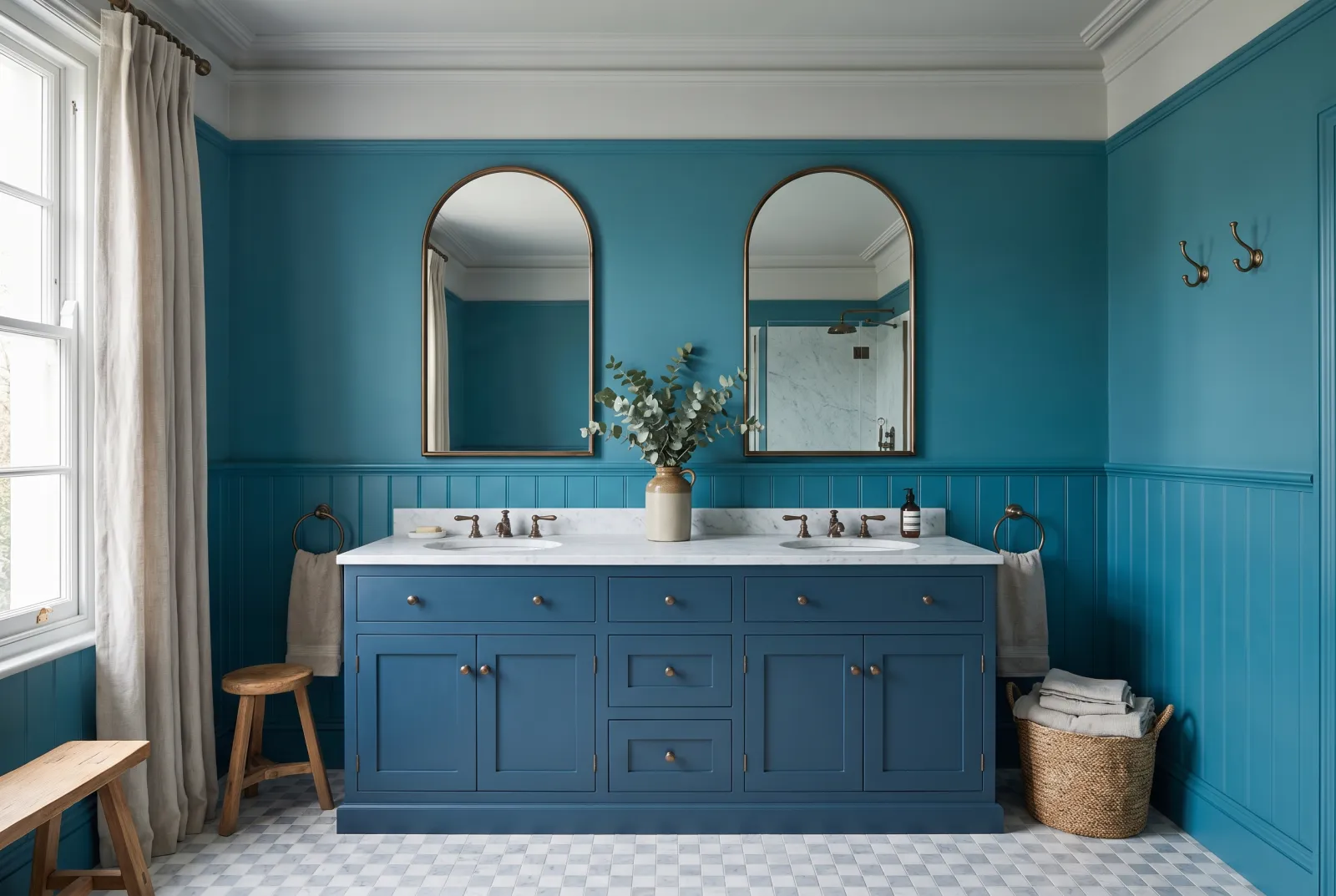
Teal as one imagines it: a muted, greyed mid blue-green, exactly halfway between the two colours, tipping from one to the other with the hour. It is our most requested blue-green — deep enough to envelop a sitting room, soft enough for a bedroom, superb on kitchen cabinets and doors. It loves wood, brass and off-white.

Our tip — Lean: balanced. For everything: sitting rooms, bedrooms, kitchens, front doors.

View the colour → Already in your basket (limit 1 per order)
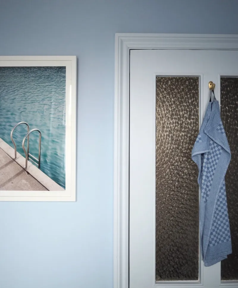
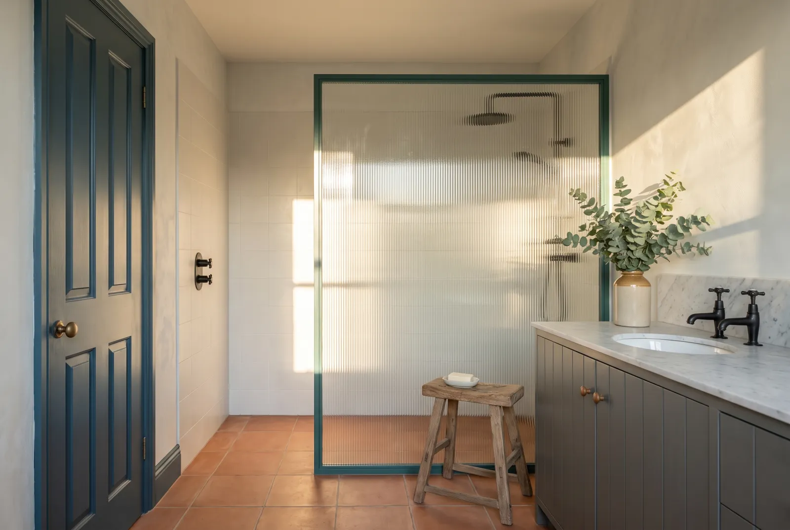
Light blue bathroom, Blue towel hanging on a door with a framed picture of a pool on the wall.
07

Deep · the sea blue-grey

Maritime™ No.236

  • Neutral
  • Dark tone
  • North light
  • LRV ≈ 15%

A deep blue-grey, the colour of the North Sea under an overcast sky. It leans to grey more than to green, which makes it the most sober of our deep blue-greens — and the one best suited to a north-facing room, where it becomes a very elegant bluish slate. Studies, libraries, adults' bedrooms.

Our tip — Lean: grey. For studies, libraries and bedrooms, north- or south-facing.

View the colour → Already in your basket (limit 1 per order)
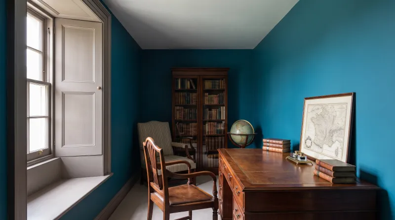
Midnight — Study
08

Deep · the petrol blue

Midnight FTT-017

  • Blue
  • Dark tone
  • South light
  • LRV ≈ 17%

A deep, saturated blue-green with no grey, the colour of a peacock feather or petrol. It is the most intense of our dark blue-greens — it doesn't recede, it radiates — and it was made for a room you want spectacular: a dining room, a library, a guest cloakroom. With brass and dark wood it is sumptuous.

Our tip — Lean: blue, saturated. For dining rooms, libraries, cloakrooms, doors.

View the colour → Already in your basket (limit 1 per order)
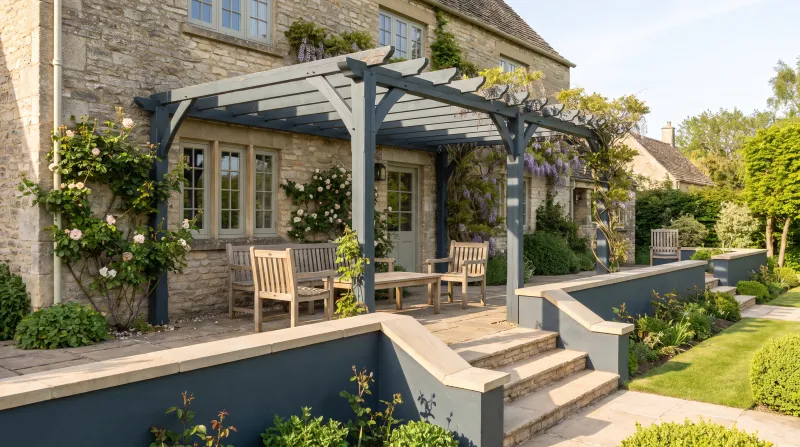
Market Green — Outside
09

Deep · the night green-blue

Market Green™ No.38

  • Neutral
  • Dark tone
  • North light
  • LRV ≈ 7%

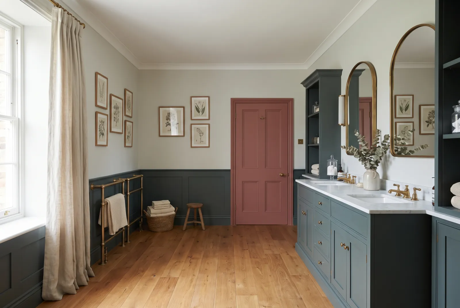
A very dark green leaning to blue — on the other side of the border from Maritime. It is the colour of an old shopfront or deep water at night, and the most enveloping of our blue-greens: on every wall of a bathroom, a study or a hallway it makes a jewel box of a room. It loves white, marble and aged brass.

Our tip — Lean: green. For bathrooms, studies, hallways and colour drenching.

View the colour → Already in your basket (limit 1 per order)
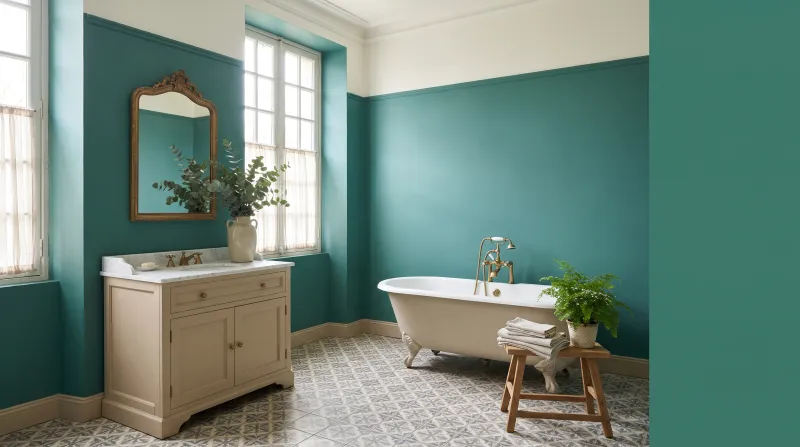
Deep Green — Bathroom
10

Deep · the emerald green

Deep Green FTT-012

  • Green
  • Dark tone
  • South light
  • LRV ≈ 17%

A saturated, bright and joyful blue-green, the colour of an emerald or old swimming-pool tiles. It is the green counterpart to Midnight: no grey, luminous even when dark, made for rooms of celebration. A dining room, a bathroom with white marble, a kitchen with brass — anywhere shine is wanted rather than calm.

Our tip — Lean: green, saturated. For bright dining rooms, bathrooms and kitchens.

View the colour → Already in your basket (limit 1 per order)

These colours in real rooms

Our schemes in which one of this guide's shades plays the lead — or a supporting role.

All schemes · Blue →
Deep Green FTT-012 Greenwich Time™ No.8 Iron Grey FTT-014 Proper Blue™ No.67
Midnight FTT-017 Saint Johns™ No.64 Proper Blue™ No.67
Market Green™ No.38 Saint Johns™ No.64 Dark Green FTT-013 Covent Garden Floral™ No.270
Eaton Square™ No.232 Saint Johns™ No.64 Maritime™ No.236 Bright Red FTT-009
Bridge Blue™ No.222 Greenwich Time™ No.8 Rain JB.03
Enamel Blue™ No.78 Greenwich Time™ No.8 Wedgwood FTT-016

How to choose a blue-green

Two questions are enough. Greyed or saturated? The greyed blue-greens — Hawksmoor No.112, Eaton Square No.232, Maritime No.236, Market Green No.38 — are everyday colours: they hold in any light and never tire. The saturated ones — Enamel Blue No.78, Midnight FTT-017, Deep Green FTT-012 — are occasion colours: they ask for light or lighting, and they make the room. Bluer or greener? The blue side (Stockholm BH.11, Enamel Blue No.78, Midnight FTT-017) is fresher and crisper; the green side (Notting Hill No.213, Market Green No.38, Deep Green FTT-012) more natural and enveloping. In the middle, Eaton Square No.232 and Bridge Blue No.222 do both depending on the hour.

By light

A north-facing room cools blue-greens: choose them greyed (Hawksmoor No.112, Maritime No.236) or frankly dark, which don't depend on sunshine. A south-facing room warms and saturates them: that is where Enamel Blue No.78 and Notting Hill No.213 are at their best. We say more in how light affects colour.

What to pair them with

Blue-greens love warm off-whites — Lots Road No.24, Sleet No.91 — rather than pure white, which makes them look cold; natural wood; brass; and their complements, pinks and terracottas. For proper blues, see our deep blues compared and our blues for a bedroom; for greens, our greens for a bathroom; for all things blue, our ideas in blue.

Frequently asked questions

What is the Mylands teal?
Eaton Square No.232: a muted, greyed mid blue-green, exactly halfway between blue and green. Bluer, Stockholm; greener, Market Green; brighter, Enamel Blue; deeper, Midnight.
What is the difference between teal, peacock and petrol blue?
Teal (Eaton Square) is a greyed mid blue-green; peacock and petrol (Midnight) are deeper and more saturated, with no grey. The first is an everyday colour, the others occasion colours.
Which blue-green for a north-facing room?
A greyed blue-green that doesn't depend on sunshine: Hawksmoor in pale, Eaton Square in mid, Maritime or Market Green in deep. Avoid saturated ones such as Enamel Blue, which cold light hardens.
Which colours go with a blue-green?
Warm off-whites (Lots Road, Sleet) rather than pure white, natural wood, brass, and their complements: powder pinks and terracottas.

Guides to read next

All colour guides →

Want to see these colours at home?

Order a sample to judge the shade in your own light, or browse every paint for the room.

Sign up to our newsletter

Sign up to our newsletter

Thanks for signing up to our newsletter!