How to tell a warm grey from a cool one
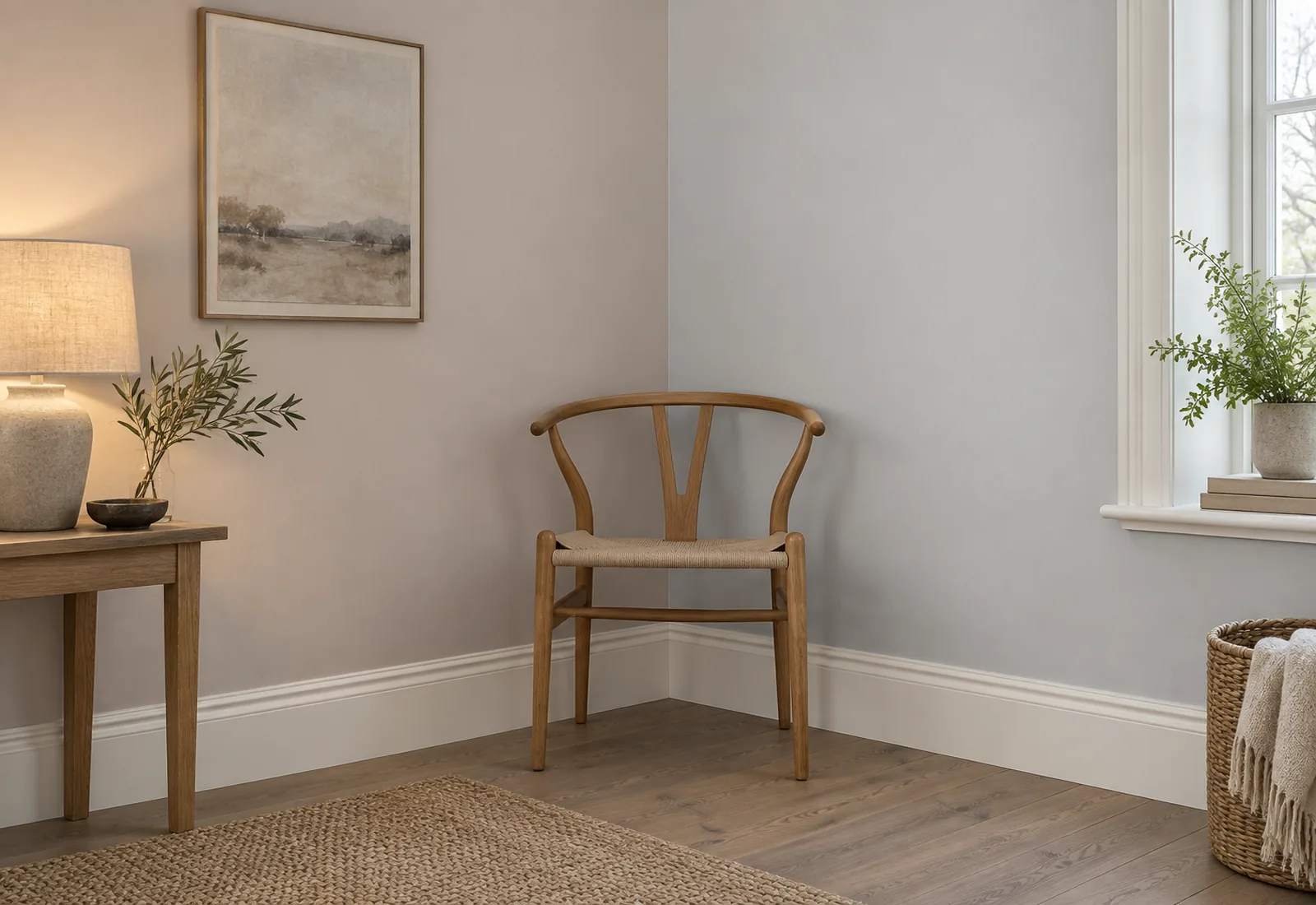
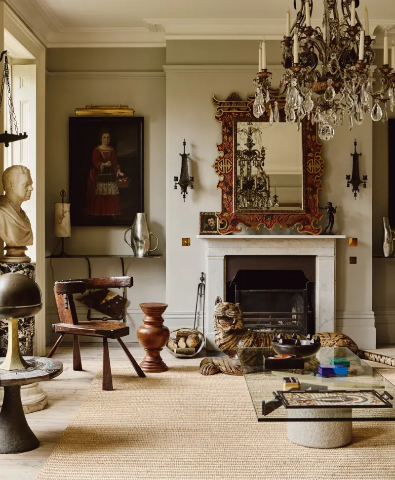
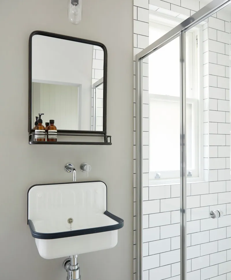
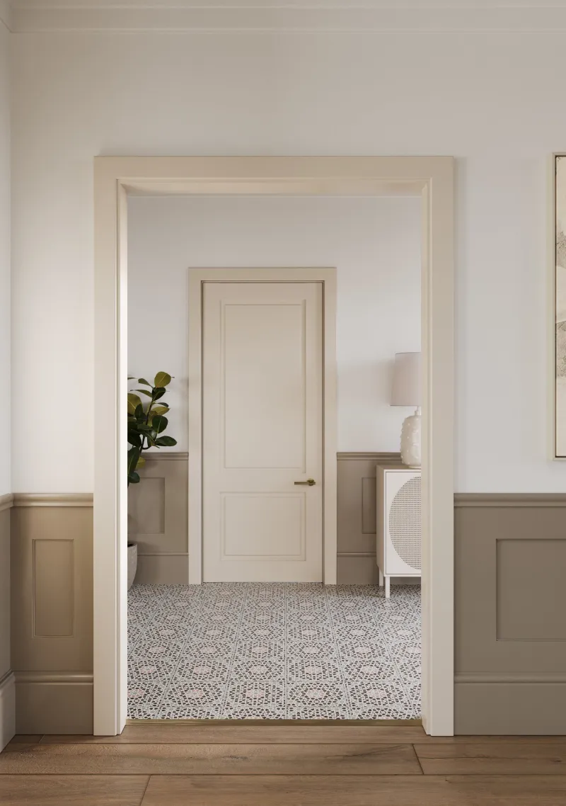
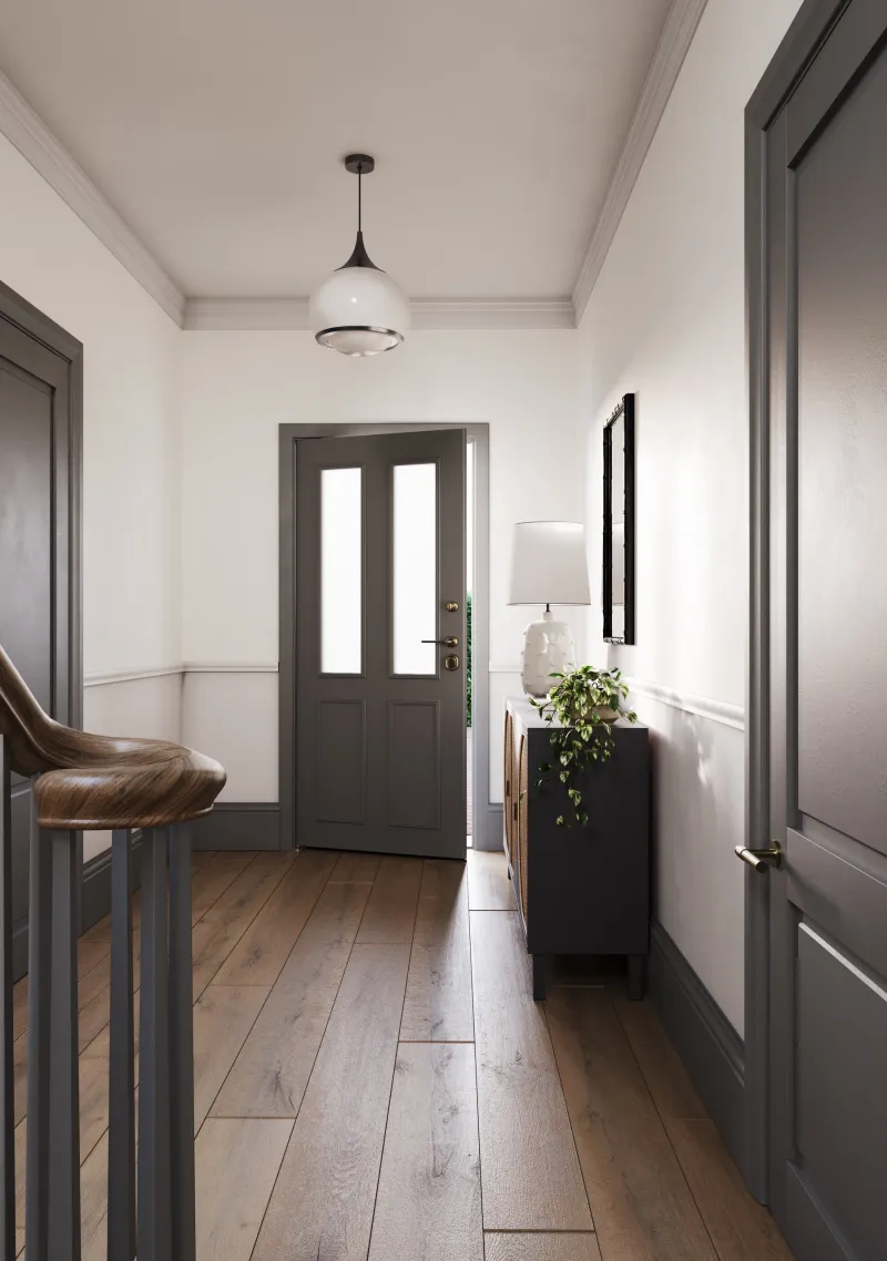
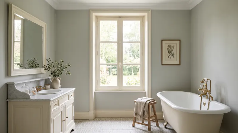
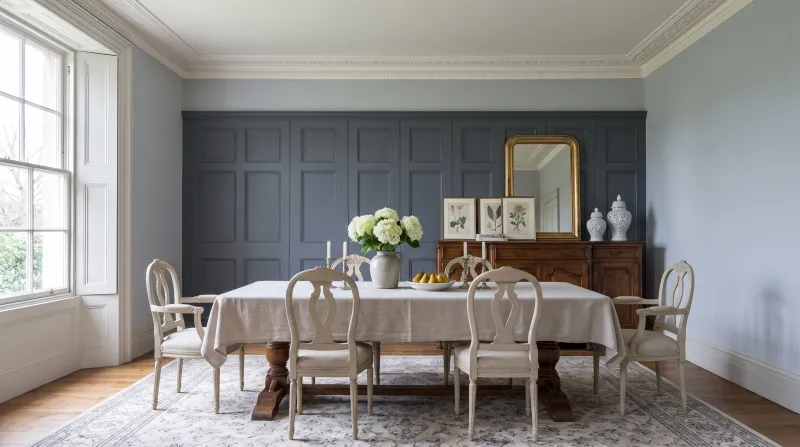
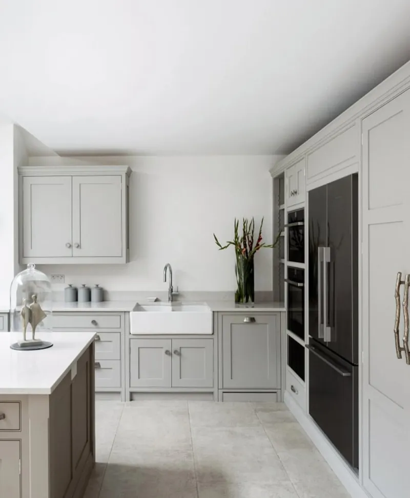
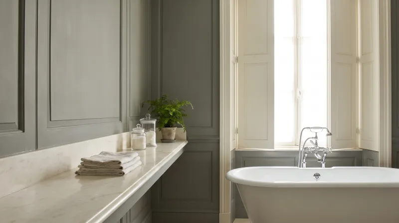
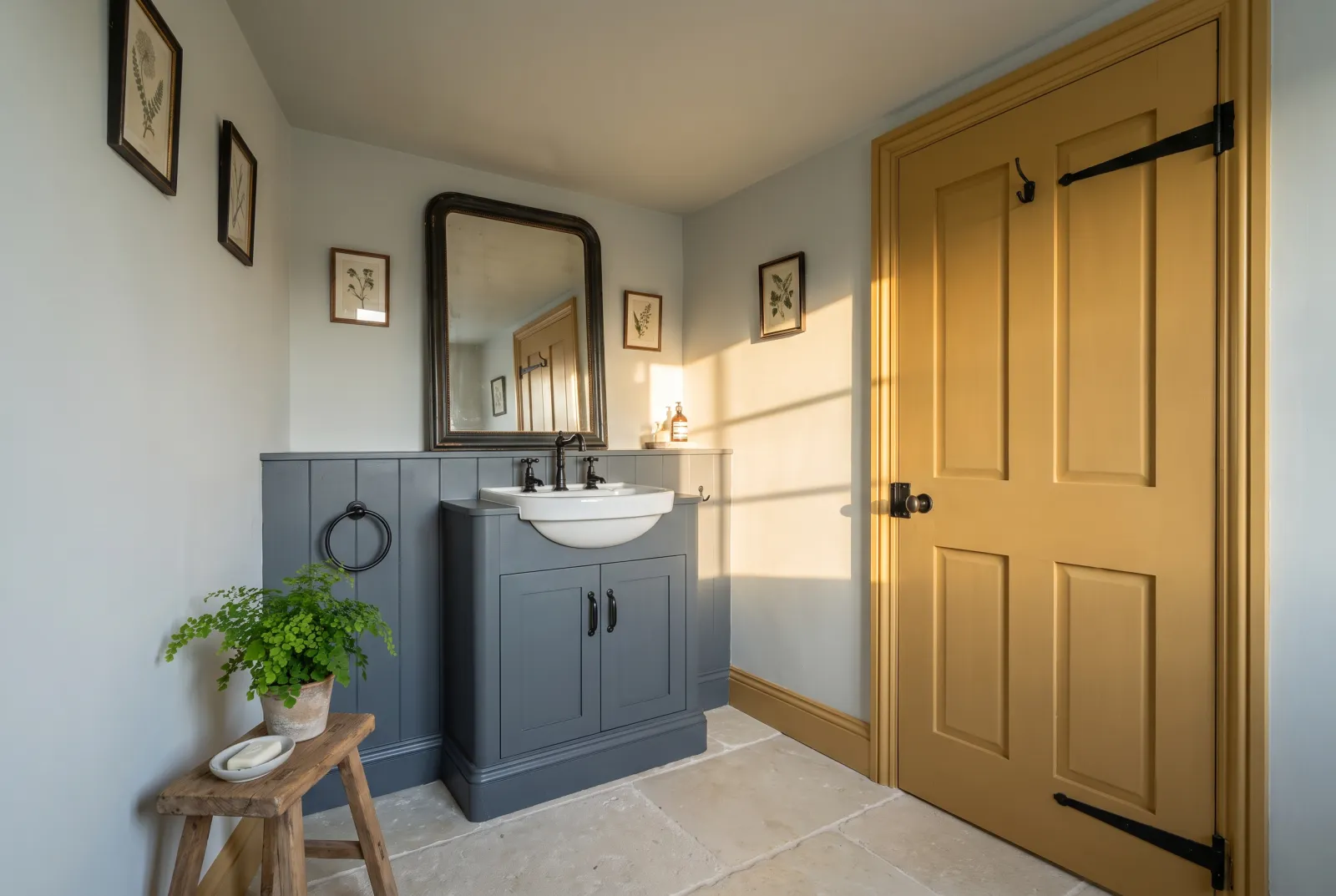
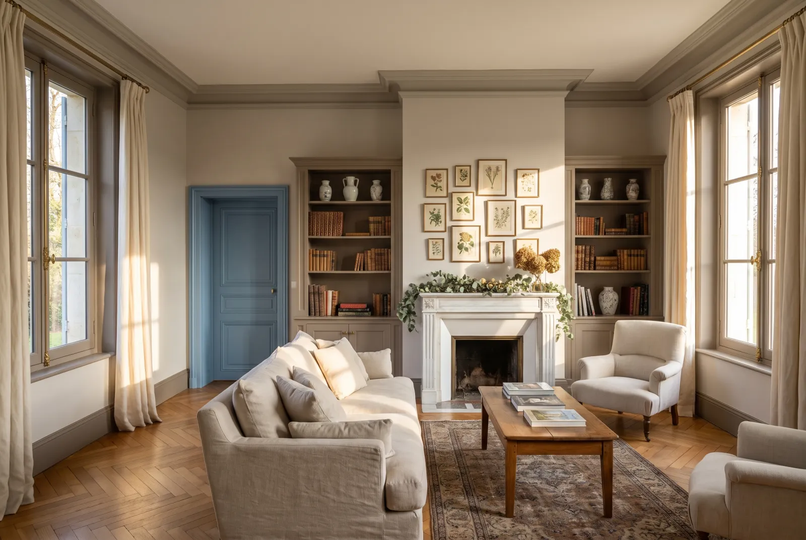
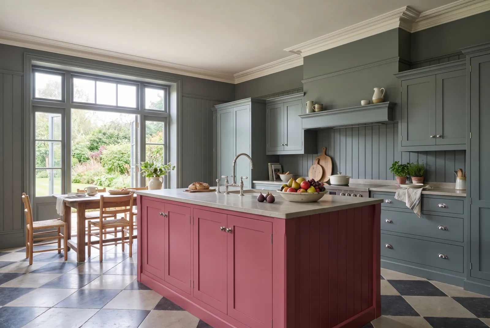
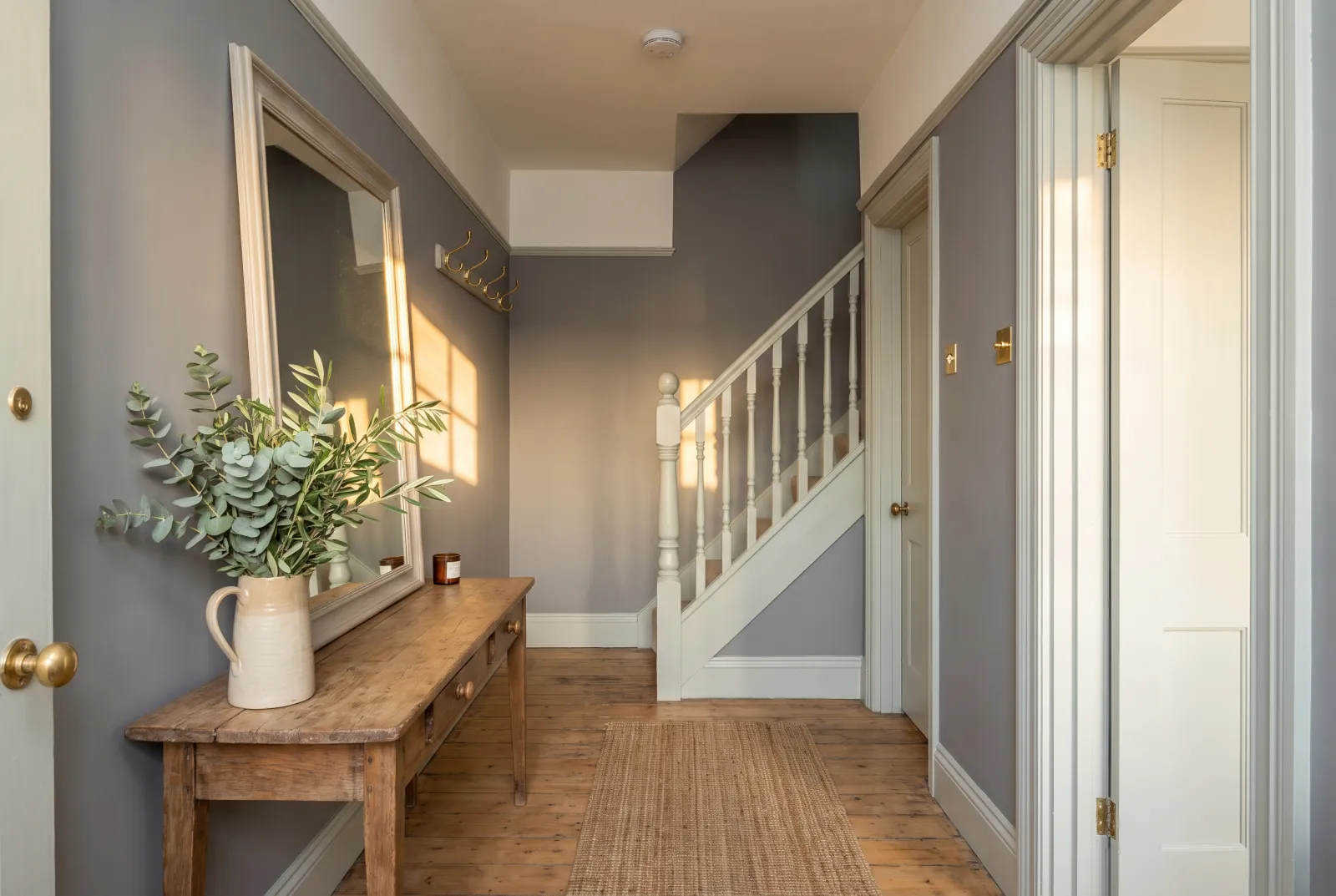
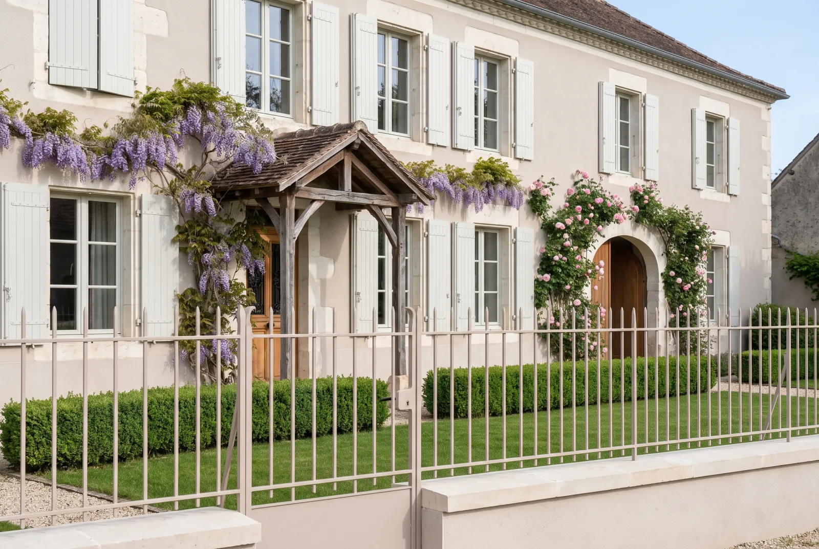
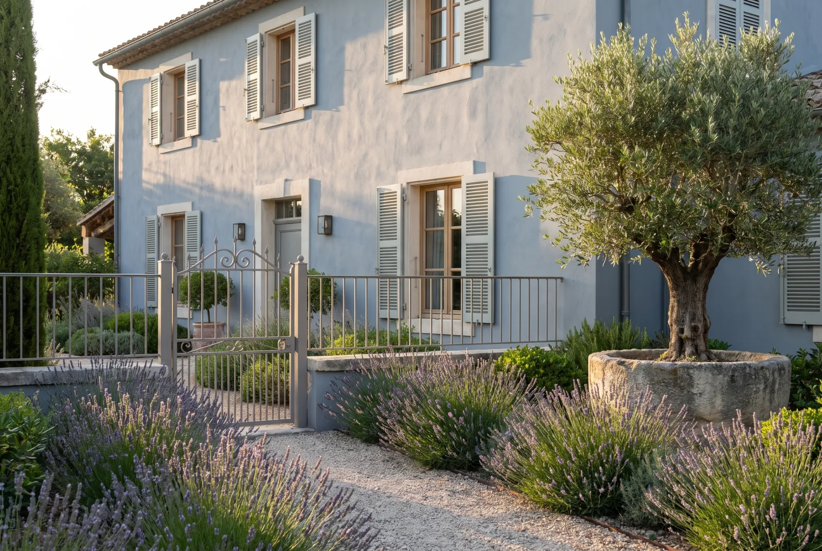
Put the sample beside a sheet of white paper in daylight. A warm grey looks faintly beige, pink or yellow; a cool grey looks faintly blue, green or violet. On our colour card, the warm greys on this page — The Boltons No.28, Frieze No.84, Ludgate Circus No.89, Grey Ochre No.152, Chambers Gate No.85, Amber Grey No.156 — all carry an undertone between yellow and pink. The cool greys — Sloane Square No.92, Islington No.23, Mid Wedgwood No.113, Drury Lane No.115, Oratory No.237, Leadenhall No.118 — lean towards blue, or towards nothing at all.
Three questions to decide
Which orientation? North and east light is cold: a cool grey looks cooler still there — crisp if you want freshness, sad if you want comfort — while a warm grey simply stays grey. South and west light is warm: a cool grey stays crisp there, a warm grey can turn beige. Our guide How light changes colour takes each case in turn.
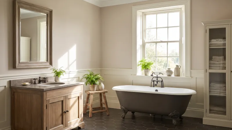
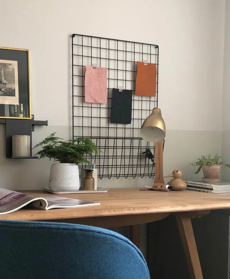
Which materials? Wood, leather, linen, terracotta and brass call for a warm grey. Concrete, steel, white marble, black and chrome call for a cool one. Mixing the two can be done — but then the grey must follow the dominant material.
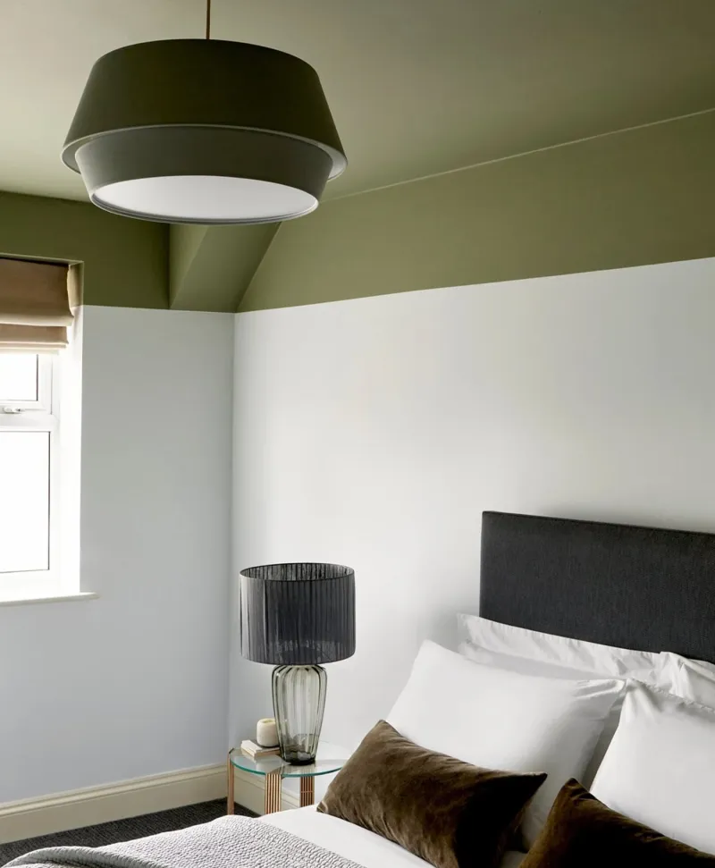
Which white beside it? A warm grey with a warm white (Holland Park No.5, Maugham White No.2); a cool grey with a cool white (Pure White No.1, Charterhouse No.4). Crossing them makes the grey look dirty and the white look yellow. See also our greys for a bedroom, our grey schemes and all our greys.