Colour guides · Study

10 colours for a home office you can focus in

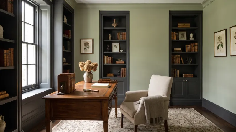
A home office asks two contradictory things: calm to concentrate, and character to make you want to walk in. The colours that manage both are rarely white — they are mid-to-deep greens, blues and greys, matt, that don't glare off the screen and wrap around thought.

Here are ten Mylands colours for a study, from the brightest to the most hushed.

Updated September 2026 · by the Mylands France colour team

10 colours for a home office you can focus in

The short answer

For a study, choose a mid green or blue-grey, matt — Uncle Maths BH.05, Museum No.151, Long Acre No.102 — that rests the eye between screens. For an enveloping library-study, a deep one such as Oratory No.237, Brompton Road No.205 or Blueprint No.50.

At a glance

Our selection

10 colours

Glass — Study
01

The brightest

Glass BH.09

  • Green
  • Pale tone
  • East light
  • LRV ≈ 66%

A barely tinted water green, between mint and blue, ethereal and crisp. For a study set up in a corner of the living room or a small room, it is the ideal replacement for white: as bright, less glaring, with a freshness that keeps you awake. Beata Heuman, who designed it, recommends it on the ceiling — a study rarely needs that, but an attic study does.

Our tip — A bookcase or shelves in Damp Leaf on Glass walls: restful green, in two values.

View the colour → Already in your basket (limit 1 per order)
Uncle Maths — Study
02

The mathematician's grey-green

Uncle Maths BH.05

  • Grey
  • Pale tone
  • North light
  • LRV ≈ 60%

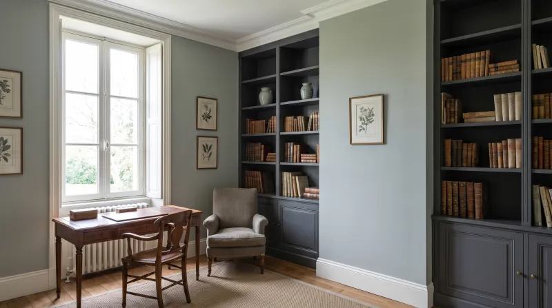
Named by Beata Heuman after a mathematician uncle: a pale grey with a green undertone, the colour of a wiped school blackboard. The name says everything about its vocation — it is a concentration colour, calm without being sad, that absorbs screen light rather than throwing it back. The most restful study grey in the range.

Our tip — Woodwork in Beata White and a desk painted in Thunder: the Beata Heuman palette for work.

View the colour → Already in your basket (limit 1 per order)
Mews Blue — Study
03

The pale grey-blue

Mews Blue™ No.98

  • Grey
  • Pale tone
  • North light
  • LRV ≈ 64%

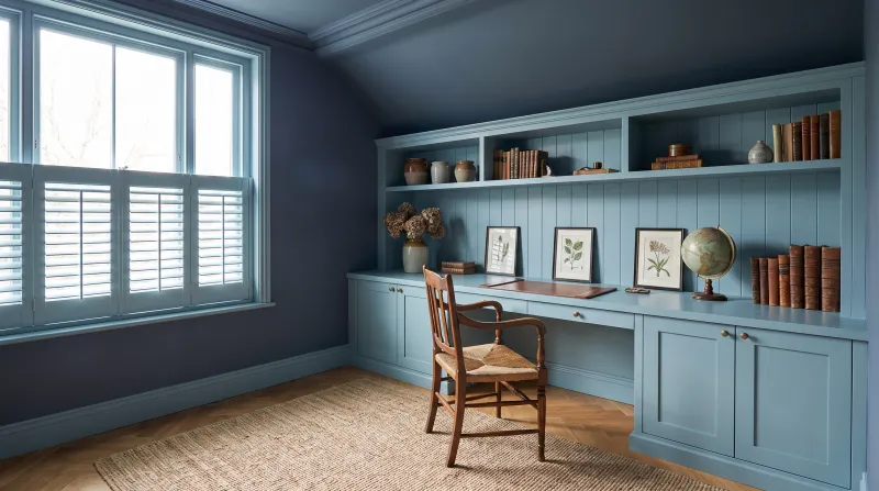
A pale grey with a blue-green undertone, the colour of a repainted London mews. It is cooler than Uncle Maths and bluer — a study in Mews Blue looks like a morning room, crisp and awake. It holds very well in north light, where purer greys look dull.

Our tip — North-facing studies; woodwork in Sleet to stay among the soft greys.

View the colour → Already in your basket (limit 1 per order)
Sprig — Study
04

The tender green

Sprig JB.06

  • Green
  • Mid tone
  • East light
  • LRV ≈ 50%

The first hazel leaf of spring, designed by Jinny Blom: a tender yellow green, more coloured than Glass, that keeps a room alive. It is the colour of a creative study — a workshop, a sewing room, a writing corner — rather than an accountant's. It brightens dark corners like a white, only better.

Our tip — A back wall in Forest behind the screen, the rest in Sprig: depth where the eye rests.

View the colour → Already in your basket (limit 1 per order)
Museum — Study
05

The museum grey-green

Museum™ No.151

  • Grey
  • Mid tone
  • North light
  • LRV ≈ 42%

A mid grey with a green undertone, the colour of gallery walls where prints are hung — hence the name. It is the perfect ground for a study with things on the wall: frames, pinboards, maps. It argues with nothing, shows everything off, and rests the eye between two screen windows.

Our tip — Skirtings and architraves in Saint Johns, a barely lighter grey: the study in gradations.

View the colour → Already in your basket (limit 1 per order)
Long Acre — Study
06

The mid grey-blue

Long Acre™ No.102

  • Grey
  • Mid tone
  • North light
  • LRV ≈ 33%

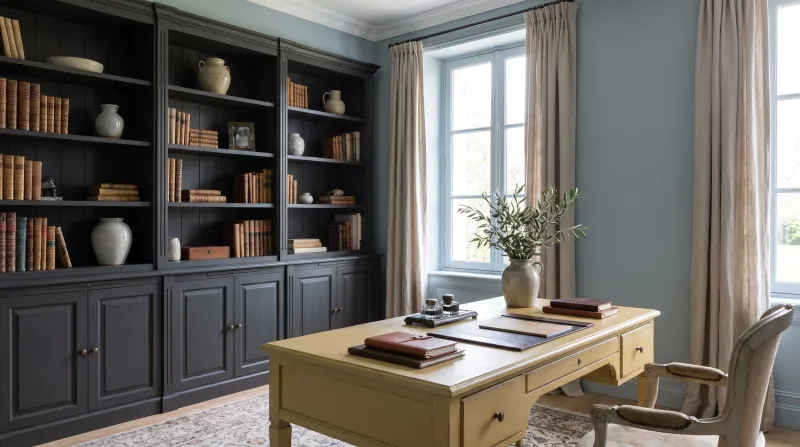
A mid grey with a blue-green undertone, the colour of wet slate after rain, named after the coachbuilders' street in Covent Garden. Deeper than Mews Blue, it gives a study the gravity of a working room without making it dark. Superb with dark timber and leather.

Our tip — Colour-drenched in Multi-Surface Dead Matt, shelves included: the working room.

View the colour → Already in your basket (limit 1 per order)
Damp Leaf — Study
07

The light forest green

Damp Leaf BH.14

  • Green
  • Dark tone
  • East light
  • LRV ≈ 15%

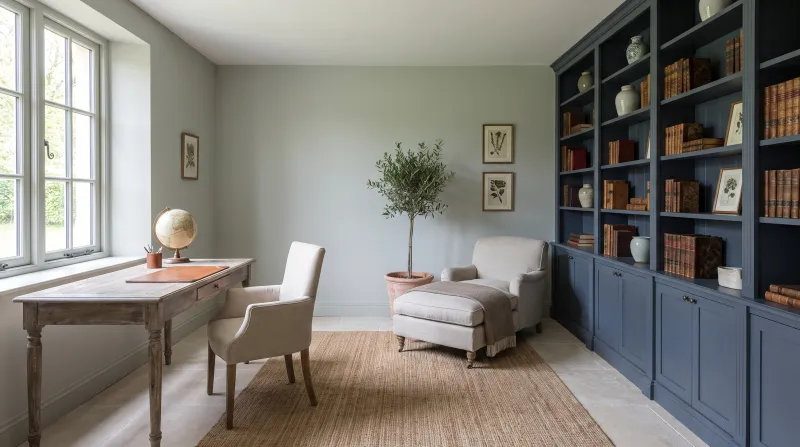
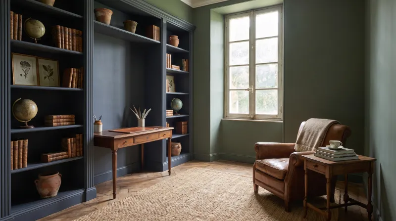
Soft and enveloping like a misty garden on a summer morning, with a little blue that makes it vibrant. Beata Heuman recommends it on storage furniture — and a study is full of it: bookcase, drawers, cupboards. On the walls too, it is the green that concentrates best: neither bright nor dull, exactly as deep as a leaf.

Our tip — Bookcase in Damp Leaf, walls in Glass: two greens from the same collection, light and deep.

View the colour → Already in your basket (limit 1 per order)
Oratory — Study
08

The slate grey

Oratory™ No.237

  • Grey
  • Dark tone
  • North light
  • LRV ≈ 14%

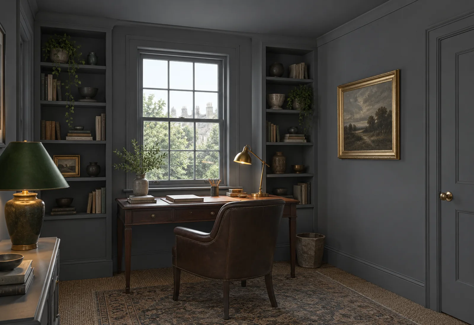
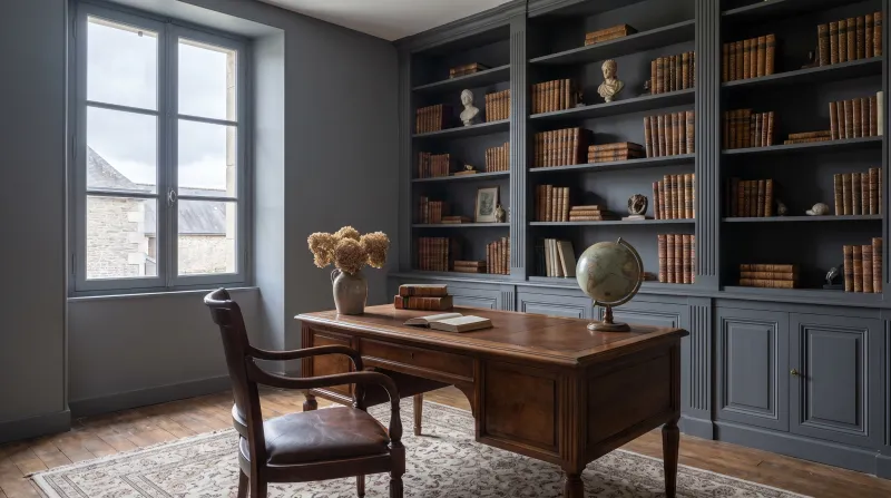
A deep grey with a blue undertone, the colour of dry slate, named after the Brompton Oratory. It has the depth of a night blue without being one — and it is our most asked-for study colour for a colour-drench: walls, woodwork and ceiling in the same grey, with brass and walnut. The room becomes a cabinet.

Our tip — In Multi-Surface Dead Matt on everything, glare-free: the screen is the only bright point.

View the colour → Already in your basket (limit 1 per order)
Brompton Road — Study
09

The deep grey-green

Brompton Road™ No.205

  • Grey
  • Dark tone
  • North light
  • LRV ≈ 13%

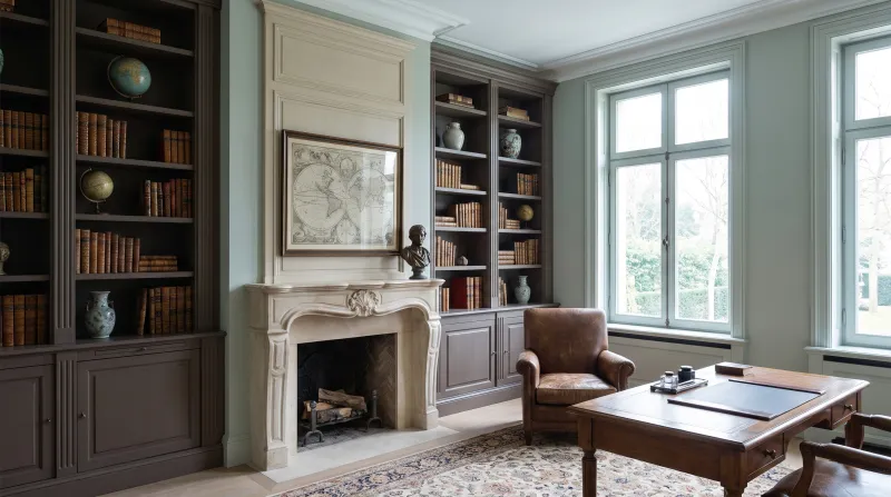
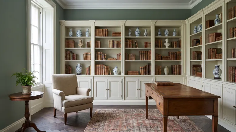
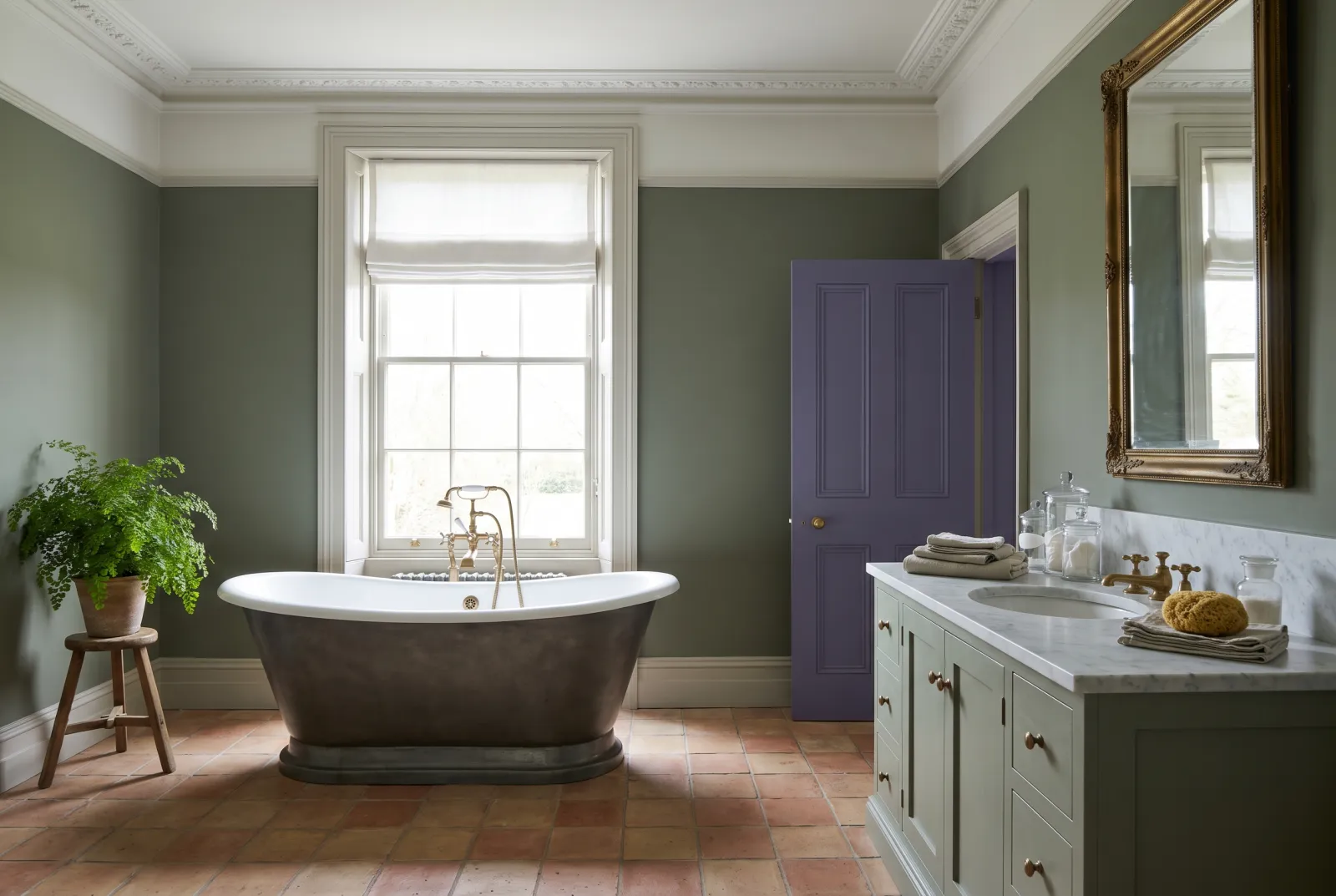
A deep green tempered with grey, with warm undertones, that turns neither blue in north light nor yellow under lamps. It is the green of library-studies: it makes book spines stand out, it calms, and it ages with a mineral patina. Under a desk lamp in the evening, it is perfect.

Our tip — Ceiling in Frieze to keep some air, or all in Brompton Road for the complete library.

View the colour → Already in your basket (limit 1 per order)
Blueprint — Study
10

The deepest

Blueprint™ No.50

  • Neutral
  • Dark tone
  • North light
  • LRV ≈ 6%

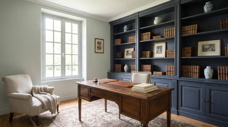
Our deepest blue, a slate blue that is almost black with a violet undertone — the blue of architects' blueprints, hence the name. In a study it makes the most focused room in the house: nothing distracts, everything set against it gains importance. For studies with a real window, and to be painted floor to ceiling.

Our tip — Shelves in Blueprint too, objects and books the only colour; a lamp with an ochre shade.

View the colour → Already in your basket (limit 1 per order)

These colours in real rooms

Our schemes in which one of this guide's shades plays the lead — or a supporting role.

Brompton Road™ No.205 St Clement™ No.11 Myrtle Green™ No.168 Ultra Violet FTT-019
Oratory™ No.237 Saint Johns™ No.64 Haymarket™ No.47
Damp Leaf BH.14 Saint Johns™ No.64 Forest BH.16 Shocking Pink FTT-006
Sprig JB.06 Syon Park™ No.13 Lamb's Ear BH.06
Blueprint™ No.50 Greenwich Time™ No.8 Woodnight JB.12
Glass BH.09 Holbein Chamber™ No.7 Shocking Pink FTT-006

Choosing a study colour

Think of the screen first. A white wall behind or facing a screen tires: it glares by contrast, and it throws lamp light back into the screen. A mid, matt colour — Museum No.151, Long Acre No.102, Uncle Maths BH.05 — reduces the contrast and rests the eye. That is why the most comfortable studies are rarely white.

Green to concentrate, blue to think, grey for everything. Mid greens (Damp Leaf BH.14, Sprig JB.06) are physiologically the most restful colours for the eye; blue-greys (Long Acre No.102, Oratory No.237) are associated with calm and reflection; grey-greens (Museum No.151) make the neutral ground you forget. Avoid bright reds and yellows, which stimulate — except as a small touch.

Light or deep?

A study used by day, with a good window, takes a deep colour colour-drenched — Oratory No.237, Brompton Road No.205, Blueprint No.50 — which makes it a room apart. A study set up in a corner or under the eaves stays more liveable in a light colour: Glass BH.09, Mews Blue No.98. In both cases, matt: Marble Matt Emulsion on the walls, Multi-Surface Dead Matt for a fully painted study, shelves included. See also our deep blues compared, warm grey or cool grey and our living-room ideas.


Frequently asked questions

Which colour helps concentration in a study?
Mid greens and blue-greys in a matt finish: Uncle Maths BH.05, Museum No.151, Long Acre No.102 or Damp Leaf BH.14. They reduce the contrast with the screen and rest the eye.
Should a home office be painted white?
Preferably not: a white wall behind or facing a screen glares by contrast. If you want a light room, a coloured white such as Glass BH.09 or a pale grey such as Mews Blue No.98 is more comfortable.
Which deep colour for a library-study?
Oratory No.237 (slate grey), Brompton Road No.205 (deep grey-green) or Blueprint No.50 (near-black blue), applied to walls, shelves and ceiling in Multi-Surface Dead Matt.
Which finish for study walls?
A matt finish, with no reflections towards the screen: Marble Matt Emulsion on the walls, or Multi-Surface Dead Matt if the shelves and woodwork are painted the same colour.

Guides to read next

All colour guides →

Want to see these colours at home?

Order a sample to judge the shade in your own light, or browse every paint for the room.

Sign up to our newsletter

Sign up to our newsletter

Thanks for signing up to our newsletter!