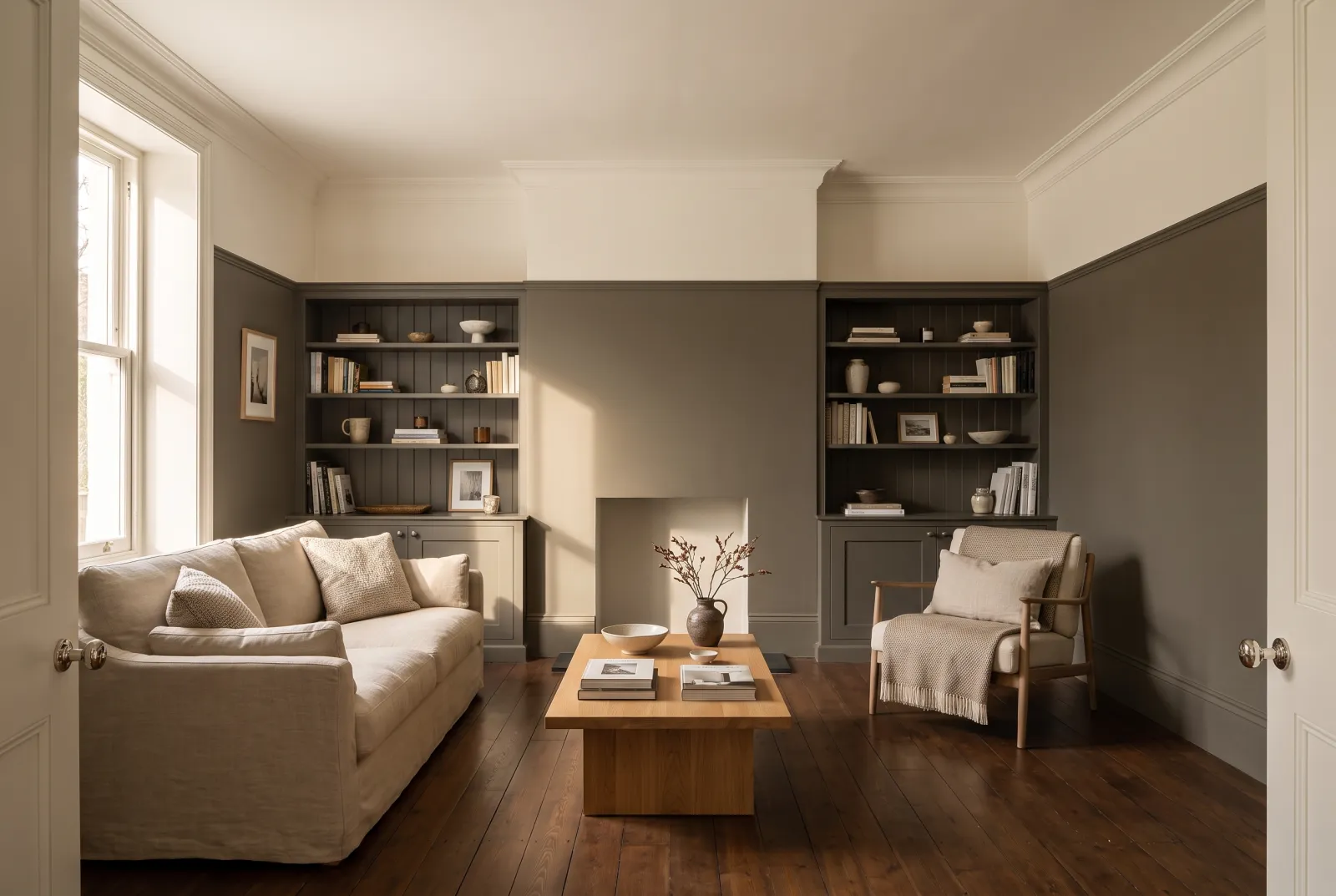
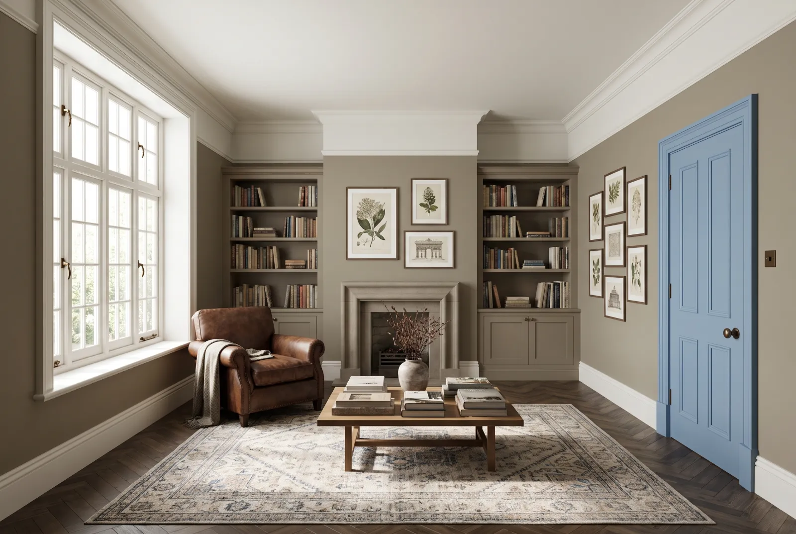
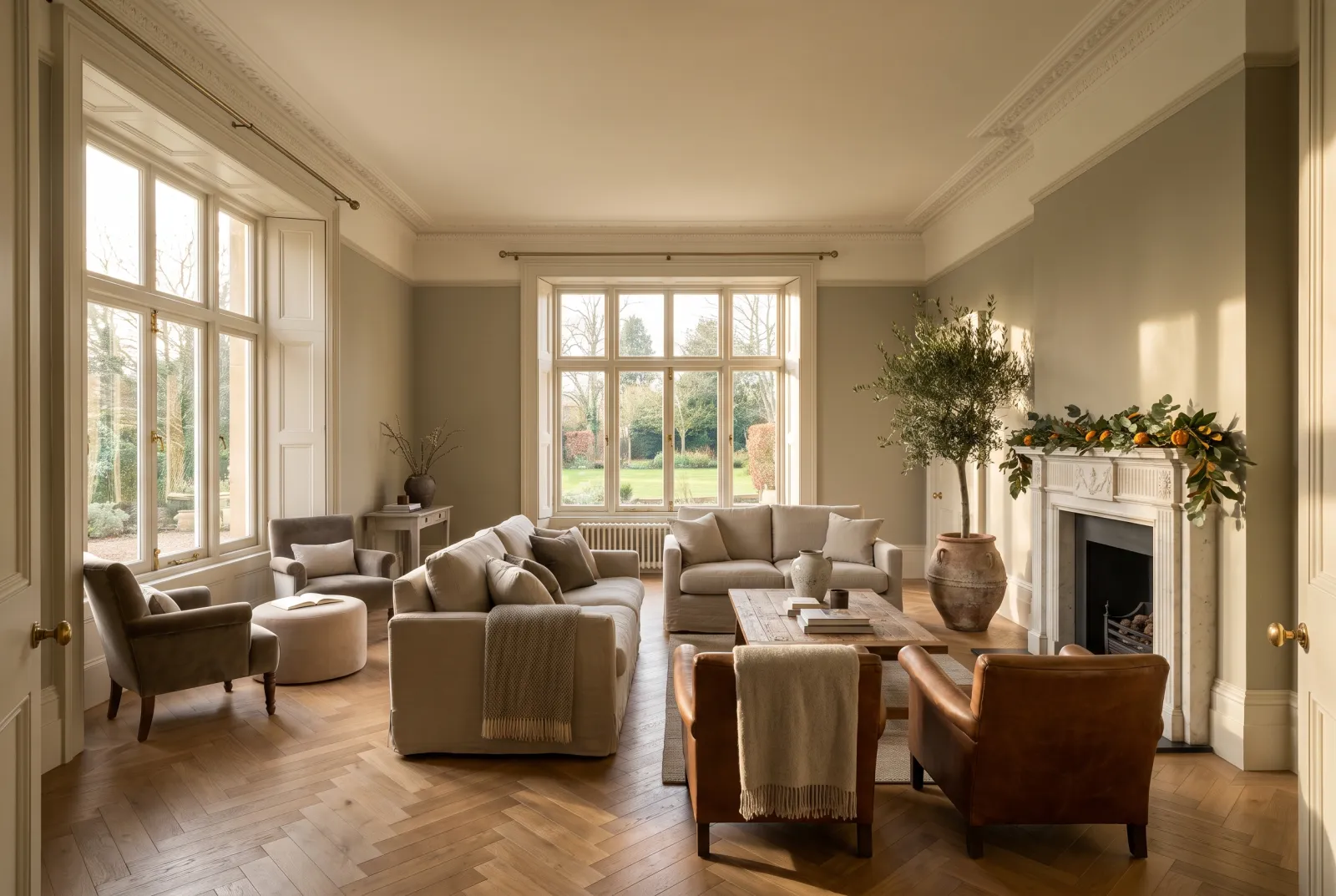
Colour guides · Green

Olive green and khaki: 12 Mylands shades compared

Olive green is the green that holds yellow and brown — that of olive leaves, uniforms, old canvas tents. Of all greens it is the closest to the neutrals, and therefore the easiest to live with: it warms where other greens cool, it goes with every wood, and it never tires.

Here are our twelve olives and khakis side by side, from palest to deepest, with their lean — yellower, greyer or browner — and the room that suits them.

Updated September 2026 · by the Mylands France colour team

Olive green and khaki: 12 Mylands shades compared

The short answer

Our olives run from the pale, almost neutrals — Hurlingham No.181, French Green No.187, Beauvais No.195, Chester Square No.199 — through the mid — Greenstone No.190, Serpentine No.192, Stockwell Green No.203, Primrose Hill No.201, Artichoke BH.13 — to the deep — Sorrel Green No.207, the reference olive, Messel No.39 and Caca d'Oie BH.15. The yellowest go in kitchens and north-facing rooms; the greyest in sitting rooms and studies; the deep ones on furniture and woodwork.

At a glance

The shades compared

Colour Family Tone Light LRV ≈ Best for
Hurlingham™ No.181 Yellow Pale tone South 63 % Lean: yellow. For kitchens and children's bedrooms; with Pure White.
French Green™ No.187 Green Pale tone East 57 % Lean: yellow-green. For kitchens and sitting rooms, north- or east-facing.
Beauvais™ No.195 Neutral Pale tone South 52 % Lean: grey. For sitting rooms and bedrooms; with Holland Park.
Chester Square™ No.199 Neutral Mid tone South 44 % Lean: balanced. For everything; the pale olive to choose when in doubt.
Greenstone™ No.190 Neutral Mid tone South 42 % Lean: grey. For sitting rooms, studies and hallways.
Serpentine™ No.192 Grey Mid tone West 31 % Lean: grey. For sitting rooms and studies, especially west-facing.
Stockwell Green™ No.203 Neutral Mid tone South 34 % Lean: yellow-brown. For kitchens and studies; with Bone and Downing Street.
Primrose Hill™ No.201 Neutral Mid tone South 33 % Lean: yellow. For north-facing kitchens and dining rooms; with Observatory.
Artichoke BH.13 Neutral Mid tone West 26 % Lean: brown-grey. For sitting rooms and bedrooms; with Mormor Zaza and Chalk.
Sorrel Green™ No.207 Green Dark tone East 15 % Lean: balanced, deep. For kitchens, studies, doors and colour drenching.
Messel™ No.39 Grey Dark tone West 12 % Lean: brown. For studies, libraries and woodwork; with Whitehall.
Caca d’Oie BH.15 Neutral Dark tone South 12 % Lean: yellow, deep. For dining rooms, studies and colour drenching; with Butter.

LRV: light reflectance estimated from the on-screen shade, from 0 (absolute black) to 100 (absolute white). Light: the orientation in which the shade looks its best.

Our selection

12 colours

Hurlingham — Hallway
01

Pale · the yellow-green

Hurlingham™ No.181

  • Yellow
  • Pale tone
  • South light
  • LRV ≈ 63%

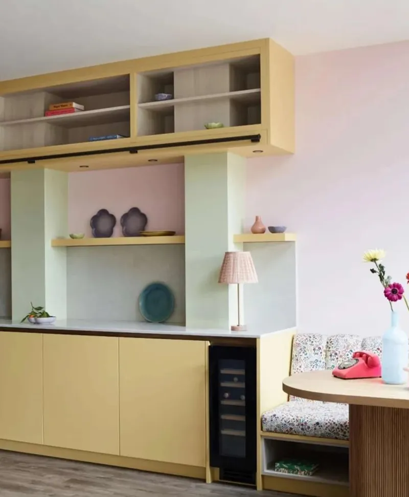
A pale yellow leaning to green, the colour of a young shoot — the family's starting point, where yellow becomes olive. It is fresh and cheerful without being bright, and it makes a springlike kitchen or child's bedroom. Its yellow share keeps it warm in a north-facing room.

Our tip — Lean: yellow. For kitchens and children's bedrooms; with Pure White.

View the colour → Already in your basket (limit 1 per order)
Retro kitchen with wooden cabinets in pastel shades including pale yellow, mint green, pastel pink, shelves, and a small table.
02

Pale · the lime-tree green

French Green™ No.187

  • Green
  • Pale tone
  • East light
  • LRV ≈ 57%

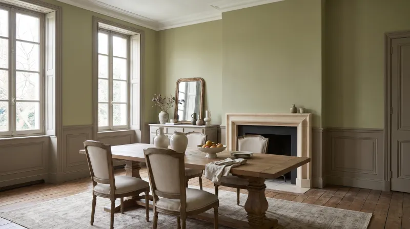
A pale, yellowed green, the colour of a lime tree in spring — a notch greener than Hurlingham. It is the most luminous pale olive, the one that turns a kitchen or sitting room into a garden through the window, and it holds facing north thanks to its yellow share. Superb on kitchen cabinets beneath cream walls.

Our tip — Lean: yellow-green. For kitchens and sitting rooms, north- or east-facing.

View the colour → Already in your basket (limit 1 per order)
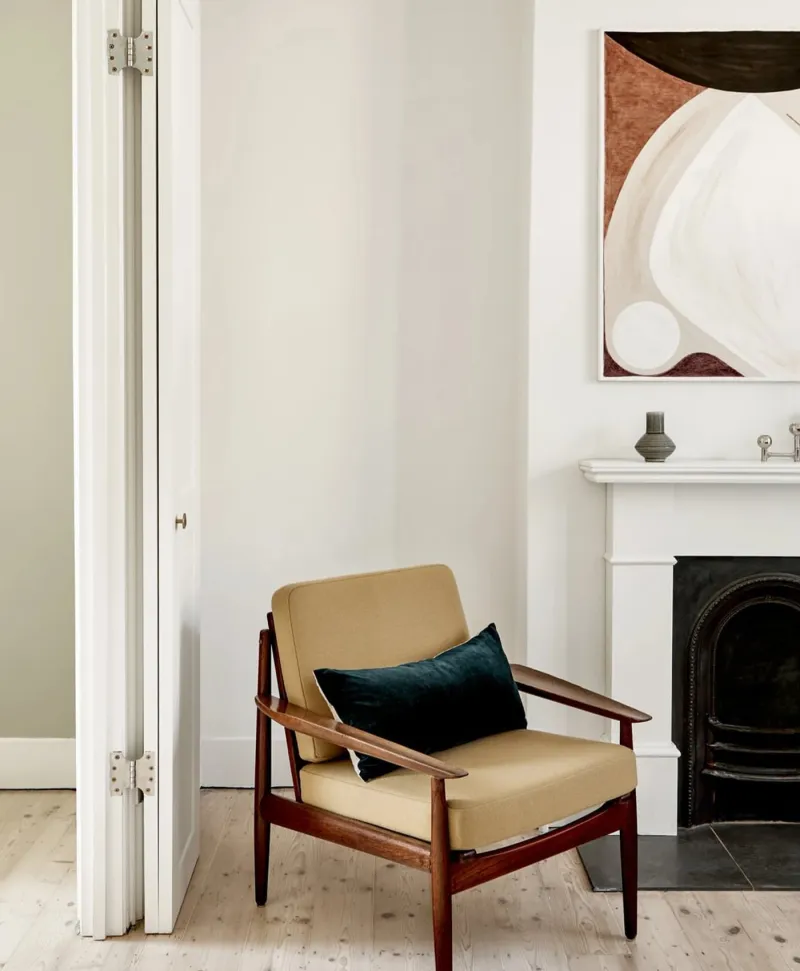
Beige armchair with a dark green pillow in a white room with a fireplace and abstract art.
03

Pale · the tapestry grey-green

Beauvais™ No.195

  • Neutral
  • Pale tone
  • South light
  • LRV ≈ 52%

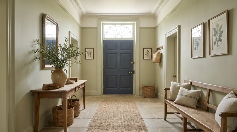
A pale, powdery grey-green, the colour of the verdures of Beauvais tapestries after three centuries. It is greyer than French Green, and therefore calmer — almost a neutral — and it makes a very soft ground for a sitting room or bedroom. It loves warm whites, linen and pale wood.

Our tip — Lean: grey. For sitting rooms and bedrooms; with Holland Park.

View the colour → Already in your basket (limit 1 per order)
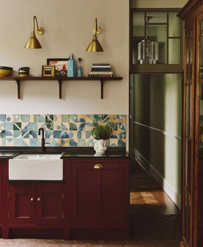
Kitchen interior with a colourful backsplash, wooden cabinets painted in a deep red, and shelves. Walls painted in plaster coloured paints.
04

Pale · the pale olive

Chester Square™ No.199

  • Neutral
  • Mid tone
  • South light
  • LRV ≈ 44%

A pale, greyed olive green, the colour of an olive leaf — the truest pale olive, neither too yellow nor too grey. It is a neutral with the warmth of yellow without its colour, and it warms a north-facing room as a beige would, more interestingly. Kitchens, sitting rooms, hallways.

Our tip — Lean: balanced. For everything; the pale olive to choose when in doubt.

View the colour → Already in your basket (limit 1 per order)
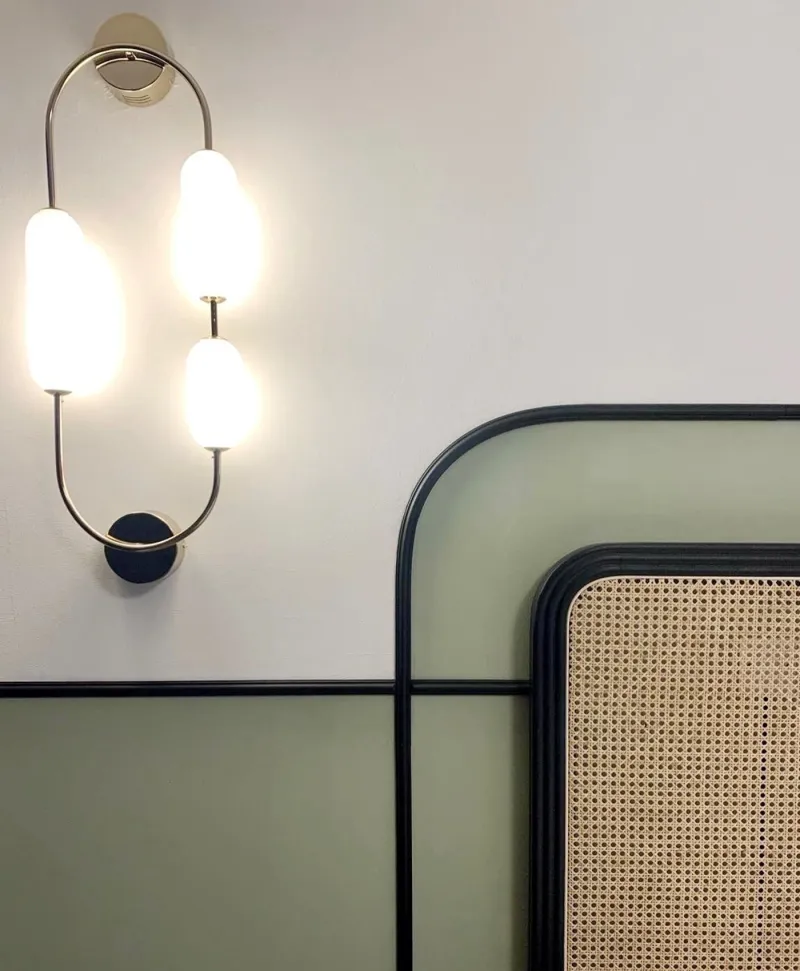
Modern bedroom with white and soft green wall, a rattan headboard with black trim
05

Mid · the green stone

Greenstone™ No.190

  • Neutral
  • Mid tone
  • South light
  • LRV ≈ 42%

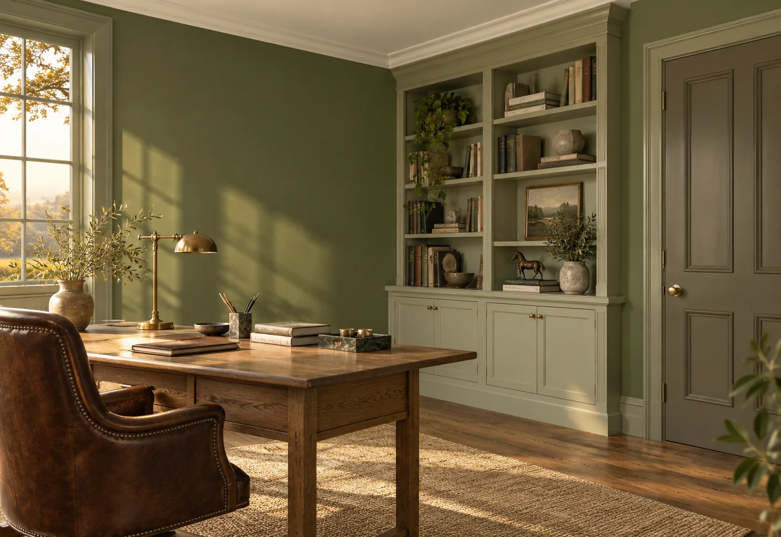
A mid grey-green, the colour of a moss-greened stone — a notch deeper than Chester Square, still greyed. It gives a sitting room or study presence without darkening it, and it is very handsome with oak, leather and warm whites. An everyday olive.

Our tip — Lean: grey. For sitting rooms, studies and hallways.

View the colour → Already in your basket (limit 1 per order)
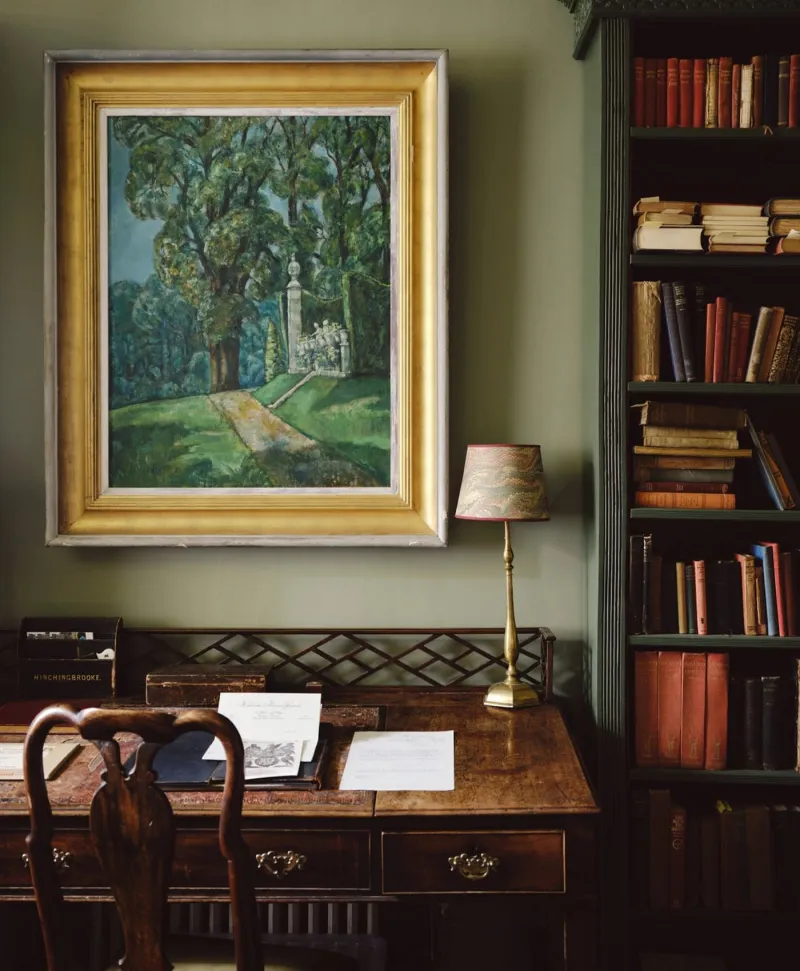
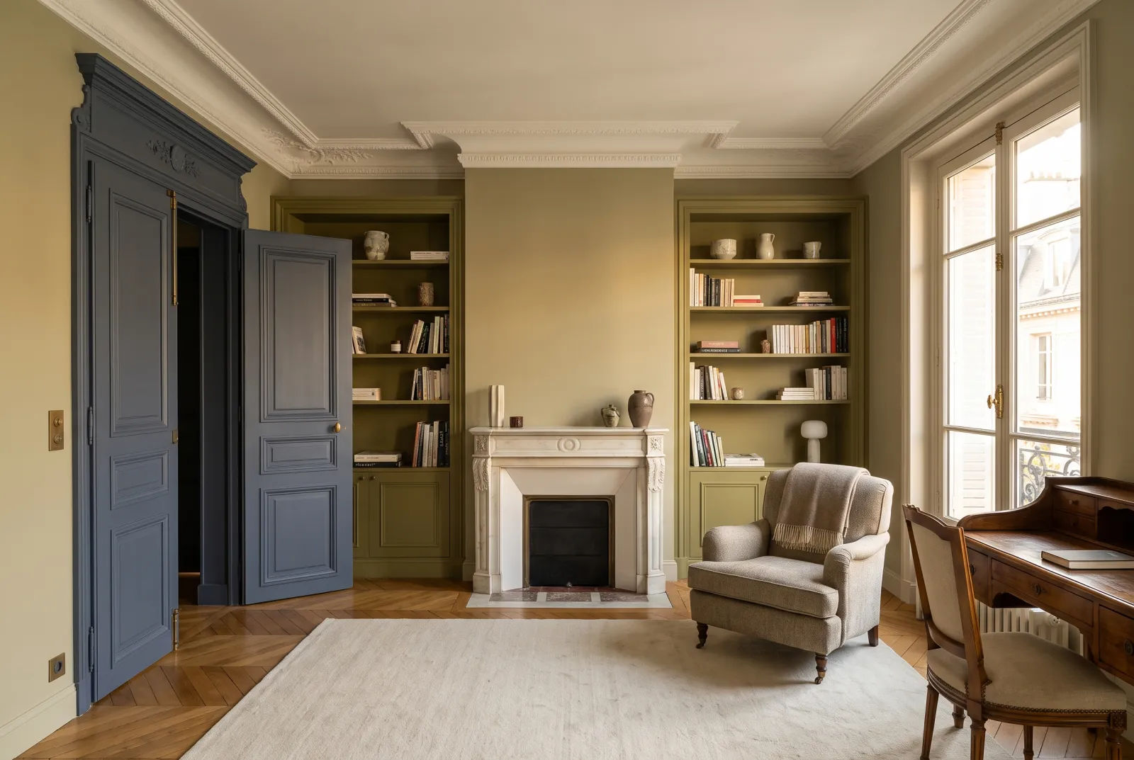
Framed painting on a pale olive green wall above a wooden desk with books and a lamp.
06

Mid · the grey olive

Serpentine™ No.192

  • Grey
  • Mid tone
  • West light
  • LRV ≈ 31%

A mid grey tinted with olive, the colour of the Serpentine in autumn — classed for west light, which is rare for a green. It is the greyest of our mid olives: from afar a warm grey, up close a green. It holds in every light and makes an elegant, sober sitting room or study, superb with leather and brass.

Our tip — Lean: grey. For sitting rooms and studies, especially west-facing.

View the colour → Already in your basket (limit 1 per order)
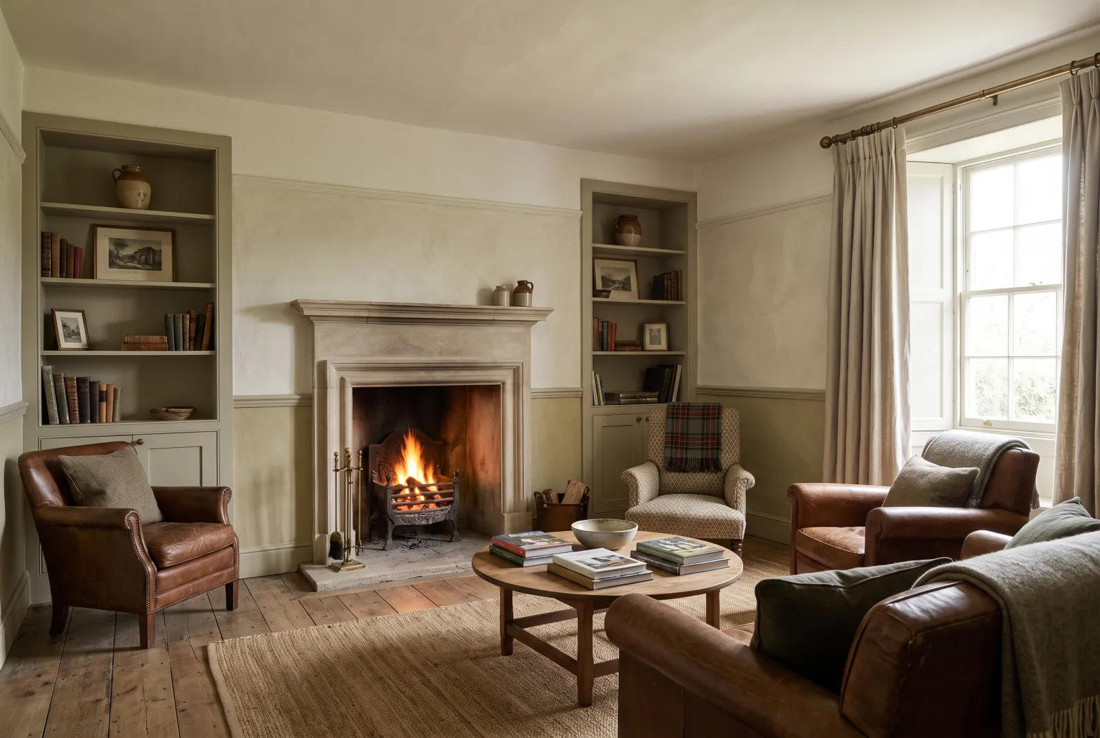
Stockwell Green — Livingroom
07

Mid · the khaki

Stockwell Green™ No.203

  • Neutral
  • Mid tone
  • South light
  • LRV ≈ 34%

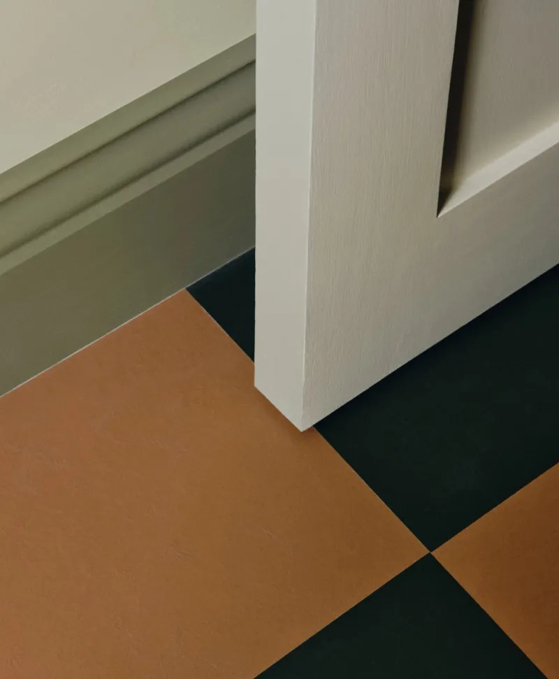
A yellowed, brown mid olive green — khaki in the proper sense, the colour of a military canvas tent. It is warmer than Greenstone and Serpentine, and more "colour": mistaken for no grey. It is the olive of contemporary kitchens and studies, superb in matt on flat cabinet doors with pale wood and black.

Our tip — Lean: yellow-brown. For kitchens and studies; with Bone and Downing Street.

View the colour → Already in your basket (limit 1 per order)
Primrose Hill — Diningroom
08

Mid · the golden olive

Primrose Hill™ No.201

  • Neutral
  • Mid tone
  • South light
  • LRV ≈ 33%

A mid olive green leaning frankly to yellow, the colour of the dry grass of Primrose Hill in August. It is the sunniest of our mid olives, and the one that warms a north-facing room most; it is superb with deep blues, cream whites and waxed wood. Kitchens, dining rooms, studies.

Our tip — Lean: yellow. For north-facing kitchens and dining rooms; with Observatory.

View the colour → Already in your basket (limit 1 per order)
Close-up of a corner with a sage green woodwork and brown and black tiles.
09

Mid · the artichoke

Artichoke BH.13

  • Neutral
  • Mid tone
  • West light
  • LRV ≈ 26%

A muted, brown mid grey-green, the colour of an artichoke leaf — designed by Beata Heuman. It is the olive closest to a taupe: from afar a warm neutral, up close a green with brown in it. It makes an enveloping sitting room or bedroom without darkening it, and it is very handsome with powder pinks and terracottas.

Our tip — Lean: brown-grey. For sitting rooms and bedrooms; with Mormor Zaza and Chalk.

View the colour → Already in your basket (limit 1 per order)
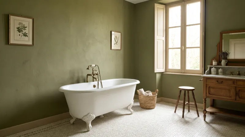
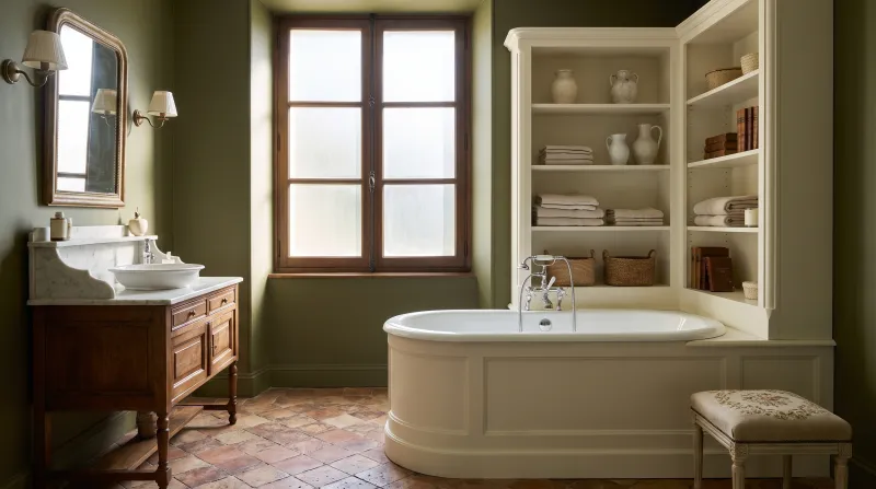
Sorrel Green — Bathroom
10

Deep · the reference olive

Sorrel Green™ No.207

  • Green
  • Dark tone
  • East light
  • LRV ≈ 15%

A mid-deep, earthy, muted olive green — olive as one imagines it, and the green of our most photographed kitchens. It has enough yellow to stay warm facing north, enough grey never to shout, and enough depth to hold on cabinets, doors or four walls. If you remember only one olive, it is this one.

Our tip — Lean: balanced, deep. For kitchens, studies, doors and colour drenching.

View the colour → Already in your basket (limit 1 per order)
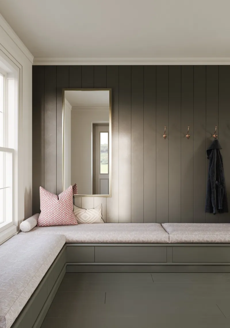
Messel — boot room
11

Deep · the brown olive

Messel™ No.39

  • Grey
  • Dark tone
  • West light
  • LRV ≈ 12%

A dark, brown olive green, the colour of a black olive or an old bronze — classed for west light. It is browner than Sorrel Green and graver, and it does what a brown would in a study or library, with the green added: it envelops, it flatters wood and leather, and the setting sun gilds it. On woodwork it is magnificent.

Our tip — Lean: brown. For studies, libraries and woodwork; with Whitehall.

View the colour → Already in your basket (limit 1 per order)
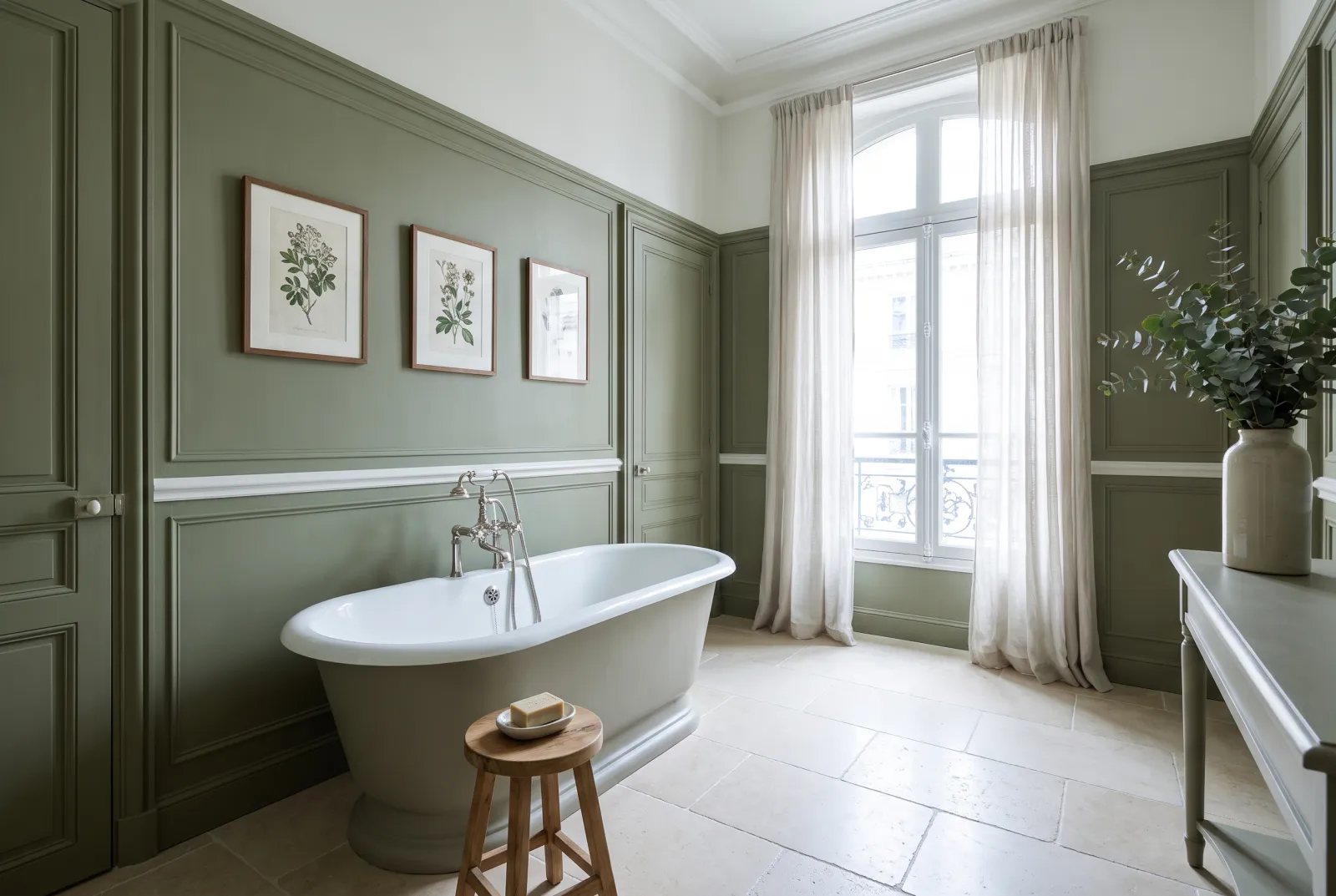
Caca d'Oie — Bathroom
12

Deep · the dark yellow-green

Caca d’Oie BH.15

  • Neutral
  • Dark tone
  • South light
  • LRV ≈ 12%

A dark, yellowed olive green with a historic name — that of a colour fashionable in the 18th century — designed by Beata Heuman. It is the yellowest deep olive, and therefore the warmest: it envelops a dining room or study without the slightest coldness, and it is superb with pinks, earthy reds and brass. A colour with character, very easy to live with.

Our tip — Lean: yellow, deep. For dining rooms, studies and colour drenching; with Butter.

View the colour → Already in your basket (limit 1 per order)

These colours in real rooms

Our schemes in which one of this guide's shades plays the lead — or a supporting role.

All schemes · Green →
Sorrel Green™ No.207 St Clement™ No.11
French Green™ No.187 Cotton Street™ No.3 Lamb's Ear BH.06
Stockwell Green™ No.203 Sleet™ No.91 Primrose Hill™ No.201 Observatory™ No.34
Messel™ No.39 Maugham White™ No.2 Artillery Ground™ No.164
Artichoke BH.13 Maugham White™ No.2 Portcullis™ No.170 Wedgwood FTT-016
Greenstone™ No.190 Elgin™ No.20

How to choose an olive

Olive is the green of the neutrals: it is chosen like a greige, by depth and by lean. Pale (Hurlingham No.181, French Green No.187, Beauvais No.195, Chester Square No.199), it replaces a beige on the walls of a whole room. Mid (Greenstone No.190, Serpentine No.192, Stockwell Green No.203, Primrose Hill No.201, Artichoke BH.13), it gives a sitting room, study or kitchen character. Deep (Sorrel Green No.207, Messel No.39, Caca d'Oie BH.15), it goes on furniture, doors, bookcases — or on four walls as a colour drench.

The lean

An olive leaning to yellow (Hurlingham No.181, Primrose Hill No.201, Caca d'Oie BH.15) is warm and sunny: it warms a north-facing room. An olive leaning to grey (Beauvais No.195, Serpentine No.192, Greenstone No.190) is calm and sober: it holds in every light. An olive leaning to brown (Artichoke BH.13, Messel No.39, Stockwell Green No.203) is enveloping: an evening and study colour. We say more in how light affects colour.

What to pair them with

Olives love warm whites — Lots Road No.24, Bone BH.04, Whitehall No.9 — and hate pure white, which makes them look dull. They love their complements, powder pinks and terracottas; deep blues, for contrast; and every wood, leather, brass and linen. For cool greens, see our sage greens compared; for greens in the kitchen, our 10 greens for a kitchen; for the whole family, our ideas in green.


Frequently asked questions

What is the reference Mylands olive green?
Sorrel Green No.207: a mid-deep, earthy, muted olive, warm enough for north light and grey enough never to shout. Paler, Chester Square; yellower, Primrose Hill; browner, Messel.
What is the difference between olive green and khaki?
Khaki is an olive leaning to brown and yellow — at Mylands, Stockwell Green. Olive in the broad sense runs from pale grey-green (Beauvais) to dark green-brown (Messel).
Does olive green suit a north-facing room?
Yes, better than most greens: its yellow share offsets the cold light. Choose an olive leaning to yellow — Hurlingham, French Green, Primrose Hill, Sorrel Green.
Which colours go with an olive green?
Warm whites (Lots Road, Bone, Whitehall) rather than pure white, powder pinks and terracottas, deep blues for contrast, and wood, leather and brass.

Guides to read next

All colour guides →

Want to see these colours at home?

Order a sample to judge the shade in your own light, or browse every paint for the room.

Sign up to our newsletter

Sign up to our newsletter

Thanks for signing up to our newsletter!