Colour guides

Violet, lilac and mauve: 10 Mylands shades compared

Violet is the colour people dare least on a wall — and one of those that age best when chosen greyed. Between the lilac of a girl's bedroom and bishop's purple lies a whole family of mauves, lavender greys, plums and aubergines that make rooms of rare elegance, provided you know which to take.

Here are our ten violets side by side, from the barely mauve grey to the proper violet, with their lean — pinker, bluer, greyer — and the room that suits them.

Updated September 2026 · by the Mylands France colour team

Violet, lilac and mauve: 10 Mylands shades compared

The short answer

Our violets run from the mauve greys, almost neutrals — Early Lavender No.260, Pale Lilac No.246, Sargasso JB.04, Lavender Garden No.30 — to the deep violets — Haar JB.09, Fluorite Violet FTT-020, Empire Violet No.80, Plum Tree No.283, Duke's House No.44 — by way of the range's only proper violet, Ultra Violet FTT-019. The mauve greys go in any bedroom; the deep ones make sumptuous dining rooms, studies and hallways.

At a glance

The shades compared

Colour Family Tone Light LRV ≈ Best for
Early Lavender™ No.260 Grey Pale tone North 63 % Lean: grey. For bedrooms and north-facing rooms; with Osterley on the ceiling.
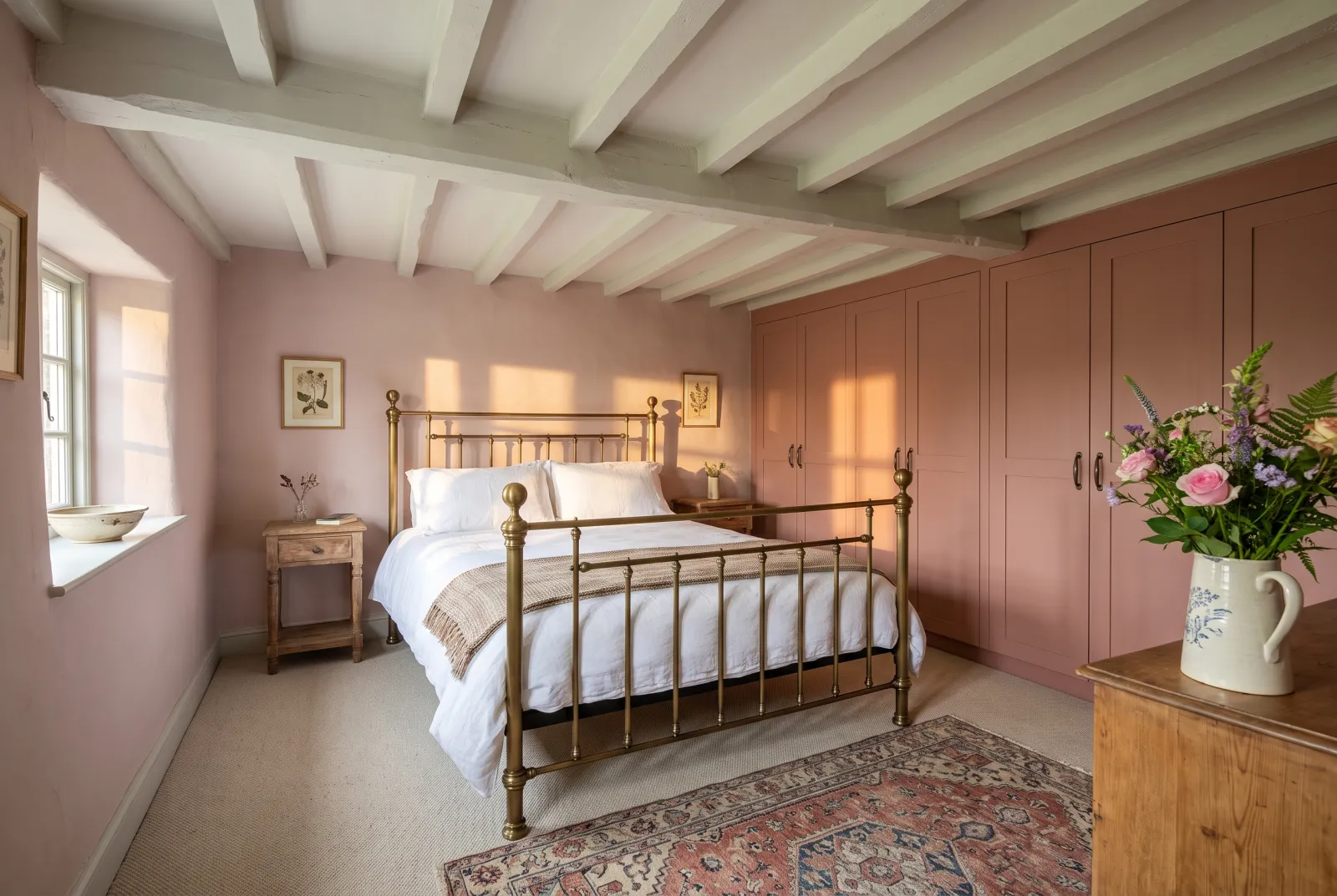
Pale Lilac™ No.246 Pink Pale tone West 50 % Lean: pink. For bedrooms, especially west-facing, where the evening turns it golden.
Sargasso JB.04 Grey Mid tone North 33 % Lean: grey-blue. For sitting rooms, studies and hallways, south- or north-facing.
Lavender Garden™ No.30 Grey Mid tone North 40 % Lean: balanced. For bedrooms and sitting rooms; graded with Early Lavender.
Haar JB.09 Grey Dark tone North 16 % Lean: grey-brown. For bedrooms, studies and colour drenching.
Fluorite Violet FTT-020 Neutral Dark tone West 11 % Lean: blue. For studies, dining rooms and doors; with cool whites.
Ultra Violet FTT-019 Blue Mid tone South 16 % Lean: blue, saturated. For doors, furniture, alcoves and cloakrooms.
Empire Violet™ No.80 Grey Dark tone North 7 % Lean: grey, deep. For dining rooms, libraries and colour drenching.
Plum Tree™ No.283 Neutral Dark tone West 7 % Lean: red-brown. For dining rooms, evening sitting rooms and bedrooms.
Duke’s House™ No.44 Black Dark tone North 5 % Lean: black. For front doors, bookcases and small evening rooms.

LRV: light reflectance estimated from the on-screen shade, from 0 (absolute black) to 100 (absolute white). Light: the orientation in which the shade looks its best.

Our selection

10 colours

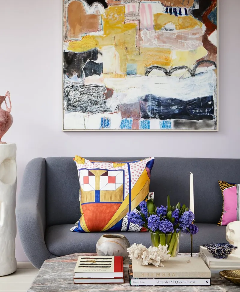
Lavender living room with a gra=ey sofa, colourful pillows, and abstract art on the wall.
01

Pale · the barely mauve grey

Early Lavender™ No.260

  • Grey
  • Pale tone
  • North light
  • LRV ≈ 63%

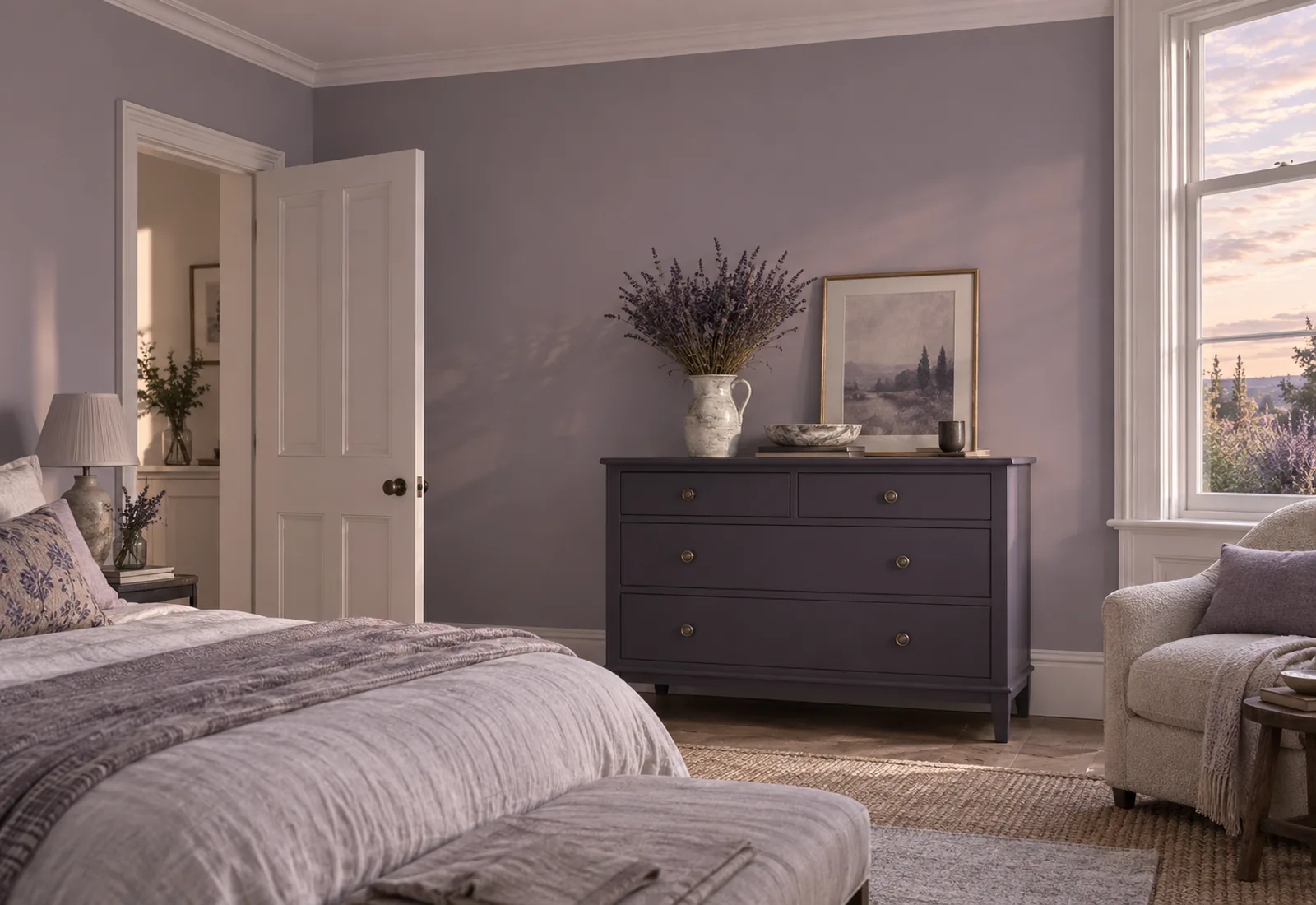
A pale grey shot with mauve, so discreet it passes for a white until a white is set beside it. It is the violet for those who don't want one: the softness of a lilac with nothing candy about it, and the calm of a grey. The colour of a sky at dawn. Bedrooms, sitting rooms, hallways — anywhere a neutral with a soul is wanted.

Our tip — Lean: grey. For bedrooms and north-facing rooms; with Osterley on the ceiling.

View the colour → Already in your basket (limit 1 per order)
Pale Lilac — Livingroom
02

Pale · the pinkish lilac

Pale Lilac™ No.246

  • Pink
  • Pale tone
  • West light
  • LRV ≈ 50%

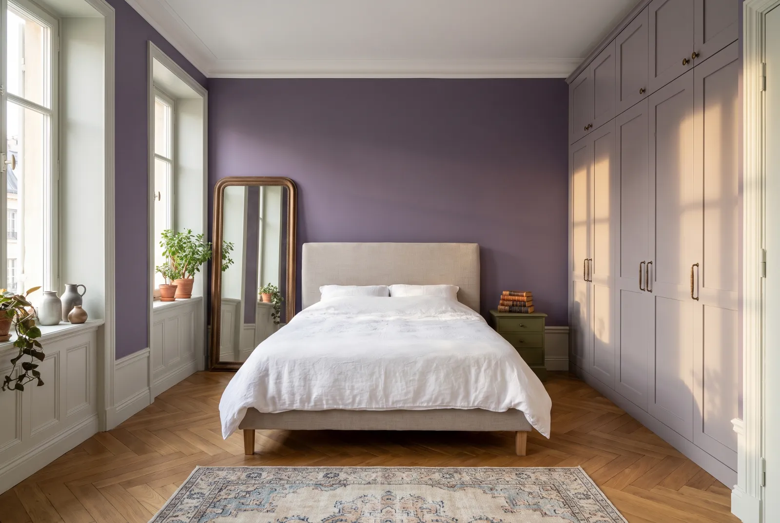
A pale, powdery lilac leaning to pink, the colour of a dried lilac flower. It is warmer than Early Lavender, and more frankly violet — it isn't mistaken for a grey — without ever being sugary, thanks to a good share of grey. It is the lilac of a grown-up bedroom, very handsome with white linen, dark wood and brass.

Our tip — Lean: pink. For bedrooms, especially west-facing, where the evening turns it golden.

View the colour → Already in your basket (limit 1 per order)
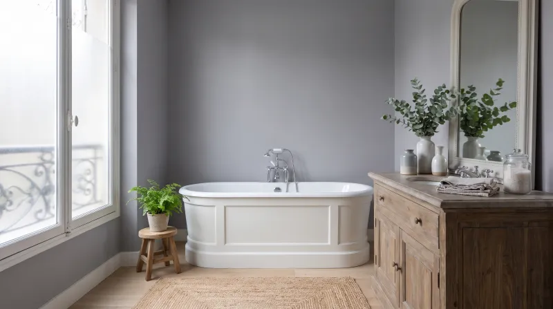
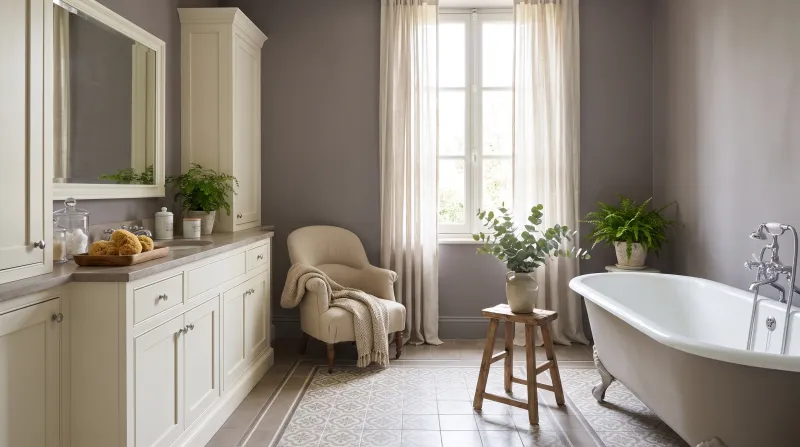
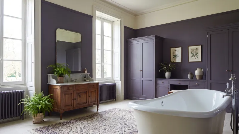
Sargasso — Bathroom
03

Mid · the sea violet grey

Sargasso JB.04

  • Grey
  • Mid tone
  • North light
  • LRV ≈ 33%

A barely violet mid grey, the colour of the Sargasso Sea under an overcast sky — designed by Jinny Blom. It is the greyest of our violets: it only reads as mauve in certain lights, in the morning or by candlelight. A contemporary, slightly mysterious neutral, for a sitting room or study you want sober without being cold.

Our tip — Lean: grey-blue. For sitting rooms, studies and hallways, south- or north-facing.

View the colour → Already in your basket (limit 1 per order)
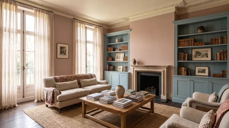
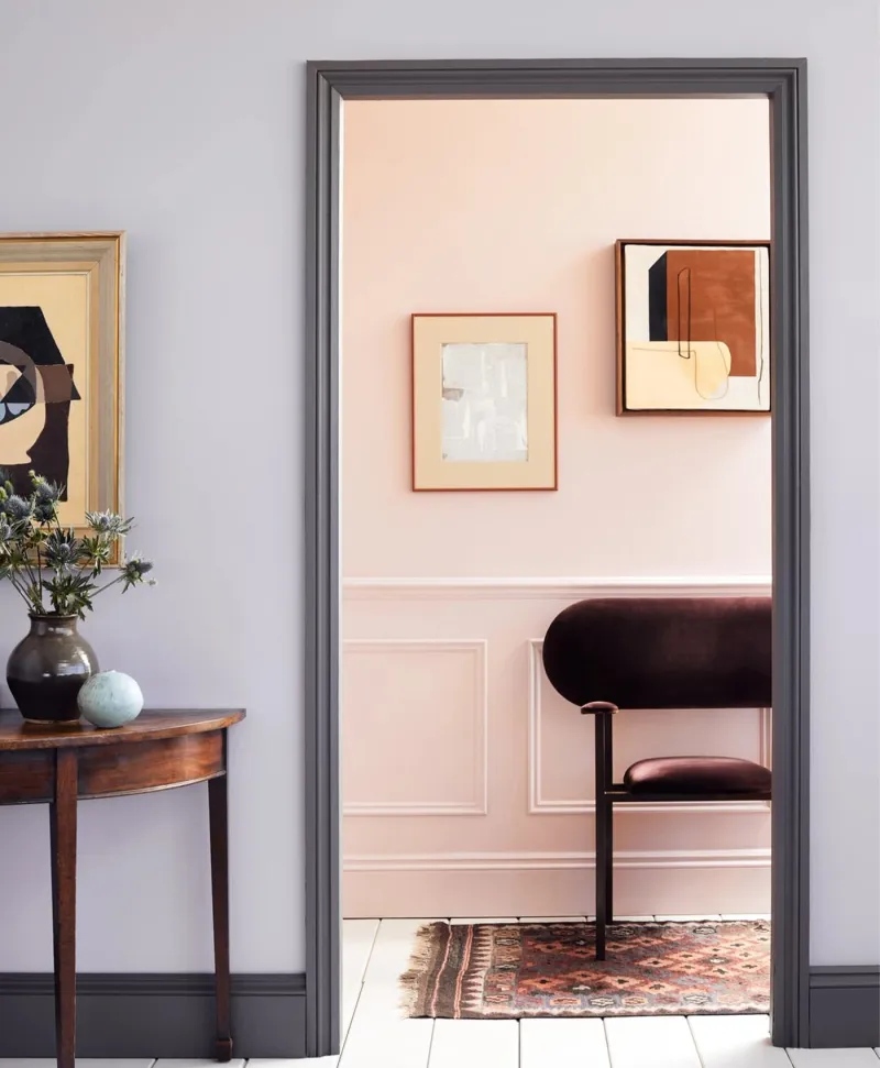
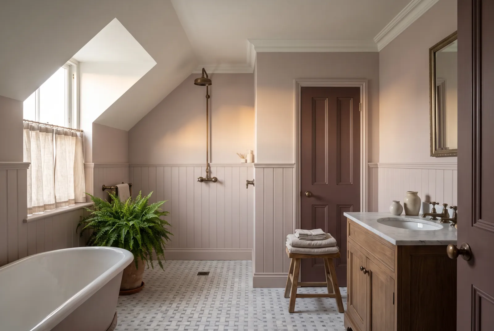
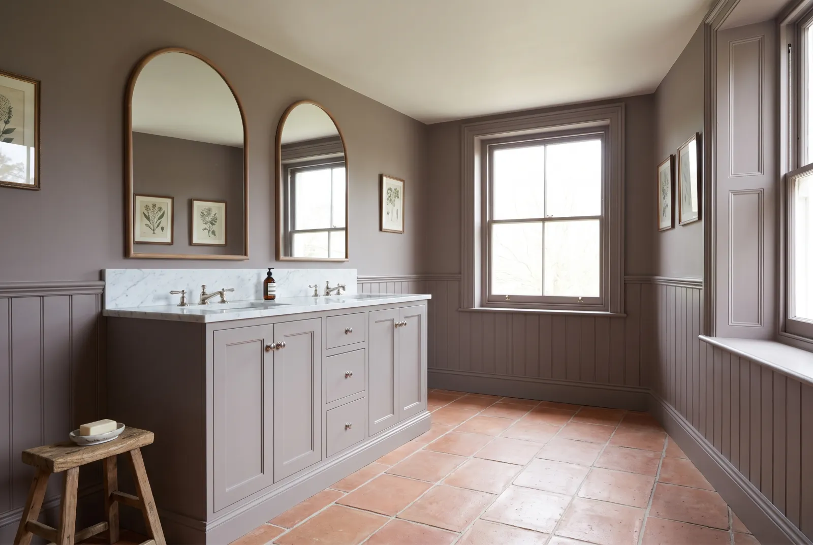
Lilac grey room with dark grey skirting leading to light pink room and wooden panelling and dark red velvet chair
04

Mid · the lavender grey

Lavender Garden™ No.30

  • Grey
  • Mid tone
  • North light
  • LRV ≈ 40%

A mid grey where the mauve shows plainly, the colour of a lavender bush in shade. It is Early Lavender's big brother: same family, one notch of depth more, which gives a bedroom or sitting room an enveloping softness without closing it in. It turns evening light violet, and it is superb with white and dark wood.

Our tip — Lean: balanced. For bedrooms and sitting rooms; graded with Early Lavender.

View the colour → Already in your basket (limit 1 per order)
Haar — Bathroom
05

Deep · the violet mist grey

Haar JB.09

  • Grey
  • Dark tone
  • North light
  • LRV ≈ 16%

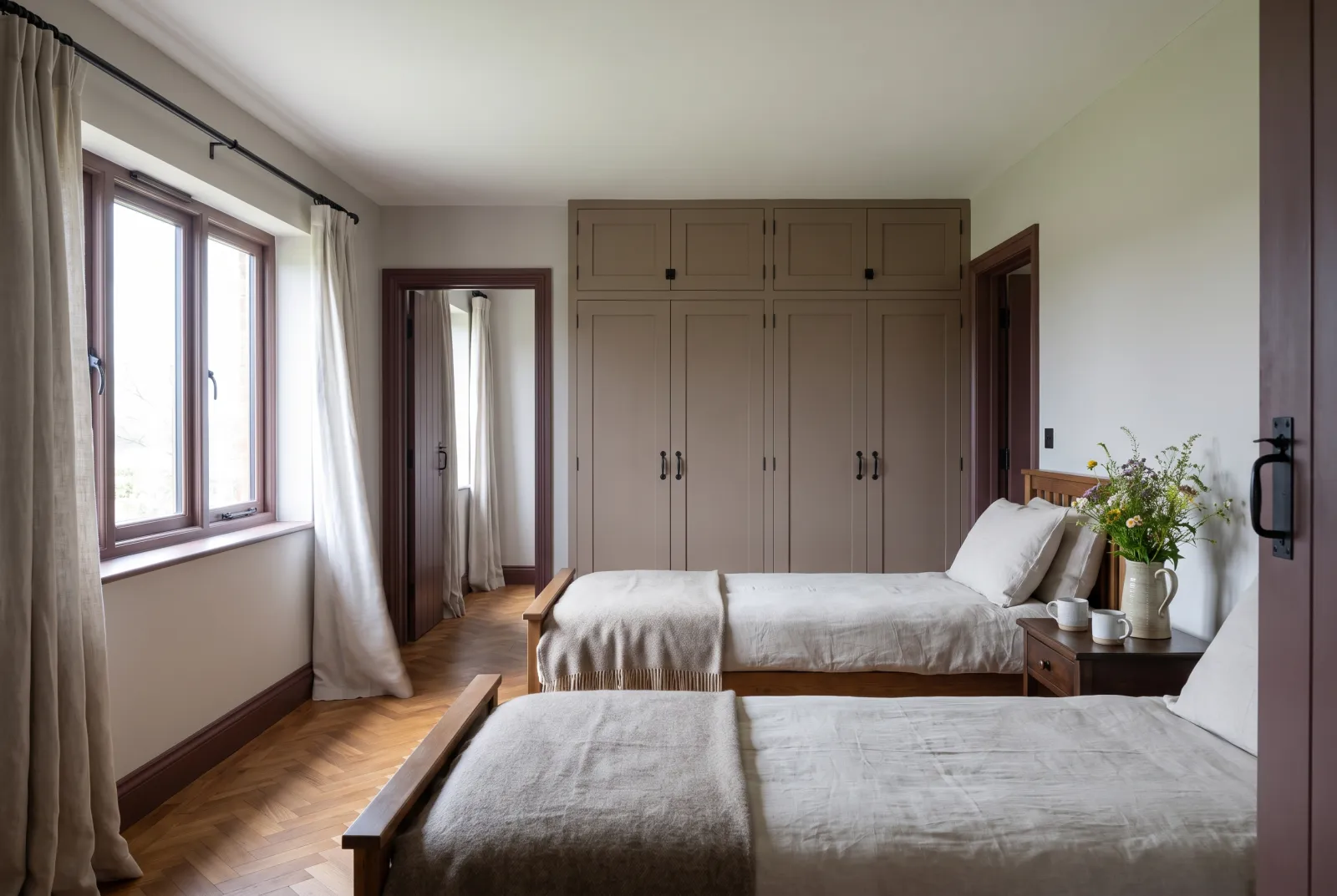
A deep grey tinted with violet and brown, the colour of a Scottish sea mist — the "haar" — at dusk. It is a violet that doesn't say its name: from afar a warm grey, up close a faded plum. It was made for a bedroom or study colour drench, where it envelops without the slightest coldness. With brass and pale wood it is very elegant.

Our tip — Lean: grey-brown. For bedrooms, studies and colour drenching.

View the colour → Already in your basket (limit 1 per order)
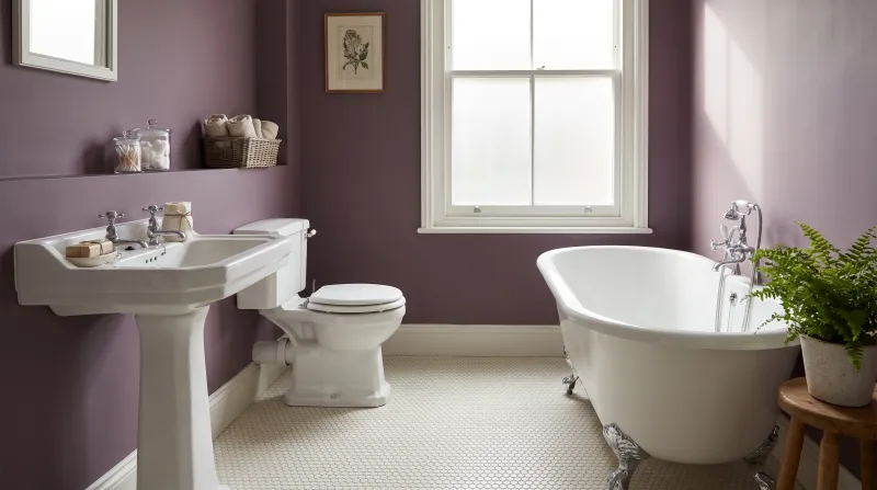
Fluorite Violet — Bathroom
06

Deep · the mineral violet

Fluorite Violet FTT-020

  • Neutral
  • Dark tone
  • West light
  • LRV ≈ 11%

A mid-deep violet, greyed and bluish, the colour of a fluorite crystal — from our archive collection. It is the most "violet" of our muted violets: mistaken for nothing else, and yet its share of grey makes it liveable. A wall, a door, a bookcase in Fluorite Violet gives a sober room an unexpected depth.

Our tip — Lean: blue. For studies, dining rooms and doors; with cool whites.

View the colour → Already in your basket (limit 1 per order)
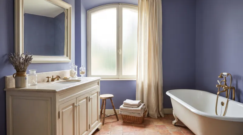
Ultra Violet — Bathroom
07

Proper · the one bright violet

Ultra Violet FTT-019

  • Blue
  • Mid tone
  • South light
  • LRV ≈ 16%

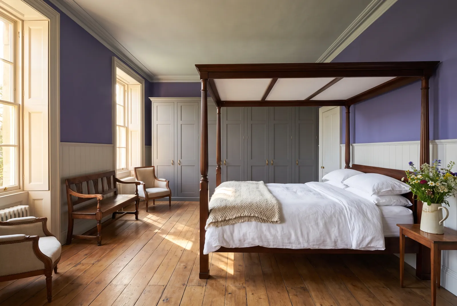
A proper, bluish mid violet, the colour of an iris or an ink — the only saturated violet in the range, from the archive collection. It has no grey in it, and therefore asks for nerve: a door, a piece of furniture, an alcove wall, the guest cloakroom. There it has a cheer and an elegance nothing else has. With white, pale yellow and brass.

Our tip — Lean: blue, saturated. For doors, furniture, alcoves and cloakrooms.

View the colour → Already in your basket (limit 1 per order)
Empire Violet — Bathroom
08

Deep · the ink violet

Empire Violet™ No.80

  • Grey
  • Dark tone
  • North light
  • LRV ≈ 7%

A very dark, greyed violet, almost black, the colour of dried violet ink — the violet of dining rooms and libraries. It does what a black does, with warmth added: at night, under candles, it turns a deep velvety violet that makes brass and gilding extraordinary. Our most sumptuous violet.

Our tip — Lean: grey, deep. For dining rooms, libraries and colour drenching.

View the colour → Already in your basket (limit 1 per order)
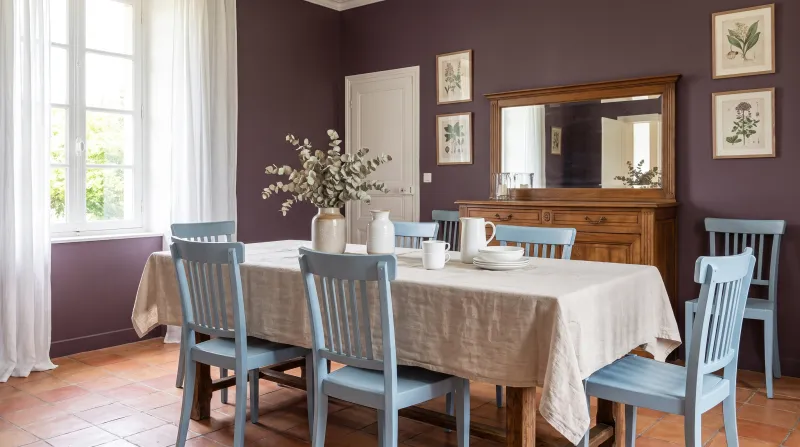
Plum Tree — Diningroom
09

Deep · the plum

Plum Tree™ No.283

  • Neutral
  • Dark tone
  • West light
  • LRV ≈ 7%

A deep, greyed brown-plum, neither red nor violet but between the two, like the skin of a damson. It is the warmest of our dark violets — its brown share brings it close to the earths — and therefore the easiest to live with in a dining room, an evening sitting room or a bedroom. Under a pendant it turns to velvet.

Our tip — Lean: red-brown. For dining rooms, evening sitting rooms and bedrooms.

View the colour → Already in your basket (limit 1 per order)
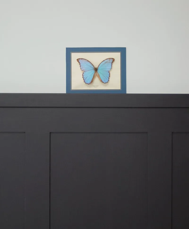
Framed blue butterfly on a light grey wall with black panelling
10

Deep · the aubergine black

Duke’s House™ No.44

  • Black
  • Dark tone
  • North light
  • LRV ≈ 5%

A black shot through with aubergine, which reads black from a distance and reveals itself as plum up close. It is the edge of the family: a black for those who want a black, with a secret. On a front door, a bookcase or the walls of a small evening room it is softer than a pure black, and it has a depth black lacks. Sublime with aged brass.

Our tip — Lean: black. For front doors, bookcases and small evening rooms.

View the colour → Already in your basket (limit 1 per order)

These colours in real rooms

Our schemes in which one of this guide's shades plays the lead — or a supporting role.

Pale Lilac™ No.246 Syon Park™ No.13 Rothschild Street™ No.296
Haar JB.09 The Boltons™ No.28 Lavender Garden™ No.30
Plum Tree™ No.283 The Boltons™ No.28 Westmoreland™ No.160
Fluorite Violet FTT-020 Greenwich Time™ No.8 Sargasso JB.04 Sorrel Green™ No.207
Ultra Violet FTT-019 Saint Johns™ No.64 Equinox JB.08
Pale Lilac™ No.246 St Clement™ No.11 Bloomsbury™ No.267

How to choose a violet

Violet frightens because people imagine it bright. Ours, with one exception, are greyed — which is what makes them liveable. So the question is not "violet or not" but "what depth, and what lean". Pale and grey (Early Lavender No.260, Pale Lilac No.246): a neutral with a soul, for any bedroom. Mid (Sargasso JB.04, Lavender Garden No.30): a colour that shows, softly, for a sitting room or bedroom. Deep (Haar JB.09, Fluorite Violet FTT-020, Empire Violet No.80, Plum Tree No.283, Duke's House No.44): evening colours, for dining rooms, studies, hallways and colour drenching. Proper (Ultra Violet FTT-019): an accent colour, in touches.

The lean

A violet leaning to pink (Pale Lilac No.246, Plum Tree No.283) is warm, and suits north-facing rooms. A violet leaning to blue (Fluorite Violet FTT-020, Ultra Violet FTT-019) is cool, and prefers south. A violet leaning to grey (Early Lavender No.260, Sargasso JB.04, Haar JB.09) goes everywhere. We say more in how light affects colour.

What to pair them with

Violets love pinkish whites — Osterley No.25, Holbein Chamber No.7 — rather than pure white, which makes them look cold; golds and brass, which make them sumptuous; pale yellows, their complement; and muted greens. For the mauve greys in detail, see our greys for a bedroom; for pinks, our pinks for a bedroom; for the darks, our blacks compared.


Frequently asked questions

Which Mylands violet for a bedroom?
A mauve grey: Early Lavender, the most discreet; Pale Lilac, pinker; Lavender Garden, deeper. For a cocoon bedroom, Haar or Plum Tree on every surface.
Is violet a hard colour to live with?
Bright violet, yes. Greyed violets — almost all of ours — are calm colours that age very well, between grey and plum. Only Ultra Violet is saturated, and is kept for touches.
Which violet for a dining room?
A deep violet that improves by candlelight: Empire Violet, almost black, or Plum Tree, warmer and browner. With brass and pinkish whites.
Which colours go with a violet?
Pinkish whites (Osterley, Holbein Chamber) rather than pure white, brass and golds, pale yellows — its complement — and muted greens.

Guides to read next

All colour guides →

Want to see these colours at home?

Order a sample to judge the shade in your own light, or browse every paint for the room.

Sign up to our newsletter

Sign up to our newsletter

Thanks for signing up to our newsletter!